Recipe Python Beginner 5 min
Fit a curve to data with error bars and draw a confidence band
Afterwards you can fit a model to data with known uncertainties, report parameter errors you can defend, and shade a confidence band around the fitted curve.
- Topic
- Curve fitting, Statistics
- Field
- Cross-disciplinary
- Libraries
matplotlib 3.11.2,numpy 2.5.3,scipy 1.18.1- Prerequisites
- none beyond Python basics
- Notebook
- Download py-fit-confidence-band.ipynb, executed with the versions above
The problem
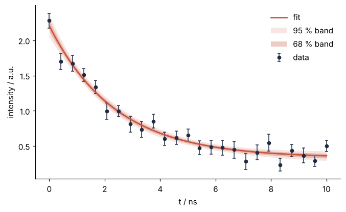
You have measurements \(y_i\) at points \(t_i\), each with its own uncertainty \(\sigma_i\), and a model with a few parameters. You want the best-fit parameters with uncertainties, a plot with error bars, and a band around the curve that shows how well the fit is pinned down.
The example is a fluorescence decay, intensity against time after the excitation pulse, with the model \(I(t) = A e^{-t/\tau} + B\). Swap in your own data and model; nothing else changes.
The code
import numpy as np
import matplotlib.pyplot as plt
from scipy.optimize import curve_fit

# ---- data: replace these three lines with your own t, y, sigma
rng = np.random.default_rng(7)
t = np.linspace(0, 10, 25)                                   # ns
sigma = 0.08 + 0.04 * rng.random(t.size)                     # one uncertainty per point
y = 2.0 * np.exp(-t / 2.5) + 0.3 + sigma * rng.standard_normal(t.size)

# ---- model and fit
def model(t, A, tau, B):
    return A * np.exp(-t / tau) + B

p0 = [y[0] - y[-1], 0.3 * t[-1], y[-1]]                      # rough guesses, taken from the data
popt, pcov = curve_fit(model, t, y, p0=p0, sigma=sigma, absolute_sigma=True)
perr = np.sqrt(np.diag(pcov))
chi2_dof = np.sum(((y - model(t, *popt)) / sigma) ** 2) / (t.size - popt.size)

# ---- confidence band: propagate the parameter covariance through the model
tt = np.linspace(t.min(), t.max(), 300)
J = np.empty((tt.size, popt.size))                           # d model / d parameter
for k in range(popt.size):
    dp = np.zeros_like(popt)
    dp[k] = 1e-6 * max(abs(popt[k]), 1.0)
    J[:, k] = (model(tt, *(popt + dp)) - model(tt, *(popt - dp))) / (2 * dp[k])
band = np.sqrt(np.einsum("ij,jk,ik->i", J, pcov, J))         # 1-sigma uncertainty of the curve

# ---- report and plot
for name, val, err in zip(["A", "tau", "B"], popt, perr):
    print(f"{name:3s} = {val:6.3f} ± {err:.3f}")
print(f"chi2 / dof = {chi2_dof:.2f}")

fit = model(tt, *popt)
fig, ax = plt.subplots(figsize=(7, 4), dpi=110)
ax.errorbar(t, y, yerr=sigma, fmt="o", color="#1f2a44", ms=4, capsize=2, lw=1, label="data")
ax.plot(tt, fit, color="#c8553d", lw=1.8, label="fit")
ax.fill_between(tt, fit - 2 * band, fit + 2 * band, color="#c8553d", alpha=0.15, lw=0, label="95 % band")
ax.fill_between(tt, fit - band, fit + band, color="#c8553d", alpha=0.30, lw=0, label="68 % band")
ax.set(xlabel="t / ns", ylabel="intensity / a.u.")
ax.spines[["top", "right"]].set_visible(False)
ax.legend(frameon=False)
plt.show()
A   =  1.876 ± 0.077
tau =  2.380 ± 0.229
B   =  0.332 ± 0.043
chi2 / dof = 0.93
The knobs
sigma and absolute_sigma=True together make the fit a proper weighted least squares: points with small error bars pull harder, and the uncertainties that come back in pcov are in the units of your data. With absolute_sigma=False, the default, curve_fit rescales the covariance so that the reduced chi-square is one, and your error bars only set the relative weights. Use True when you trust your \(\sigma_i\), which you should if they come from counting statistics or a calibrated instrument. The starting values p0 are read off the data: the drop from first to last point for \(A\), the last point for the offset \(B\), and a fraction of the time range for \(\tau\). Exponentials in particular need a sensible \(\tau\) to start from. The data above were generated with \(A = 2.0\), \(\tau = 2.5\) and \(B = 0.3\); the fit lands within two standard errors of each, which is what the errors are supposed to mean.
The band is first-order error propagation. The fitted curve at a point \(t\) is a function of the parameters, so its variance is \(J \Sigma J^\mathsf{T}\) with \(J\) the row of derivatives of the model with respect to the parameters at that \(t\) and \(\Sigma\) the parameter covariance pcov. The code computes \(J\) by central differences so that you never have to differentiate your model by hand. One band is one standard deviation, the 68 % band; twice it is 95 %. This is the band of the curve, the region where the true mean intensity plausibly lies. It is not the region where the next data point will fall; that prediction band is wider, \(\sqrt{\text{band}^2 + \sigma^2}\), and it does not shrink as you collect more points.
Pitfalls
Starting values in the wrong units. If your time axis is in picoseconds and runs to 10 000, the default start \(\tau = 1\) makes \(e^{-t/\tau}\) underflow to zero for every point but the first. The fit then cannot move \(\tau\) at all, returns it unchanged, and reports infinite uncertainties with an OptimizeWarning: Covariance of the parameters could not be estimated. That warning almost always means bad starting values, not bad data. Take p0 from the data as above.
A reduced chi-square far from one. The value printed above should be near 1 if the error bars are honest and the model is right. If it is 15, either your \(\sigma_i\) are too small or the model is missing something, and the parameter errors from absolute_sigma=True are meaningless until you find out which. Do not fix it by switching to absolute_sigma=False; that hides the problem in a rescaling. If it is 0.1, your error bars are too large, which is less dangerous but still wrong.
Reading the band as a prediction. Two-thirds of the data points will not lie inside the 68 % band, and they are not supposed to. The band says where the curve is, not where the points are. If a referee asks why so many points are outside, that is the answer.