Matplotlib from the ground up: a two-panel figure for one journal column
Afterwards you can build a Matplotlib figure from Figure and Axes, size it for a journal column, share an axis between panels, and save it at print size.
- Topic
- Visualization
- Field
- Cross-disciplinary
- Prerequisites
- none beyond Python basics
- Libraries
matplotlib 3.11.2numpy 2.5.3
py-matplotlib.ipynb, executed with the versions above
The problem: a spectrum, its model, and its residuals in one journal column
You have a measured emission spectrum, the model curve that should describe it, and the residuals between the two, and they go into a paper as one figure, 8.6 cm wide: one column of a two-column journal. Draw it with a handful of plt.plot calls in Matplotlib and you get a figure 6.4 inches wide. Shrunk to 8.6 cm, it is scaled by 0.529, so the 10-point tick labels print at 5.3 pt. A point is the unit of font sizes in your word processor, 1/72 inch, so these labels are about half the size of the body text around the figure. The residual panel also carries a second x axis with the same tick labels as the first, and takes as much height as the spectrum it only qualifies.
The 8.6 cm is the single-column width of the Physical Review journals; check your own journal's guide for its number. A chromatogram with its fit, or a diffraction pattern with its refinement, is the same figure.
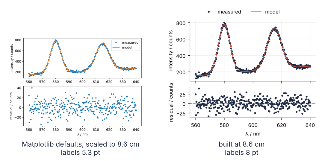
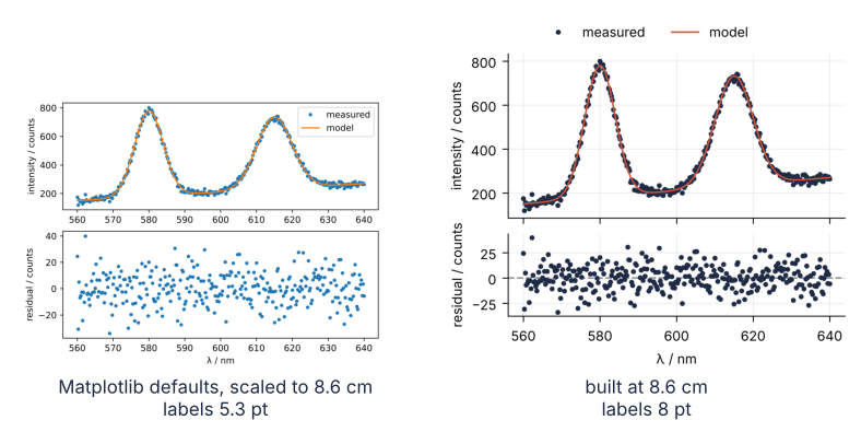
This is where we end up. On the left, the default figure scaled to the column; on the right, the figure built from a Figure and two Axes at 8.6 by 7.6 cm before anything is drawn, with 8 pt text, a shared x axis, and a residual panel half the height of the spectrum. Step 6 renders both at the same physical width, after saving the right one as a PDF and a 600 dpi PNG whose sizes it reads back.
Setup
from pathlib import Path
import io
import re

import numpy as np
import matplotlib.pyplot as plt

# Settings every new figure starts from: the size, fonts, and colors of this site's screen figures.
# Step 1 says what these are; Step 4 replaces them for print.
plt.rcParams.update({
    "figure.figsize": (7, 4.4), "figure.dpi": 110,
    "axes.spines.top": False, "axes.spines.right": False,
    "axes.grid": True, "grid.alpha": 0.25,
    "font.size": 11, "lines.linewidth": 1.8,
})
INK, ACCENT, SECOND, MUTED = "#1f2a44", "#c8553d", "#2a7f9e", "#8a8f98"

def gauss(lam, a, mu, sigma):
    return a * np.exp(-0.5 * ((lam - mu) / sigma) ** 2)

rng = np.random.default_rng(3)
lam = np.linspace(560, 640, 321)                                   # wavelength / nm
model = 150 + 1.5 * (lam - 560) + gauss(lam, 600, 580, 4) + gauss(lam, 500, 615, 5)
counts = model + rng.normal(0, 12, lam.size)                       # the measured spectrum
resid = counts - model

Path("assets").mkdir(exist_ok=True)
print(f"{lam.size} points from {lam[0]:.0f} to {lam[-1]:.0f} nm, largest reading {counts.max():.0f} counts")
321 points from 560 to 640 nm, largest reading 800 counts
Step 1: Draw the figure the quick way and shrink it to a column
Here is the version most people write first. Matplotlib keeps its settings in a dictionary, plt.rcParams, that every new figure reads its size and fonts from; the setup cell changed some of them. To see what Matplotlib does on its own, the figure is created inside plt.style.context("default"), which restores the factory settings for this one block:
with plt.style.context("default"):
    before = plt.figure()
    plt.subplot(2, 1, 1)
    plt.plot(lam, counts, ".", label="measured")
    plt.plot(lam, model, label="model")
    plt.ylabel("intensity / counts")
    plt.legend()
    plt.subplot(2, 1, 2)
    plt.plot(lam, resid, ".")
    plt.xlabel("λ / nm")
    plt.ylabel("residual / counts")
    plt.show()

w_in, h_in = before.get_size_inches()
label_pt = before.axes[1].xaxis.label.get_fontsize()   # the bottom panel's x label
scale = 8.6 / 2.54 / w_in
print(f"size {w_in} x {h_in} in, scale to 8.6 cm: {scale:.3f}, labels print at {label_pt * scale:.1f} pt")
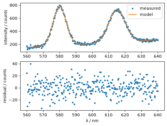
size 6.4 x 4.8 in, scale to 8.6 cm: 0.529, labels print at 5.3 pt
On screen nothing looks wrong. The trouble is the size: 6.4 inches is 16.3 cm, the journal shrinks that to 8.6 cm, and the 10 pt labels end up at 5.3 pt, smaller than the minimum many journals' figure guides set. Look up yours in the guide that gives the column width, and use it wherever this tutorial says 8 pt. The two panels are equally tall, and the upper one repeats the wavelength ticks of the lower one for nothing. The handle before is kept for the comparison at the end.
Step 2: Ask plt.subplots for the Figure and its Axes
A figure in Matplotlib is two kinds of objects. The Figure is the page: its size and the file it is saved to. An Axes is one panel on that page, with its own data limits, axis labels, and legend. plt.subplots creates both at once and hands them to you:
fig, axs = plt.subplots(2, 1)
print(type(fig).__name__, type(axs).__name__, axs.shape, type(axs[0]).__name__)

axs[0].plot(lam, counts, "o", ms=3, color=INK, label="measured")
axs[0].plot(lam, model, color=ACCENT, label="model")
axs[0].set(ylabel="intensity / counts")
axs[0].legend(frameon=False)
axs[1].plot(lam, resid, "o", ms=3, color=INK)
axs[1].set(xlabel="λ / nm", ylabel="residual / counts")
plt.show()
Figure ndarray (2,) Axes
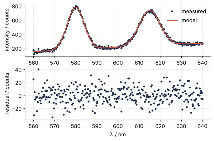
axs is a NumPy array of two Axes, top and bottom. The Matplotlib documentation calls the two styles the implicit pyplot interface and the explicit Axes interface. plt.xlabel acts on whichever Axes is current, the last one created or touched, and you have to keep track of which that is. axs[1].set_xlabel says which one. The translation is mechanical: plt.xlabel becomes ax.set_xlabel, plt.xlim becomes ax.set_xlim, plt.legend becomes ax.legend, and ax.set(xlabel=..., ylabel=...) calls set_xlabel and set_ylabel in one line. Use the explicit form for anything with more than one panel.
The figure now has the site's look, but it still has two x axes.
Step 3: Share the x axis and give the residuals less height
The drawing goes into a function that takes the Axes as an argument. That is the habit worth keeping: the same function then draws into a screen figure or a column figure. The marker size is an argument because it is measured in points, a physical size like a font size, which does not shrink when the figure does; the column figure will need smaller markers. ms, lw, and ls in this code are Matplotlib's short names for markersize, linewidth, and linestyle. The dashed gray line in the residual panel marks zero residual, the level your eye judges the scatter against.
def draw_spectrum(axs, ms):
    axs[0].plot(lam, counts, "o", ms=ms, color=INK, label="measured")
    axs[0].plot(lam, model, color=ACCENT, label="model")
    axs[0].set(ylabel="intensity / counts")
    axs[1].axhline(0, color=MUTED, lw=1, ls="--")
    axs[1].plot(lam, resid, "o", ms=ms, color=INK)
    axs[1].set(xlabel="λ / nm", ylabel="residual / counts")

fig, axs = plt.subplots(2, 1, sharex=True, height_ratios=[2, 1], layout="constrained")
draw_spectrum(axs, ms=3)
axs[0].legend(frameon=False)
axs[1].set_xlim(556, 644)          # set on the bottom panel only
lo, hi = axs[0].get_xlim()
print(f"top panel x range: {lo:.0f} to {hi:.0f} nm")
plt.show()
top panel x range: 556 to 644 nm
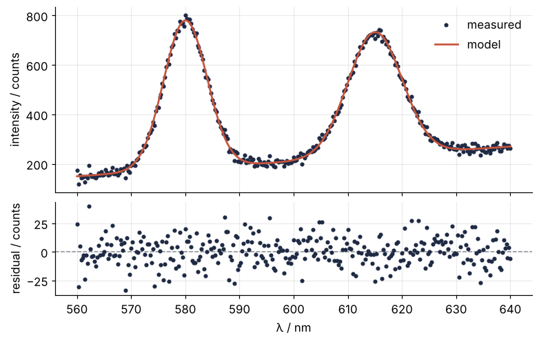
Three arguments do the work. sharex=True links the x limits of the panels and hides the tick labels of the upper one: the limits were set on the bottom panel and the top panel reports them. height_ratios=[2, 1] gives the spectrum two thirds of the height. layout="constrained" makes room for the tick and axis labels, so that nothing overlaps or is cut off at the edge.
Step 4: Size the figure in inches and the text in points
Matplotlib measures the figure size in inches, and font sizes, line widths, and marker sizes in points, 1/72 inch. All of these are sizes on paper. The dpi only decides how many pixels a screen or a PNG spends on them. So a figure built at 8.6 cm with 8 pt text prints with 8 pt text, as long as nobody rescales it.
Every rcParams name is listed with its default in the rcParams guide linked at the end. A style, like "default" in Step 1, is a named set of them. plt.rc_context takes a dict directly:
COLUMN = (8.6 / 2.54, 7.6 / 2.54)        # inches
JOURNAL = {"font.size": 8, "lines.linewidth": 1.0, "axes.linewidth": 0.6,
           "xtick.major.width": 0.6, "ytick.major.width": 0.6, "grid.linewidth": 0.5}

with plt.rc_context(JOURNAL):
    fig, axs = plt.subplots(2, 1, figsize=COLUMN, sharex=True, height_ratios=[2, 1],
                            layout="constrained")
    draw_spectrum(axs, ms=2)
    leg = axs[0].legend(frameon=False)
plt.show()
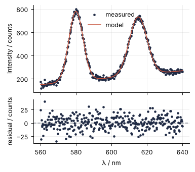
The rule to carry into your scripts: rcParams are read when each thing on the figure is created, the figure and its Axes first, then every line and legend you add. So create the figure and draw into it inside the block. Once created, an element keeps its sizes, and showing or saving the figure later does not change them. The exception is the settings that only matter when a file is written, read at save time: the savefig.* family and the per-format ones such as pdf.fonttype, which chooses how fonts are embedded in a PDF. Set those around the save. The savefig.* ones are also arguments of savefig itself, which is how Step 6 passes the dpi; pdf.fonttype has no such argument.
To check, collect the font size of everything you can name on the figure. Tick labels, axis labels, and legend entries are all text objects, and each reports its own size:
def font_sizes(axs, legend):
    texts = list(legend.get_texts())
    for ax in axs:
        texts += ax.get_xticklabels() + ax.get_yticklabels() + [ax.xaxis.label, ax.yaxis.label]
    return {t.get_fontsize() for t in texts}

w_cm, h_cm = fig.get_size_inches() * 2.54
print(f"{w_cm:.1f} x {h_cm:.1f} cm, font sizes {font_sizes(axs, leg)}")
8.6 x 7.6 cm, font sizes {8.0}
The figure appears on screen at its print size, small, and that is the point. Every label is 8 pt. But the legend now sits on the flank of the first peak. The cell below converts the legend box and every data point to pixel positions on the finished figure and counts the points inside the box:
Show code
def points_under(legend, ax):
    ax.figure.canvas.draw()
    xy = ax.transData.transform(np.column_stack([lam, counts]))
    return legend.get_window_extent().count_contains(xy)

print(f"data points under the legend: {points_under(leg, axs[0])}")
data points under the legend: 12
In the 7-inch screen figure of Step 3, the same axs[0].legend() found an empty corner. Without a loc argument it uses loc="best", which picks the least crowded of nine fixed positions, and a narrow panel full of data has none free.
Step 5: Put the legend where the data is not
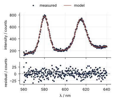
Give the legend to the Figure instead of the Axes. fig.legend() collects the labeled lines of all its panels, here "measured" and "model" from the top one. With constrained layout, a location that starts with "outside" puts it in a strip of its own, and the panels shrink to make room:
with plt.rc_context(JOURNAL):
    fig, axs = plt.subplots(2, 1, figsize=COLUMN, sharex=True, height_ratios=[2, 1],
                            layout="constrained")
    draw_spectrum(axs, ms=2)
    leg = fig.legend(loc="outside upper center", ncols=2, frameon=False)
plt.show()
Show code
print(f"data points under the legend: {points_under(leg, axs[0])}")
data points under the legend: 0
No point is covered; the panels gave up one line of height to the strip. Two alternatives work as well: a fixed loc plus headroom from set_ylim, or no legend at all and the two curves labeled with ax.text next to them, which is what I would do with fewer data points. This fig is the one that goes to the journal.
Step 6: Save a PDF and a 600 dpi PNG, and check their size
Save outside the with block, which by the rule of Step 4 changes nothing. A PDF is vector graphics, sharp at any zoom, and it is the file to send for line art like this plot. When a journal wants pixels instead, its guide asks for 600 dpi or more for line art; the 300 dpi you see quoted everywhere is for photographs.
fig.savefig("assets/spectrum-column.pdf", metadata={"CreationDate": None})  # no timestamp: same file every run
fig.savefig("assets/spectrum-column.png", dpi=600)
print("font sizes after saving:", font_sizes(axs, leg))

rows, cols, channels = plt.imread("assets/spectrum-column.png").shape
print(f"PNG: {cols} x {rows} px = {cols / 600 * 2.54:.2f} x {rows / 600 * 2.54:.2f} cm at 600 dpi")
font sizes after saving: {8.0}
PNG: 2031 x 1795 px = 8.60 x 7.60 cm at 600 dpi
The sizes survived the save, and the PNG has 2031 by 1795 pixels: the 3.39 by 2.99 inches of the figure times 600 dpi. plt.imread returns the image as an array of rows first, so the shape reads height, width, color channels.
A PDF stores the size of each page as plain text in the file, in an entry named /MediaBox that lists the page rectangle as four numbers. The last two are the width and height in points, so this entry says exactly how large the page will print:
box = re.search(rb"/MediaBox \[([^\]]*)\]", Path("assets/spectrum-column.pdf").read_bytes())
x0, y0, width_pt, height_pt = map(float, box.group(1).split())
print(f"PDF: {width_pt:.1f} x {height_pt:.1f} pt = {width_pt / 72 * 2.54:.2f} x {height_pt / 72 * 2.54:.2f} cm")
PDF: 243.8 x 215.4 pt = 8.60 x 7.60 cm
Any PDF viewer shows the same number in the document properties (in Adobe Acrobat, File > Properties > Page Size); the code makes the check repeatable. Both files have the size you built, so the journal has nothing to scale and the 8 pt stay 8 pt. Open the PDF at 100 % zoom and hold a ruler to the screen if you do not believe it.
The figure below puts the default figure from Step 1, shrunk to 8.6 cm, next to the one just saved, at the same physical width. The code that assembles it only arranges two pictures, so it is collapsed.
Show code
buf = io.BytesIO()
before.savefig(buf, format="png", dpi=600 * scale)       # 8.6 cm wide, like the column PNG
buf.seek(0)
images = [(plt.imread(buf), "Matplotlib defaults, scaled to 8.6 cm\nlabels 5.3 pt"),
          (plt.imread("assets/spectrum-column.png"), "built at 8.6 cm\nlabels 8 pt")]

width, gap, caption = 8.6 / 2.54, 0.2, 0.45                # inches
height = max(img.shape[0] / img.shape[1] * width for img, _ in images)
W, H = 2 * width + gap, height + caption
comparison = plt.figure(figsize=(W, H))
for i, (img, text) in enumerate(images):
    x = i * (width + gap)
    h = img.shape[0] / img.shape[1] * width
    ax = comparison.add_axes([x / W, caption / H, width / W, h / H])   # bottoms aligned above the captions
    ax.imshow(img)
    ax.set_axis_off()
    comparison.text((x + width / 2) / W, 0.05 / H, text, ha="center", va="bottom", color=INK)
plt.show()
Pitfalls
A label on the wrong panel. After fig, axs = plt.subplots(2, 1), a call to plt.ylabel("intensity / counts") puts the label on the bottom panel, and the top panel stays without one. The current Axes is the last one created, and plt.subplots creates the bottom panel last. Mixing the two interfaces is how this happens. Once you have axs, use Axes methods for everything.
An empty file from savefig after show. In a notebook, plt.show() displays the figure and pyplot forgets it. A plt.savefig("figure.png") in the next line then has no current figure, creates a new empty one, and writes a white image of 640 by 480 pixels without a word of warning. Either call plt.savefig before plt.show(), or call fig.savefig on the handle, which works at any time. The second is the habit of this tutorial.
bbox_inches="tight" changes the size you built. The option trims the saved figure to its contents and then adds 0.1 inch of padding on every side, so the file no longer has the size you asked for:
buf = io.BytesIO()
fig.savefig(buf, format="png", dpi=300, bbox_inches="tight")
buf.seek(0)
width_in = plt.imread(buf).shape[1] / 300
print(f"tight: {width_in:.2f} in = {width_in * 2.54:.2f} cm, "
      f"so 8 pt print at {8 * 8.6 / (width_in * 2.54):.1f} pt after scaling to 8.6 cm")
tight: 3.50 in = 8.89 cm, so 8 pt print at 7.7 pt after scaling to 8.6 cm
Three millimeters too wide, and the journal scales your fonts down by the same 3 % to fit. Constrained layout already manages the margins, so save without bbox_inches whenever the size matters.
Variations
- A full-width figure. For a figure across both columns (17.8 cm in the Physical Review journals), change the width in
figsize. The fonts stay 8 pt, which is the point of sizing in physical units. - Panels side by side.
plt.subplots(1, 2, sharey=True, width_ratios=[3, 1])puts a histogram of the residuals next to the spectrum, sharing the intensity axis. - Irregular layouts.
fig, axd = plt.subplot_mosaic("AB;CC")returns the Figure and a dict of Axes by name, here two small panels above one wide one. - One style file for the whole paper. Write the
JOURNALsettings intocolumn.mplstyle, onename: valueper line, and callplt.style.use("column.mplstyle")at the top of every plotting script.
Cheat sheet
with plt.rc_context({"font.size": 8}):           # read as each element is created: draw inside
    fig, axs = plt.subplots(2, 1, figsize=(w_cm / 2.54, h_cm / 2.54),   # figsize in inches
                            sharex=True, height_ratios=[2, 1], layout="constrained")
    axs[0].plot(x, y)                            # one Axes per panel: ax.plot, ax.set, ax.legend
    axs[1].set(xlabel="x / unit", ylabel="y / unit", xlim=(x0, x1))
    fig.legend(loc="outside upper center", ncols=2, frameon=False)   # legend in its own strip
fig.savefig("fig.pdf")                           # save with fig.savefig, or plt.savefig before plt.show()
fig.savefig("fig.png", dpi=600)                  # line art: 600 dpi; no bbox_inches="tight"
Further reading
- The Matplotlib documentation: the Quick start guide for the two interfaces, Arranging multiple Axes in a Figure, the constrained layout guide, the legend guide, Customizing Matplotlib with style sheets and rcParams, and the
Figure.savefigreference. - Nicolas P. Rougier, Scientific Visualization: Python + Matplotlib (2021), free online, for everything after this tutorial.
- Related tutorials on this site: Numerical integration with scipy.integrate: the area under a measured peak for the area of such a spectrum, Fit a curve to data with error bars and draw a confidence band for where a model curve and its residuals come from when the parameters are unknown, solve_ivp from the ground up: the pendulum beyond small angles, and Draw a phase portrait of a two-variable ODE system for another figure built from Figure and Axes.
- Download the notebook. It was executed with the library versions in the header.