Map projections: why Greenland looks as large as Africa, and what each keeps
Afterwards you can say what a map projection keeps and distorts, read Tissot's indicatrix, and pick an equal-area map for areas or a conformal one for angles.
- Field
- Biology, Geology, Physics
- Prerequisites
- none beyond Python basics
- Libraries
cartopy 0.26.0matplotlib 3.11.2numpy 2.4.3pyproj 3.8.0shapely 2.2.0
py-map-projections.ipynb, executed with the versions above. The download needs a free account
Run it yourself. In a terminal, this installs exactly the versions above:
pip install numpy==2.4.3 pyproj==3.8.0 cartopy==0.26.0 shapely==2.2.0 matplotlib==3.11.2 jupyterlabThe question
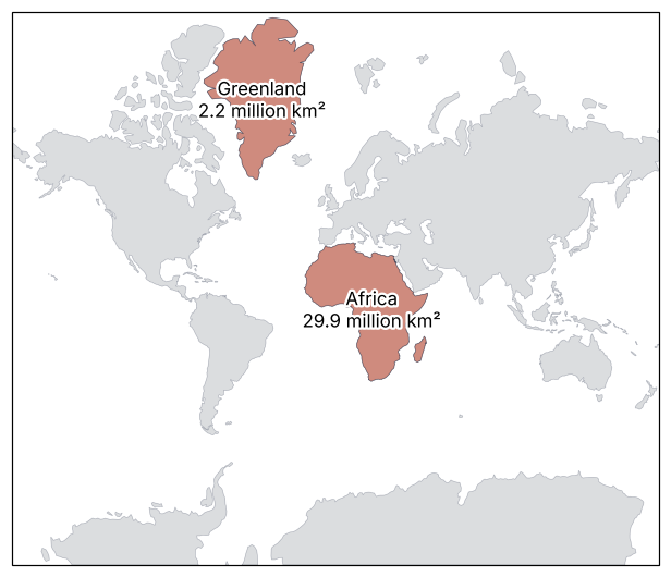
A map projection is the rule that lays the curved surface of the Earth flat, and the one behind nearly every web map draws Greenland about as large as Africa. Here are both on the Mercator map, cut from Natural Earth's 1:110m outlines of the land, which ship with this tutorial (five files, 94 kB, public domain).
Show code
import warnings
from pathlib import Path

import numpy as np
import matplotlib.pyplot as plt
from matplotlib import patheffects
import cartopy
import cartopy.crs as ccrs
from cartopy.io import shapereader
import shapely
from shapely.geometry import Point, Polygon
from shapely.geometry.polygon import orient
import pyproj

cartopy.config["pre_existing_data_dir"] = Path("assets")       # holds shapefiles/natural_earth/physical/
warnings.simplefilter("error", cartopy.io.DownloadWarning)      # a download attempt stops the run
warnings.filterwarnings("ignore", message="Approximating coordinate system")  # raised by tissot

plt.rcParams.update({
    "figure.figsize": (8, 6), "figure.dpi": 110,
    "axes.spines.top": False, "axes.spines.right": False,
    "axes.grid": True, "grid.alpha": 0.25,
    "font.size": 11, "lines.linewidth": 1.8,
})
INK, ACCENT, SECOND, MUTED = "#1f2a44", "#c8553d", "#2a7f9e", "#8a8f98"
LAND = dict(facecolor=MUTED, alpha=0.3, edgecolor=INK, lw=0.4)
HIGHLIGHT = dict(facecolor=ACCENT, alpha=0.6, edgecolor=INK, lw=0.4)
LONLAT = ccrs.PlateCarree()

# ---- the land of Natural Earth 1:110m, one polygon per continent or island
land_file = shapereader.natural_earth(resolution="110m", category="physical", name="land")
parts = [p for g in shapereader.Reader(land_file).geometries() for p in getattr(g, "geoms", [g])]

def part_at(lon, lat):
    return next(p for p in parts if p.contains(Point(lon, lat)))

# Africa is joined to Asia at Sinai: cut along the Suez Canal and through Bab-el-Mandeb
greenland = part_at(-40, 72)
cut = Polygon([(-30, -40), (-30, 38), (32.4, 38), (32.4, 29.9), (43.4, 12.6), (60, 12.6), (60, -40)])
pieces = part_at(20, 0).intersection(cut)
africa = shapely.union_all([max(pieces.geoms, key=lambda p: p.area), part_at(47, -19)])  # and Madagascar

# ---- areas on the globe (WGS84 ellipsoid) and on the Mercator map
geod = pyproj.Geod(ellps="WGS84")

def globe_area(geom):
    """Area in km² on the ellipsoid; orient() makes every ring counterclockwise, so the sign is positive."""
    return sum(geod.geometry_area_perimeter(orient(p))[0] for p in getattr(geom, "geoms", [geom])) / 1e6

def map_ratio(proj):
    """Greenland's area on the map divided by Africa's, in the projection's own units."""
    return proj.project_geometry(greenland, LONLAT).area / proj.project_geometry(africa, LONLAT).area

A_greenland, A_africa = globe_area(greenland), globe_area(africa)
globe_ratio = A_greenland / A_africa

fig, ax = plt.subplots(subplot_kw={"projection": ccrs.Mercator()})
ax.add_geometries(parts, crs=LONLAT, **LAND)
ax.add_geometries([greenland, africa], crs=LONLAT, **HIGHLIGHT)
halo = [patheffects.withStroke(linewidth=3, foreground="white")]    # labels stay legible across coastlines
ax.text(-41, 76, f"Greenland\n{A_greenland / 1e6:.1f} million km²", transform=LONLAT, ha="center", va="center",
        path_effects=halo)
ax.text(20, 3, f"Africa\n{A_africa / 1e6:.1f} million km²", transform=LONLAT, ha="center", va="center",
        path_effects=halo)
ax.set_global()
plt.show()

print(f"on the globe: Greenland {A_greenland / 1e6:5.2f} million km², Africa {A_africa / 1e6:5.2f} million km², "
      f"Africa / Greenland = {1 / globe_ratio:.1f}")
print(f"on the Mercator map: Greenland / Africa = {map_ratio(ccrs.Mercator()):.2f}")
on the globe: Greenland  2.21 million km², Africa 29.89 million km², Africa / Greenland = 13.5
on the Mercator map: Greenland / Africa = 1.09
The cell measures each area twice: on the globe, with pyproj.Geod on the WGS84 ellipsoid, and on the map, as plain flat area after projecting. On the globe Greenland has 2.21 million km² and Africa 29.9 million, 13.5 times as much. The reference values are 2.17 and 30.4 million km², a factor of 14; each of the measured areas is off by under 2 %, which is what a 1:110m coastline costs. On the map, Greenland comes out at 1.09 times Africa.
Two things are obvious once you look. Antarctica is a band along the whole bottom edge, wider than any continent above it. And the farther from the equator a country lies, the larger it looks.
Less obvious: if the map is this wrong about areas, why does every ship's chart table and every web map use it? And could a flat map get the areas right without breaking something else? The answer to both comes from following one small circle from the globe onto the map, and it holds for every map you will ever draw.
The idea: follow a small circle from the globe to the map
Draw a circle on the globe, 500 km in radius, and ask what the map makes of it. If the map stretches the ground east-west by one factor and north-south by another, the circle becomes an ellipse, and the ellipse tells you what the map does at that spot.
Cylindrical maps are the easiest place to see it, because there the whole projection is one function. The x coordinate is the longitude, so the meridians are vertical lines at equal spacing. The y coordinate is some function of the latitude φ alone, so the parallels are horizontal lines. On the globe the parallel at latitude φ is cos φ times as long as the equator; on the map every parallel is exactly as long as the equator. Every cylindrical map therefore stretches the ground east-west by k = 1/cos φ, a factor 2 at 60° and 3.24 at Greenland's 72°. That stretch is forced. What is free is the north-south stretch h, set by how far apart the map spaces its parallels.
There are three natural choices. Leave north-south alone, h = 1, and the circle becomes an ellipse lying on its side: that is Plate Carrée, longitude and latitude plotted as they are. Match the east-west stretch, h = k, and the circle stays round but grows: Mercator. Undo it, h = 1/k, and the circle keeps its area but flattens: the cylindrical equal-area map.
Two numbers say what happened to the circle. The product h·k is how many times its area grew on the map: 4 for Mercator at 60° N, 1 for the equal-area map. The ratio k/h is how many times wider than tall it became, its flattening: 1 for Mercator, 4 for the equal-area map at 60° N.
In Cartopy, the keyword projection=ccrs.... chooses the map an axes draws, and ax.tissot draws circles of 500 km radius on the globe as that projection draws them. Here are the three cylinders, over half the globe so that the circles stay large enough to see:
cylinders = {"Plate Carrée, h = 1": ccrs.PlateCarree(),
             "Mercator, h = k": ccrs.Mercator(),
             "cylindrical equal-area, h = 1/k": ccrs.LambertCylindrical()}
centers = dict(lons=range(-150, 181, 60), lats=[-60, -30, 0, 30, 60, 75])

fig, axes = plt.subplots(1, 3, figsize=(8, 4.6), subplot_kw={"projection": ccrs.PlateCarree()})
fig.subplots_adjust(left=0.01, right=0.99, bottom=0.08, top=0.99, wspace=0.08)
for ax, (name, proj) in zip(axes, cylinders.items()):
    ax.remove()
    ax = fig.add_subplot(ax.get_subplotspec(), projection=proj)
    ax.set_extent([-120, 60, -80, 80], crs=LONLAT)                # half the globe, so the circles stay visible
    ax.add_geometries(parts, crs=LONLAT, facecolor="none", edgecolor=INK, lw=0.4)
    ax.tissot(rad_km=500, **centers, facecolor=SECOND, alpha=0.5)
    x_mid = ax.get_position().x0 + ax.get_position().width / 2
    fig.text(x_mid, 0.065, name, ha="center", va="top")         # one baseline under all three maps
    x0, x1, y0, y1 = ax.get_extent()
    print(f"{name:32s} height / width = {(y1 - y0) / (x1 - x0):.2f}")
plt.show()
Plate Carrée, h = 1              height / width = 0.89
Mercator, h = k                  height / width = 1.55
cylindrical equal-area, h = 1/k  height / width = 0.63
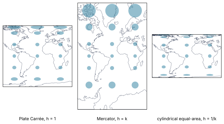
At 60° N the Plate Carrée circles are ellipses twice as wide as tall. Mercator's are round and four times the area of those on the equator, and the equal-area ones are slivers four times as wide as tall with the same area as on the equator. The printed heights are the same story told by the whole map: the same 180° of longitude and 160° of latitude come out 1.55 times as tall as wide in Mercator, 0.89 in Plate Carrée, and 0.63 in the equal-area map.
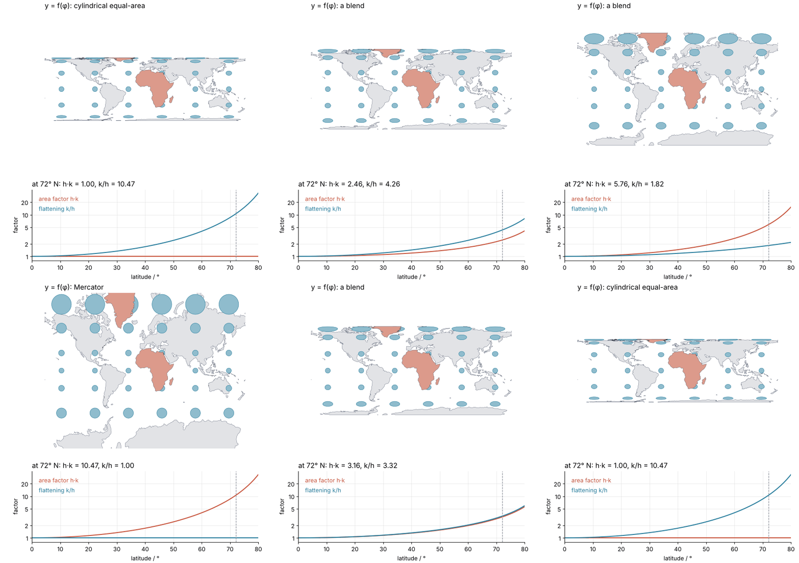
The three are members of one family, and nothing stops you from blending the spacing of the parallels smoothly from one to the next. Watch the circles round out as the parallels spread, and their area factor h·k climb while their flattening k/h falls:
Show code
"""Indicatrix morph: the cylindrical projections from equal-area through Plate Carrée to Mercator and back.

Renders ../../assets/indicatrix-morph.gif. Every cylindrical map has x = longitude and y = f(latitude);
the frames blend f linearly between sin φ (cylindrical equal-area), φ (Plate Carrée), and
ln tan(π/4 + φ/2) (Mercator). The in-between frames are valid projections that nobody uses.
Top: the land of Natural Earth 1:110m and circles of 500 km radius on the globe, drawn through the
current f. Bottom: the area factor h·k and the flattening k/h against latitude for the current f,
with k = sec φ and h = f′(φ). Run it from any directory:

    python scene.py
"""
from pathlib import Path

import numpy as np
import matplotlib.pyplot as plt
from matplotlib.animation import FuncAnimation, PillowWriter
from PIL import Image
import pyproj
import shapely
from shapely.geometry import Point, Polygon, box
from cartopy.io import shapereader

HERE = Path(__file__).resolve().parent
TUTORIAL = HERE.parents[1]
OUT = TUTORIAL / "assets" / "indicatrix-morph.gif"
INK, ACCENT, SECOND, MUTED = "#1f2a44", "#c8553d", "#2a7f9e", "#8a8f98"
LIGHT, FILL, CIRCLE = "#e2e3e6", "#dc9a8b", "#8fbccd"         # MUTED, ACCENT, SECOND on white, no alpha: fewer GIF colors
plt.rcParams.update({"axes.spines.top": False, "axes.spines.right": False,
                     "axes.grid": True, "grid.alpha": 0.25, "font.size": 11})

# ---- land, Greenland, Africa: the same file and the same cut as the tutorial
land_file = TUTORIAL / "assets" / "shapefiles" / "natural_earth" / "physical" / "ne_110m_land.shp"
parts = [p for g in shapereader.Reader(str(land_file)).geometries() for p in getattr(g, "geoms", [g])]

def part_at(lon, lat):
    return next(p for p in parts if p.contains(Point(lon, lat)))

greenland = part_at(-40, 72)
cut = Polygon([(-30, -40), (-30, 38), (32.4, 38), (32.4, 29.9), (43.4, 12.6), (60, 12.6), (60, -40)])
pieces = part_at(20, 0).intersection(cut)
africa = shapely.union_all([max(pieces.geoms, key=lambda p: p.area), part_at(47, -19)])

clip = box(-180, -80, 180, 80)                                       # Mercator needs a latitude limit
def rings(geom):
    geom = geom.intersection(clip)
    return [np.asarray(p.exterior.coords) for p in getattr(geom, "geoms", [geom]) if not p.is_empty]

others = [r for p in parts if not (p.equals(greenland) or p.contains(Point(20, 0)) or p.contains(Point(47, -19)))
          for r in rings(p)]
highlighted = rings(greenland) + rings(africa)
rest_of_afroeurasia = [r for r in rings(part_at(20, 0).difference(africa))]
others += rest_of_afroeurasia

# 500 km circles on the sphere, at the tutorial's centers
geod = pyproj.Geod(a=6371000, b=6371000)
circles = []
for lat0 in [-60, -30, 0, 30, 60, 75]:
    for lon0 in range(-150, 181, 60):
        az = np.linspace(0, 360, 73)
        lon, lat, _ = geod.fwd(np.full(az.size, lon0), np.full(az.size, lat0), az, np.full(az.size, 500e3))
        circles.append(np.column_stack([lon, lat]))

# ---- the family of cylindrical maps: s = 0 equal-area, 1 Plate Carrée, 2 Mercator
F = [np.sin, lambda p: p, lambda p: np.log(np.tan(np.pi / 4 + p / 2))]
DF = [np.cos, np.ones_like, lambda p: 1 / np.cos(p)]

def blend(funcs, s, phi):
    i = min(int(s), 1)
    w = s - i
    return (1 - w) * funcs[i](phi) + w * funcs[i + 1](phi)

s_path = np.concatenate([np.linspace(0, 2, 44), np.full(8, 2.0), np.linspace(2, 0, 30), np.full(8, 0.0)])
lat_line = np.radians(np.linspace(0, 80, 161))
Y_MAX = F[2](np.radians(80))

fig, (ax1, ax2) = plt.subplots(2, 1, figsize=(7, 7.4), dpi=80, height_ratios=[2.2, 1])
fig.subplots_adjust(left=0.12, right=0.97, top=0.96, bottom=0.075, hspace=0.2)


def to_map(xy, s):
    return np.radians(xy[:, 0]), blend(F, s, np.radians(xy[:, 1]))


def update(frame):
    s = s_path[frame]
    ax1.clear(); ax2.clear()
    for r in others:
        ax1.fill(*to_map(r, s), facecolor=LIGHT, edgecolor=INK, lw=0.3)
    for c in circles:
        ax1.fill(*to_map(c, s), facecolor=CIRCLE, edgecolor=SECOND, lw=0.6)
    for r in highlighted:                                            # above the circles: Greenland stays whole
        ax1.fill(*to_map(r, s), facecolor=FILL, edgecolor=INK, lw=0.3)
    ax1.set(xlim=(-np.pi, np.pi), ylim=(-Y_MAX, Y_MAX), aspect="equal", xticks=[], yticks=[])
    ax1.spines[["left", "bottom"]].set_visible(False)
    ax1.grid(False)
    name = {0.0: "cylindrical equal-area", 1.0: "Plate Carrée", 2.0: "Mercator"}.get(round(s, 3), "a blend")
    ax1.set_title(f"y = f(φ): {name}", loc="left")

    h = blend(DF, s, lat_line)
    k = 1 / np.cos(lat_line)
    ax2.plot(np.degrees(lat_line), h * k, color=ACCENT, lw=1.8)
    ax2.plot(np.degrees(lat_line), k / h, color=SECOND, lw=1.8)
    ax2.text(0.03, 0.92, "area factor h·k", color=ACCENT, transform=ax2.transAxes, va="top")
    ax2.text(0.03, 0.78, "flattening k/h", color=SECOND, transform=ax2.transAxes, va="top")
    ax2.axvline(72, color=MUTED, lw=1, ls="--")
    h72, k72 = blend(DF, s, np.radians(72)), 1 / np.cos(np.radians(72))
    ax2.set_title(f"at 72° N: h·k = {h72 * k72:.2f}, k/h = {k72 / h72:.2f}", loc="left")
    ax2.set_yscale("log")
    ax2.set(xlim=(0, 80), ylim=(0.8, 40), xlabel="latitude / °", ylabel="factor")
    ax2.set_yticks([1, 2, 5, 10, 20], labels=["1", "2", "5", "10", "20"])
    ax2.minorticks_off()


# ---- render, and read back what was written
OUT.parent.mkdir(exist_ok=True)
FuncAnimation(fig, update, frames=len(s_path)).save(OUT, writer=PillowWriter(fps=12))
plt.close(fig)
with Image.open(OUT) as im:
    print(f"{OUT.name}: {im.width} x {im.height} px, {im.n_frames} frames, {OUT.stat().st_size / 1024:,.0f} kB")
The frames between the three named maps are valid projections that nobody uses. At 72° N the two numbers simply trade places: the equal-area map has h·k = 1 and k/h = 10.47, Mercator has h·k = 10.47 and k/h = 1.
Why no flat map keeps both angles and areas
Mercator keeps angles and pays in area. The equal-area map keeps areas and pays in shape. That could be a failing of these two maps, or of every flat map, and a triangle settles which.
Take the triangle on the globe with one corner at the North Pole and two on the equator, at 0° E and 90° E. Its sides are a quarter of the equator and two quarter meridians, all three arcs of great circles, which are the shortest paths between their ends on the globe. Each corner is a right angle, so the three angles add up to 270°, and the triangle covers one eighth of the sphere, 63.8 million km² for a radius of 6371 km.
Now suppose a map kept every angle and every area. Keeping angles means a small circle stays a circle, h = k. Keeping areas means h·k = 1. Together they give h = k = 1, and the map keeps every length. A map that keeps every length keeps the length of every path, so the shortest path between two points stays the shortest path, and on a flat sheet the shortest path is a straight line. The triangle would therefore come out as a flat triangle with straight sides and its three right angles intact, 270° in all. A flat triangle has 180°. No such map exists.
Gauss's Theorema Egregium is the general statement: the curvature of a surface cannot be flattened out without stretching it. The everyday version is an orange peel, which tears when you press it flat. Every projection is a choice of what to give up.
Formalization
At any point of a map, name two stretches. The scale factor h is the length of a short piece of meridian on the map divided by its length on the globe, and k is the same along the parallel. Both depend on where you are.
In general a small circle becomes an ellipse, called Tissot's indicatrix after the cartographer Nicolas Auguste Tissot. Its semi-axes a ≥ b are the largest and the smallest stretch at that point. The product a·b is the area factor and the ratio a/b measures how much shapes are distorted. A projection is conformal when a = b everywhere, so that small circles stay circles and angles are kept, and equal-area when a·b = 1 everywhere. Where meridians and parallels meet at right angles on the map, as on every cylindrical map and every polar azimuthal map, a and b are h and k.
A cylindrical projection puts a point at x = Rλ and y = R f(φ), with R the radius of the globe and λ the longitude in radians. Its scale factors are
the forced stretch of the parallels and the free choice of their spacing.
Mercator's price is sec²φ. Conformal means h = k, so f′(φ) = sec φ, which integrates to
the spacing of the parallels on Gerardus Mercator's world map of 1569. The area factor is h·k = sec²φ: 4 at 60°, 10.47 at 72°, infinite at the pole, which is why every Mercator map stops short of it, Cartopy's at 84° N. What the price buys is angles: a rhumb line, a course of constant compass bearing, crosses the vertical meridians at one angle and is therefore straight.
The equal-area price is the same number, paid in shape. Equal-area means h·k = 1, so f′(φ) = cos φ and y = R sin φ, Lambert's cylindrical equal-area projection of 1772. Its circles keep their area, but k/h = sec²φ, so at 72° the circle is 10.47 times wider than tall. Mollweide's projection is equal-area too and spreads the shape error more evenly, with a/b = 2.37 at 40° W, 72° N. There h = 0.937 and k = 1.383 multiply to 1.296, not 1, because its curved meridians cross the parallels at θ′ = 50.5°, not 90°. A small rectangle of the globe becomes a parallelogram, whose area factor is h·k·sin θ′ = 1.296 × 0.772 = 1.00.
Keeping distances from one point. The azimuthal equidistant projection centered on the North Pole draws every meridian as a straight line from the center at its true length, h = 1, so distances and directions from the pole are true. Across, the circle at angular distance c from the center is 2πR sin c long on the globe and 2πR c on the map, so
which is 1.017 at 72° N (c = 18°), π/2 = 1.57 on the equator, and infinite at the South Pole.
The table's last column is the price at 72° N, with the equator added where the far end says more.
| Keeps | Condition | Projections | Price at 72° N |
|---|---|---|---|
| angles (conformal) | a = b | Mercator, stereographic | area factor 10.47 on Mercator |
| areas (equal-area) | a·b = 1 | cylindrical equal-area, Mollweide | a/b of 10.47 and 2.37 |
| distances from one point | h = 1 along lines from the center | azimuthal equidistant | k = 1.017, and 1.57 on the equator |
| nothing exactly (compromise) | none | Robinson | area factor 1.505, and 0.815 on the equator |
A conformal map centered on the region you care about pays little: the stereographic projection centered on the North Pole has an area factor of 1.05 at 72° N. Its scale is true at the pole and grows outward, so working grids shrink the map by one factor. On EPSG:3413 the scale is then 0.970 at the pole, exactly 1 on the standard parallel, and the excess at the edge shrinks by the same factor; areas take it twice. Where the scale is true is the map maker's choice, not a property of the projection.
See it in code
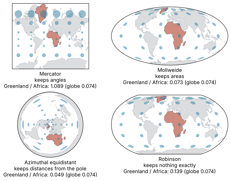
pyproj, the Python interface to the PROJ library, computes h, k, and the rest at any point with Proj.get_factors. The cell asks six projections on a sphere of radius 6371 km about 40° W, 72° N, in the middle of Greenland. Then it draws the four maps of the table and measures Greenland against Africa on each.
Show code
# ---- scale factors at 40° W, 72° N, in the middle of Greenland, on a sphere of radius 6371 km
proj_strings = {
    "Mercator": "merc", "stereographic (pole)": "stere +lat_0=90", "cylindrical equal-area": "cea",
    "Mollweide": "moll", "azimuthal equidistant (pole)": "aeqd +lat_0=90", "Robinson": "robin",
}
print(f"{'projection':29s} {'h':>6s} {'k':>6s} {'area':>7s} {'a/b':>6s} {'θ′':>7s}")
for name, s in proj_strings.items():
    f = pyproj.Proj(f"+proj={s} +R=6371000").get_factors(-40, 72)
    print(f"{name:29s} {f.meridional_scale:6.3f} {f.parallel_scale:6.3f} {f.areal_scale:7.3f} "
          f"{f.tissot_semimajor / f.tissot_semiminor:6.2f} {f.meridian_parallel_angle:6.1f}°")

# ---- the same land and the same circles on four maps
four = {
    "Mercator": (ccrs.Mercator(), "angles"),
    "Mollweide": (ccrs.Mollweide(), "areas"),
    "Azimuthal equidistant": (ccrs.AzimuthalEquidistant(central_latitude=90), "distances from the pole"),
    "Robinson": (ccrs.Robinson(), "nothing exactly"),
}
print()
fig = plt.figure(figsize=(8, 7.6), layout="compressed")
for i, (name, (proj, keeps)) in enumerate(four.items()):
    ax = fig.add_subplot(2, 2, i + 1, projection=proj)
    ax.set_global()
    ax.add_geometries(parts, crs=LONLAT, **LAND)
    ax.add_geometries([greenland, africa], crs=LONLAT, **HIGHLIGHT)
    ax.tissot(rad_km=500, **centers, facecolor=SECOND, alpha=0.5)
    r = map_ratio(proj)
    ax.text(0.5, -0.03, f"{name}\nkeeps {keeps}\nGreenland / Africa: {r:.3f} (globe {globe_ratio:.3f})",
            transform=ax.transAxes, ha="center", va="top")
    print(f"{name:22s} Greenland / Africa on the map = {r:.3f}   globe = {globe_ratio:.3f}   factor {r / globe_ratio:5.2f}")
plt.show()

merc = ccrs.Mercator()
for name, geom, area in [("Greenland", greenland, A_greenland), ("Africa", africa, A_africa)]:
    print(f"Mercator enlarges {name:9s} {merc.project_geometry(geom, LONLAT).area / 1e6 / area:5.2f} times on average")
projection                         h      k    area    a/b      θ′
Mercator                       3.236  3.236  10.472   1.00   90.0°
stereographic (pole)           1.025  1.025   1.051   1.00   90.0°
cylindrical equal-area         0.309  3.236   1.000  10.47   90.0°
Mollweide                      0.937  1.383   1.000   2.37   50.5°
azimuthal equidistant (pole)   1.000  1.017   1.017   1.02   90.0°
Robinson                       0.838  1.926   1.505   2.54   68.9°

Mercator               Greenland / Africa on the map = 1.089   globe = 0.074   factor 14.75
Mollweide              Greenland / Africa on the map = 0.073   globe = 0.074   factor  0.99
Azimuthal equidistant  Greenland / Africa on the map = 0.049   globe = 0.074   factor  0.66
Robinson               Greenland / Africa on the map = 0.139   globe = 0.074   factor  1.88
Mercator enlarges Greenland 16.44 times on average
Mercator enlarges Africa     1.11 times on average
The table reads the formulas back: Mercator's h = k = 3.236 = sec 72° and area 10.47 = sec²72°, the equal-area map's h = 0.309 = cos 72°, the azimuthal k = 1.017. Mollweide's row shows h·k = 1.296 next to an area factor of 1.000, with θ′ = 50.5°, the parallelogram of the Formalization.
The maps against the globe's 0.074: Mollweide gives 0.073, right to 1 %, which is the difference between the sphere it is drawn from and the ellipsoid the true areas were measured on. Robinson gives 0.139, 1.9 times too much. The azimuthal equidistant map shrinks Greenland to 0.049 of Africa, because Africa, far from the pole, is stretched sideways by up to k = 2.7 at 35° S. Mercator gives 1.089, not 10.47 × 0.074 = 0.78, because 72° N is only Greenland's middle. Greenland reaches 83.6° N, where sec²φ is about 80, and the map enlarges it 16.4 times on average. Africa's own enlargement, 1.11 times, takes back only a little. To draw your own data on such maps, see Maps with Cartopy: a sea-surface temperature anomaly and its stations.
Where it shows up
- Navigation and web maps. Nautical charts are drawn in Mercator because a course of constant compass bearing is a straight line on them. Online map tiles use Web Mercator, registered as EPSG:3857, which is why the field-trip map on your phone has the same Greenland.
- Geology and field mapping. UTM divides the Earth into 60 zones 6° wide and draws each in a transverse Mercator, a conformal cylinder turned on its side, with the scale reduced to 0.9996 on the central meridian. The scale is then true on two lines about 180 km to either side and 1.0010 at the zone's edge on the equator, so outcrop maps and GPS coordinates in meters are true in length to 0.1 % inside a zone.
- Seismology. An azimuthal equidistant map centered on a station shows every earthquake at its true epicentral distance and in its true direction from the station. Near the rim, the far side of the Earth, k grows without limit and events are smeared sideways.
- Ecology and biology. Species ranges and protected-area coverage are compared on equal-area projections, Mollweide or Behrmann for the world, Lambert azimuthal equal-area or Albers centered on a region. On Mercator a boreal range at 60° N looks four times as large as a tropical one of the same area.
- Climate and ocean grids. A 1° × 1° grid cell covers cos φ times the area of one on the equator, half of it at 60°, so a global mean of a gridded field weights every cell by cos φ. Equal-area grids such as EASE-Grid 2.0 make every cell the same size and the weighting unnecessary.
- Ice sheets and sea ice. Polar data come on polar stereographic grids, EPSG:3413 for NSIDC's Arctic sea ice and EPSG:3031 for Antarctica, conformal, with the standard parallel at 70° N and 71° S. An ice area summed over their cells needs each cell's area factor, 0.94 at the North Pole on the Arctic grid.
- Physics. Sky maps of the cosmic microwave background are drawn in Mollweide, so that a patch of sky takes the same share of the map wherever it lies. HEALPix, the pixelization those maps are computed on, divides the sphere into cells of equal area for the same reason.
In every case the first decision is the same: whether the map must compare areas or keep angles, with distances from one place as the special third case, and then a projection that keeps that one. For any other projection, its PROJ documentation page says whether it is conformal or equal-area, and get_factors at a point of your own study area gives its area factor and a/b.
Further reading
- Snyder, Map Projections: A Working Manual, USGS Professional Paper 1395 (1987), for h, k, and the formulas of every projection used here.
- The PROJ documentation's list of projections, one page per projection with its properties, and pyproj's
Proj.get_factors. - Cartopy's list of projections and
GeoAxes.tissot. - Natural Earth, the public-domain source of the 1:110m land shipped with this tutorial (94 kB).
- Related tutorials on this site: Maps with Cartopy: a sea-surface temperature anomaly and its stations, for drawing data on a projection; Matplotlib animation with FuncAnimation: a probe sweep as a small GIF, how the animation above was built; Colormaps: why a rainbow scale draws features that are not in the data, the other half of what a map does to its data; planned: the same tutorial in Julia.
- Download the notebook. It was executed with the library versions in the header.