Maps with Cartopy: a sea-surface temperature anomaly and its stations
Afterwards you can draw a gridded field and station points on a map projection with Cartopy, add coastlines from shipped files, and pick a projection that fits.
- Field
- Geology, Physics
- Libraries
cartopy 0.26.0matplotlib 3.11.2numpy 2.5.3scipy 1.18.1shapely 2.2.0
py-cartopy.ipynb, executed with the versions above. The download needs a free account
Run it yourself. In a terminal, this installs exactly the versions above:
pip install numpy==2.5.3 scipy==1.18.1 cartopy==0.26.0 shapely==2.2.0 matplotlib==3.11.2 jupyterlabThe problem: a warm Pacific on a map that tells the truth
A sea-surface temperature (SST) anomaly is how much warmer or cooler the ocean is than its long-term mean for the month. Here is one on a 1° grid, 180 latitudes by 360 longitudes, with a warm tongue of up to 3.1 K along the equator in the eastern Pacific, the pattern of an El Niño, and forty buoys that measured the anomaly for themselves. Draw the grid with imshow and the latitudes beyond 60° take 33.3 % of the picture, while they cover 13.4 % of the Earth's surface. There are no coastlines either, so you guess where the ocean ends. Cartopy, the map library built on Matplotlib, fixes both.
It does so with two keywords. The axes get a projection, which decides how the curved surface is laid flat, and every plotting call gets a transform, which says what coordinates its numbers are in. Coastlines and land come from Natural Earth files that ship with the tutorial, so nothing is downloaded while the map draws.
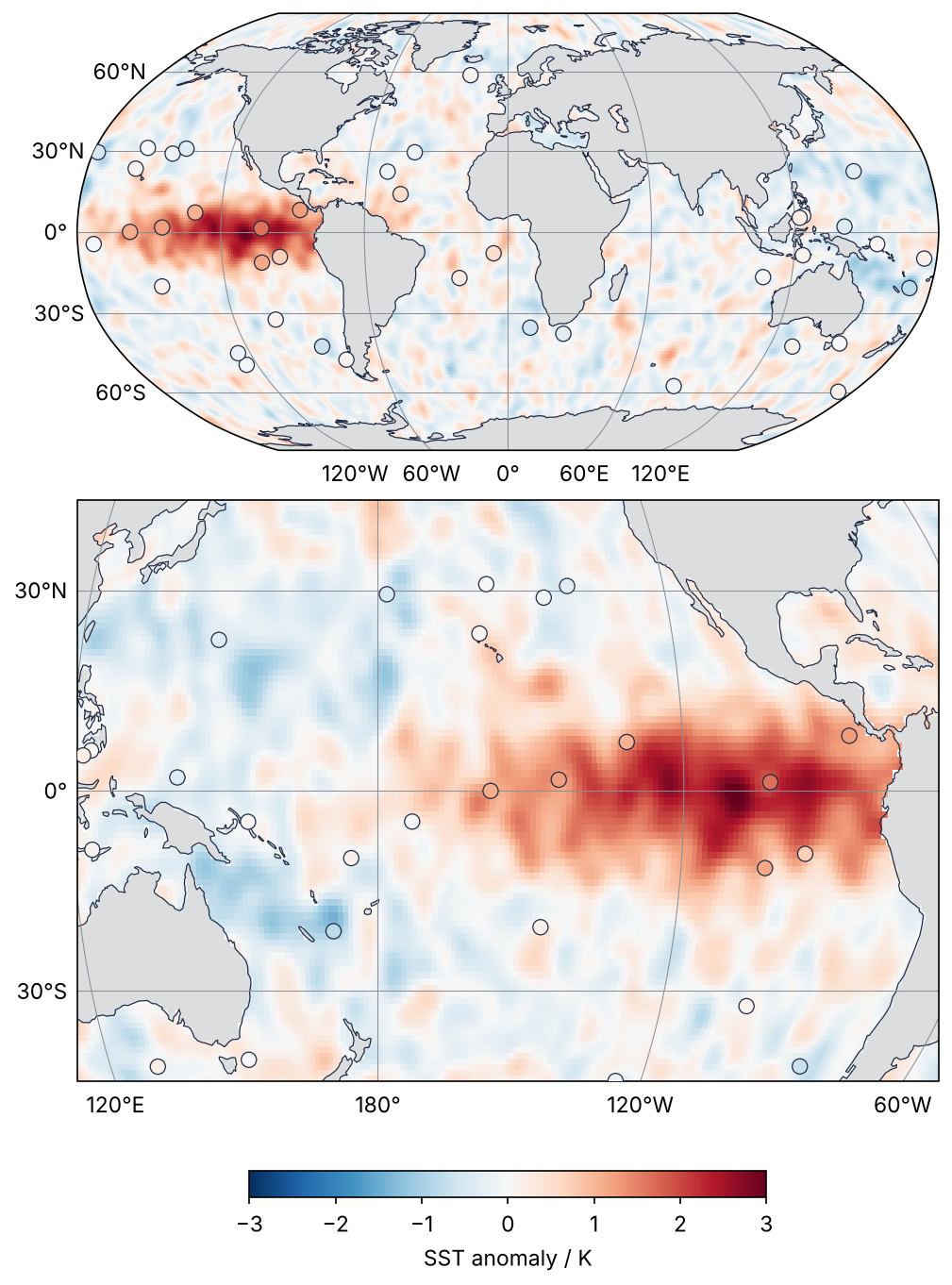
This is where we end up. On top is the whole globe in the Robinson projection with the field, the stations, the coastlines, and a labeled grid of meridians and parallels. Below it is the Pacific in the Equal Earth projection, centered on 180° and cut out across the dateline, where the 19.1 million km² of water warmer than +1 K take their true share of the map. Step 6 draws it.
Setup
The data stand in for a monthly SST analysis and its buoys: a warm tongue centered at 110°W, a weaker cool horseshoe in the western Pacific, smoothed noise, land masked out, and forty stations at random ocean points. The coastline and land files ship in assets/, and the pre_existing_data_dir line tells Cartopy to look there first. The warnings line turns any attempt to download into an error, so the notebook never touches the network.
import warnings
from pathlib import Path

import numpy as np
import matplotlib.pyplot as plt
import cartopy
import cartopy.crs as ccrs
import cartopy.feature as cfeature
from cartopy.io import shapereader
from cartopy.util import add_cyclic_point
import shapely
from scipy.ndimage import gaussian_filter

cartopy.config["pre_existing_data_dir"] = Path("assets")       # holds shapefiles/natural_earth/physical/
warnings.simplefilter("error", cartopy.io.DownloadWarning)      # a download attempt stops the run

plt.rcParams.update({
    "figure.figsize": (8, 4.4), "figure.dpi": 110,
    "axes.spines.top": False, "axes.spines.right": False,
    "axes.grid": True, "grid.alpha": 0.25,
    "font.size": 11, "lines.linewidth": 1.8,
})
INK, ACCENT, SECOND, MUTED = "#1f2a44", "#c8553d", "#2a7f9e", "#8a8f98"
CMAP, VLIM = "RdBu_r", 3.0                                       # K, symmetric about zero

# ---- data: mark land cells, build the field, place the stations (not part of the lesson)
rng = np.random.default_rng(62)
land_file = shapereader.natural_earth(resolution="110m", category="physical", name="land")
land = shapely.union_all(list(shapereader.Reader(land_file).geometries()))
shapely.prepare(land)

lon = np.arange(-179.5, 180, 1.0)                                # cell centers, degrees
lat = np.arange(-89.5, 90, 1.0)
LON, LAT = np.meshgrid(lon, lat)

def bump(lon0, lat0, width_lon, width_lat):
    dlon = (LON - lon0 + 180) % 360 - 180                        # longitude distance across the dateline
    return np.exp(-0.5 * ((dlon / width_lon) ** 2 + ((LAT - lat0) / width_lat) ** 2))

noise = gaussian_filter(rng.standard_normal(LON.shape), 2, mode=("nearest", "wrap"))
sst = (2.5 * bump(-110, 0, 35, 8)
       - 0.6 * (bump(160, 20, 25, 8) + bump(160, -20, 25, 8))
       + 0.3 * noise / noise.std())
is_land = shapely.contains_xy(land, LON, LAT)
sst[is_land] = np.nan

st_lon, st_lat = [], []
while len(st_lon) < 40:
    lo = rng.uniform(-180, 180)
    la = np.degrees(np.arcsin(rng.uniform(-np.sin(np.radians(60)), np.sin(np.radians(60)))))
    if shapely.contains_xy(land, lo, la) or np.isnan(sst[int(la + 90), int(lo + 180)]):
        continue
    st_lon.append(lo)
    st_lat.append(la)
st_lon, st_lat = np.array(st_lon), np.array(st_lat)
st_grid = sst[(st_lat + 90).astype(int), (st_lon + 180).astype(int)]  # field at the nearest cell
st_val = st_grid + rng.normal(0, 0.2, st_lon.size)

k = np.nanargmax(sst)
print(f"grid {sst.shape[0]} × {sst.shape[1]}, land {is_land.mean():.1%} of cells")
print(f"maximum {sst.flat[k]:.1f} K at longitude {LON.flat[k]:.1f}°, latitude {LAT.flat[k]:.1f}°")
print(f"{st_lon.size} stations")
grid 180 × 360, land 33.2% of cells
maximum 3.1 K at longitude -109.5°, latitude -0.5°
40 stations
Step 1: Draw the field with imshow and see what is wrong
Most people first treat the grid as a picture, on the plain Axes of Matplotlib from the ground up. extent puts the outer edges of the image at those longitudes and latitudes, and origin="lower" puts row 0, the southernmost latitude, at the bottom. fig.colorbar draws the key from color to value for the image it is given. The colormap is the diverging RdBu_r with limits symmetric about zero, so that white means no anomaly (the colormaps tutorial says why).
fig, ax = plt.subplots()
im = ax.imshow(sst, extent=(-180, 180, -90, 90), origin="lower", cmap=CMAP, vmin=-VLIM, vmax=VLIM)
ax.set(xlabel="longitude / °", ylabel="latitude / °")
fig.colorbar(im, ax=ax, label="SST anomaly / K")
plt.show()

image_share = 2 * 30 / 180
surface_share = 1 - np.sin(np.radians(60))
print(f"beyond ±60°: {image_share:.1%} of the picture, {surface_share:.1%} of the surface")
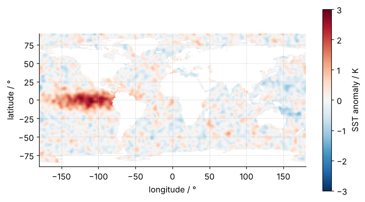
beyond ±60°: 33.3% of the picture, 13.4% of the surface
The area of a sphere between the equator and latitude φ grows as sin φ, so the two caps beyond ±60° hold \(1 - \sin 60°\) of the surface. The picture gives them a third of its height, two and a half times their share. The warm tongue is plain to see, but the continents are holes in the same white as zero anomaly.
Step 2: Give the axes a projection and the data a transform
A map projection is a function that turns longitude and latitude into x and y on a flat page. For Robinson, x and y are in meters, and x runs from -17,005,833 m to +17,005,833 m. ccrs.PlateCarree() is the projection that leaves the numbers as they are: x is the longitude and y the latitude, in degrees. That is why, handed over as transform, it means "these numbers are plain longitude and latitude", not "draw a Plate Carrée map".
fig.add_subplot(projection=...) returns a GeoAxes, an Axes with a map behind it. On it, pcolormesh draws every value as a filled cell, here a 1° square around each grid point, and a projection can bend cells where it cannot bend an image:
fig = plt.figure(layout="compressed")                  # no empty band around the map
ax = fig.add_subplot(projection=ccrs.Robinson())
mesh = ax.pcolormesh(lon, lat, sst, transform=ccrs.PlateCarree(), cmap=CMAP, vmin=-VLIM, vmax=VLIM)
ax.coastlines("110m", color=INK, lw=0.6)
ax.set_global()
plt.show()
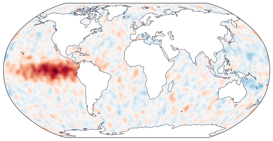
The rule fits in one line: projection is how the map is drawn, and transform is the coordinate system the numbers are in, which for longitude and latitude is PlateCarree(), or Geodetic() when a line between two points should follow a great circle. Leave the transform out and see what happens. get_datalim returns the box the mesh covers, in whatever coordinates its argument converts from. ax.transData, Matplotlib's conversion from the map's x and y to pixels on the screen, makes that the map's x and y in meters. It has nothing to do with the transform keyword.
fig_bad = plt.figure()
ax_bad = fig_bad.add_subplot(projection=ccrs.Robinson())
mesh_bad = ax_bad.pcolormesh(lon, lat, sst, cmap=CMAP, vmin=-VLIM, vmax=VLIM)    # no transform
ax_bad.set_global()
lim = mesh_bad.get_datalim(ax_bad.transData)
x_min, x_max = ax_bad.projection.x_limits
plt.close(fig_bad)

print(f"mesh without transform: x from {lim.x0:12,.0f} m to {lim.x1:12,.0f} m")
print(f"Robinson map:           x from {x_min:12,.0f} m to {x_max:12,.0f} m")
mesh without transform: x from         -180 m to          180 m
Robinson map:           x from  -17,005,833 m to   17,005,833 m
Cartopy took the degrees for Robinson meters. The field became a speck 360 m wide at the center of a map 34,000 km wide, without an error or a warning.
Step 3: Put the stations on in the same colors
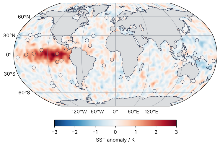
The stations go on with scatter, with the same transform and the same cmap, vmin, and vmax as the field. Then a dot that matches the water around it agrees with the grid, and a dot that stands out disagrees. Land gets a light gray fill, so that it is no longer mistaken for the white of zero anomaly, and the colorbar goes underneath. All three go onto the map from Step 2. plt.show() made pyplot forget that figure, but the variable fig still holds it, and a bare fig as the last line of a cell displays it again:
ax.scatter(st_lon, st_lat, c=st_val, cmap=CMAP, vmin=-VLIM, vmax=VLIM, s=60,
           edgecolors=INK, linewidths=0.6, transform=ccrs.PlateCarree(), zorder=3)
ax.add_feature(cfeature.LAND.with_scale("110m"), facecolor=MUTED, alpha=0.3)
fig.colorbar(mesh, ax=ax, orientation="horizontal", shrink=0.6, label="SST anomaly / K")

diff = st_val - st_grid
print(f"station - grid: mean {diff.mean():+.3f} K, RMS {np.sqrt(np.mean(diff**2)):.3f} K")
fig
station - grid: mean -0.023 K, RMS 0.196 K
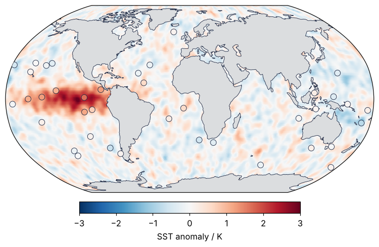
The stations differ from the grid at their nearest cell by 0.196 K RMS, the 0.2 K of noise they were built with, and on the map most dots take the color of the water around them. A buoy that had drifted onto the wrong coordinates would be the one dot you notice.
Step 4: Add coastlines from shipped files and a labeled graticule
ax.coastlines("110m") names its resolution for a reason. The default, "auto", picks a finer Natural Earth file when the map shows a small region and fetches it while the figure draws: a 20° extent asks for ne_50m_coastline.zip. Naming the scale on every call, here and in cfeature.LAND.with_scale("110m"), keeps Cartopy on the files you have. The function that fetches files is also the one that finds them:
print(shapereader.natural_earth(resolution="110m", category="physical", name="coastline"))
assets/shapefiles/natural_earth/physical/ne_110m_coastline.shp
Natural Earth is a public-domain collection of map data. Each of the two files is a shapefile, a .shp with four companion files, about 90 kB at 110 m. On a machine with network and no pre_existing_data_dir, the same call downloads them into cartopy.config["data_dir"], by default ~/.local/share/cartopy, under shapefiles/natural_earth/physical/. Do it once:
shapereader.natural_earth(resolution="110m", category="physical", name="coastline")
shapereader.natural_earth(resolution="110m", category="physical", name="land")
# copy the shapefiles folder into your project; pre_existing_data_dir is the folder that holds it
Last, the graticule, the grid of meridians and parallels. gridlines draws and labels it. By default it labels all four sides, which on Robinson prints every label twice and puts 180° at both ends of the flat top and bottom, so the labels go on the bottom and left only:
gl = ax.gridlines(draw_labels=True, xlocs=range(-120, 121, 60), ylocs=range(-60, 61, 30),
                  color=MUTED, linewidth=0.5)
gl.top_labels = False
gl.right_labels = False
fig
Step 5: Pick a projection that fits
Robinson looks right, but does it keep areas? Take a 1° by 1° cell centered on the equator and one centered on 60°N. On the sphere the second has half the area of the first. proj.transform_points(ccrs.PlateCarree(), lons, lats) is the conversion that transform= does while drawing, applied to plain arrays; it returns columns x, y, and z, and the area needs the first two. shapely.Polygon(xy).area is the area the cell covers on the printed map, which is what the eye compares. The units are square degrees for Plate Carrée and square meters for the others; they cancel in the ratio.
corner_lon = np.array([-0.5, 0.5, 0.5, -0.5])
corner_lat = np.array([-0.5, -0.5, 0.5, 0.5])
true_ratio = np.diff(np.sin(np.radians([59.5, 60.5])))[0] / np.diff(np.sin(np.radians([-0.5, 0.5])))[0]

print(f"{'projection':12s} area at 60°N / area at equator")
for name, proj in [("PlateCarree", ccrs.PlateCarree()), ("Robinson", ccrs.Robinson()),
                   ("EqualEarth", ccrs.EqualEarth())]:
    area = []
    for lat0 in (0, 60):
        xy = proj.transform_points(ccrs.PlateCarree(), corner_lon, lat0 + corner_lat)[:, :2]
        area.append(shapely.Polygon(xy).area)
    print(f"{name:12s} {area[1] / area[0]:.3f}")
print(f"{'sphere':12s} {true_ratio:.3f}")
projection   area at 60°N / area at equator
PlateCarree  1.000
Robinson     0.731
EqualEarth   0.505
sphere       0.500
Plate Carrée draws the cell at 60°N as large as the one on the equator, twice its true size, which is the stretched third of Step 1. Robinson gives 0.731, still 46 % too large. Equal Earth gives 0.505, because Cartopy makes it equal-area on the slightly flattened WGS84 Earth rather than on a sphere. Robinson is a compromise, good for a world overview. When the map is for comparing areas, the warm tongue against the cool horseshoe, use an equal-area projection such as Equal Earth. Conformal projections such as Mercator and Lambert conformal keep shapes instead, for navigation and regional maps.
Step 6: Center the Pacific and cut it out across the dateline
Every map centered on 0° splits the Pacific at its edge. Center the projection on 180° with central_longitude=180 and cut the region out with set_extent. A longitude past 180 continues east, so the eastern bound 290 is 70°W and the box runs from 120°E across the dateline. The extent is in longitude and latitude, so it takes crs=ccrs.PlateCarree(), the rule of transform again. A helper collects Steps 2 to 4 for both panels. The last line reads back what the panel shows in PlateCarree(central_longitude=180), longitude and latitude with longitude counted from the dateline, not from Greenwich. The box is 60° west to 110° east of 180°, so 180° sits a third of the way across:
def draw_map(ax, xlocs):
    mesh = ax.pcolormesh(lon, lat, sst, transform=ccrs.PlateCarree(), cmap=CMAP, vmin=-VLIM, vmax=VLIM)
    ax.add_feature(cfeature.LAND.with_scale("110m"), facecolor=MUTED, alpha=0.3)
    ax.coastlines("110m", color=INK, lw=0.6)
    ax.scatter(st_lon, st_lat, c=st_val, cmap=CMAP, vmin=-VLIM, vmax=VLIM, s=60,
               edgecolors=INK, linewidths=0.6, transform=ccrs.PlateCarree(), zorder=3)
    gl = ax.gridlines(draw_labels=True, xlocs=xlocs, ylocs=range(-60, 61, 30),
                      color=MUTED, linewidth=0.5)
    gl.top_labels = False
    gl.right_labels = False
    return mesh

fig = plt.figure(figsize=(7.5, 9), layout="compressed")
gs = fig.add_gridspec(2, 1, height_ratios=[3, 4])      # both panels at the full width
ax_globe = fig.add_subplot(gs[0], projection=ccrs.Robinson())
ax_pacific = fig.add_subplot(gs[1], projection=ccrs.EqualEarth(central_longitude=180))
mesh = draw_map(ax_globe, xlocs=range(-120, 121, 60))
draw_map(ax_pacific, xlocs=range(-180, 181, 60))      # meridians every 60° from the dateline
ax_globe.set_global()
ax_pacific.set_extent([120, 290, -45, 45], crs=ccrs.PlateCarree())
fig.colorbar(mesh, ax=[ax_globe, ax_pacific], orientation="horizontal", shrink=0.6,
             label="SST anomaly / K")
plt.show()

west, east, south, north = ax_pacific.get_extent(ccrs.PlateCarree(central_longitude=180))
print(f"Pacific panel: {west:.1f}° to {east:.1f}° from 180°, {south:.0f}° to {north:.0f}° latitude")
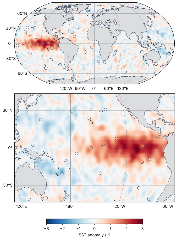
Pacific panel: -68.8° to 128.2° from 180°, -45° to 45° latitude
The panel shows a little more, 68.8° west and 128.2° east. The map is the smallest rectangle in Equal Earth's x and y that holds the box, and at its corners, where the meridians lean in toward the poles, that rectangle reaches past both bounds.
The data have their own seam at 180°, between the columns at 179.5° and -179.5°, and pcolormesh draws across it without a gap. Its cell edges lie halfway between the centers, so the 360 cells span -180° to 180° without a break.
For the warm area, each cell covers \(R^2\,\Delta\lambda\,\Delta\varphi\cos\varphi\) of the sphere, with \(R\) = 6371 km, \(\varphi\) the latitude, and \(\Delta\lambda = \Delta\varphi = 1°\) in radians:
R = 6371.0                                                       # km
cell_area = R**2 * np.deg2rad(1.0) ** 2 * np.cos(np.deg2rad(LAT))
ocean = ~np.isnan(sst)
warm = ocean & (np.nan_to_num(sst) > 1.0)
print(f"ocean warmer than +1 K: {cell_area[warm].sum() / 1e6:5.1f} million km²")
print(f"all ocean on the grid:  {cell_area[ocean].sum() / 1e6:5.1f} million km²")
ocean warmer than +1 K:  19.1 million km²
all ocean on the grid:  362.7 million km²
That is 19.1 million km², 5.3 % of the ocean, and the Equal Earth panel draws it at its true size to the 1 % that Step 5 measured. contourf, which fills the regions between contour levels, would leave a white stripe at 180° in this view; the first pitfall says why.
Pitfalls
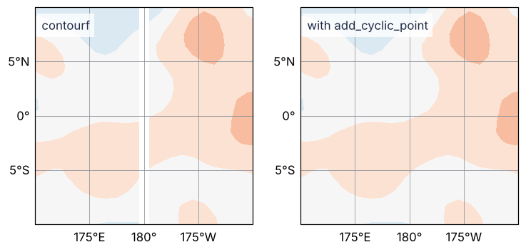
A white line along 180°. Draw the same arrays with contourf and a stripe 1° wide opens at the dateline. contourf interpolates between grid values, so its coverage ends at the outermost centers, -179.5° and 179.5°, and the strip between them belongs to no pair of neighbors in the array. add_cyclic_point appends a copy of the first column at 180.5°, which is -179.5° plus 360°, and closes the strip:
sst_c, lon_c = add_cyclic_point(sst, coord=lon)
levels = np.arange(-3.25, 3.3, 0.5)
fig, axes = plt.subplots(1, 2, figsize=(8, 3.6),
                         subplot_kw=dict(projection=ccrs.PlateCarree(central_longitude=180)))
for ax, x, z, name in [(axes[0], lon, sst, "contourf"), (axes[1], lon_c, sst_c, "with add_cyclic_point")]:
    ax.contourf(x, lat, z, levels=levels, cmap=CMAP, transform=ccrs.PlateCarree())
    ax.set_extent([170, 190, -10, 10], crs=ccrs.PlateCarree())
    gl = ax.gridlines(draw_labels=True, xlocs=[175, 180, -175], ylocs=[-5, 0, 5], color=MUTED, linewidth=0.5)
    gl.top_labels = False
    gl.right_labels = False
    ax.text(0.03, 0.95, name, transform=ax.transAxes, color=INK, va="top",
            bbox=dict(facecolor="white", edgecolor="none", alpha=0.8))
print(f"appended column at {lon_c[-1]:.1f}°")
plt.show()
appended column at 180.5°
It works on your machine and fails on the cluster. A map that drew fine fails on a colleague's laptop or on a compute node without network, and the error comes out of savefig or show, not out of the line that caused it. On your machine the first run quietly downloaded a missing Natural Earth file into ~/.local/share/cartopy, and every later run found it there. The fix is Step 4, the scale named on every call and the files shipped with the code. The DownloadWarning filter from Setup makes the slip fail on your own machine first.
Zero is not white in contourf. With levels=np.arange(-3, 3.1, 0.5), zero is the boundary between two levels, so water near zero is drawn light pink or light blue and the whole map looks slightly warm or slightly cool. Put a band around zero, as the levels np.arange(-3.25, 3.3, 0.5) above do, or stay with pcolormesh and vmin=-vmax.
Variations
- A polar view of sea ice or Antarctic stations:
ccrs.SouthPolarStereo()withax.set_extent([-180, 180, -90, -50], ccrs.PlateCarree()). - A regional map of a field area or a seismic network:
ccrs.LambertConformal(central_longitude=..., standard_parallels=(...)), withcentral_longitudeat the middle of the region and the two standard parallels about one sixth of the latitude range inside its southern and northern edges, the usual rule of thumb for conic projections. - Contours over the colors:
ax.contour(lon_c, lat, sst_c, levels=[1], colors=INK, transform=ccrs.PlateCarree())marks the edge of the region above +1 K. - Real data: an xarray
DataArrayof SST plots withda.plot.pcolormesh(ax=ax, transform=ccrs.PlateCarree()), and thetransformrule is the same.
Cheat sheet
cartopy.config["pre_existing_data_dir"] = Path("assets")    # look for shapefiles/natural_earth/... here
ax = fig.add_subplot(projection=ccrs.Robinson())             # how the map is drawn
ax.pcolormesh(lon, lat, z, transform=ccrs.PlateCarree())     # the numbers are longitude and latitude
ax.scatter(lons, lats, c=v, transform=ccrs.PlateCarree())    # same transform for every layer
ax.coastlines("110m")                                        # name the scale, or "auto" may download
gl = ax.gridlines(draw_labels=True); gl.top_labels = False   # labeled meridians and parallels
ax = fig.add_subplot(projection=ccrs.EqualEarth(central_longitude=180))   # Pacific in the middle
ax.set_extent([120, 290, -45, 45], crs=ccrs.PlateCarree())   # east bound > 180 crosses the dateline
z_c, lon_c = add_cyclic_point(z, coord=lon)                  # before contourf, or a gap at the seam
Further reading
- Cartopy documentation: the list of projections, Understanding the transform and projection keywords, the
GeoAxes.gridlinesreference,cartopy.util.add_cyclic_point, andcartopy.io.shapereader.natural_earth. - Natural Earth, the public-domain coastlines, land, and borders at 1:10, 1:50, and 1:110 million.
- Šavrič, Patterson, Jenny, "The Equal Earth map projection", International Journal of Geographical Information Science 33 (2019), for why the projection was designed and how it compares with Robinson.
- Snyder, Map Projections: A Working Manual, USGS Professional Paper 1395 (1987), for the formulas behind every projection above and the choice of standard parallels.
- Related tutorials on this site: Matplotlib from the ground up: a two-panel figure for one journal column, for the Figure and Axes underneath every map; Colormaps: why a rainbow scale draws features that are not in the data, for the diverging colormap; Counting cells with scipy.ndimage: how many are there, and how large?, for
gaussian_filterand other operations on gridded data; PyVista for 3D fields: slices and isosurfaces through a block of rock, for fields that do not lie on a surface. - Download the notebook. It was executed with the library versions in the header.