Matplotlib animation with FuncAnimation: a probe sweep as a small GIF
Afterwards you can turn a parameter sweep into a readable animation with matplotlib.animation, update artists instead of redrawing them, and keep the GIF small.
- Topic
- Visualization
- Field
- Cross-disciplinary
- Prerequisites
- Matplotlib from the ground up: a two-panel figure for one journal column, The Fourier transform: asking a signal how much of each frequency it contains
- Libraries
PIL 12.3.0matplotlib 3.11.2numpy 2.5.3
py-matplotlib-animation.ipynb, executed with the versions above. The download needs a free account
Run it yourself. In a terminal, this installs exactly the versions above:
pip install pillow==12.3.0 numpy==2.5.3 matplotlib==3.11.2 jupyterlabBefore and after: the probe sweep from the Fourier tutorial
The Fourier tutorial explains the transform with an animation: a cosine probe sweeps from 0.03 to 0.10 cycles per hour over thirty days of hourly sea level, and three stacked panels follow it. The top panel shows the signal and the probe, the middle one their product with its average printed, the bottom one that average traced out against probe frequency. Here it is built with Matplotlib's FuncAnimation, starting from what a first attempt draws.
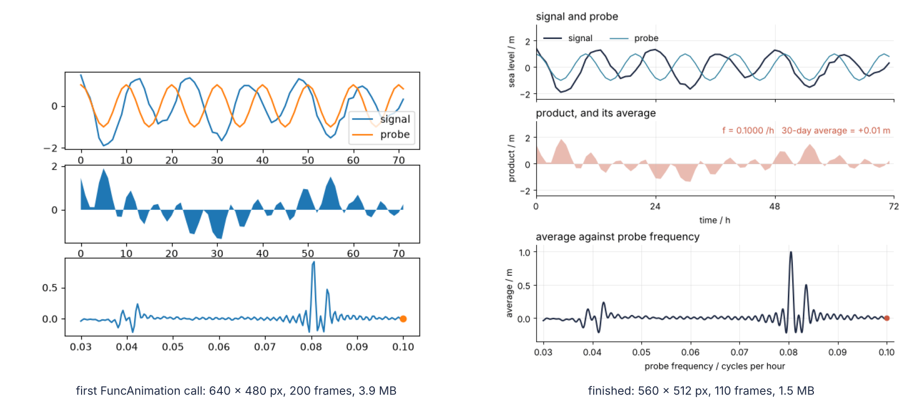
On the left is the last frame of that first attempt: 640 x 480 px, 200 frames, 3.9 MB, with axes that rescale on every frame. On the right is the last frame of the finished GIF: 560 x 512 px, 110 frames, 1.5 MB, every axis fixed, every panel named, and the M2 peak at its true 1.0 m. A hidden cell at the end of the notebook, there in the download, assembles this comparison from the two GIF files. The finished one is rendered by the script under Full source and plays like this:
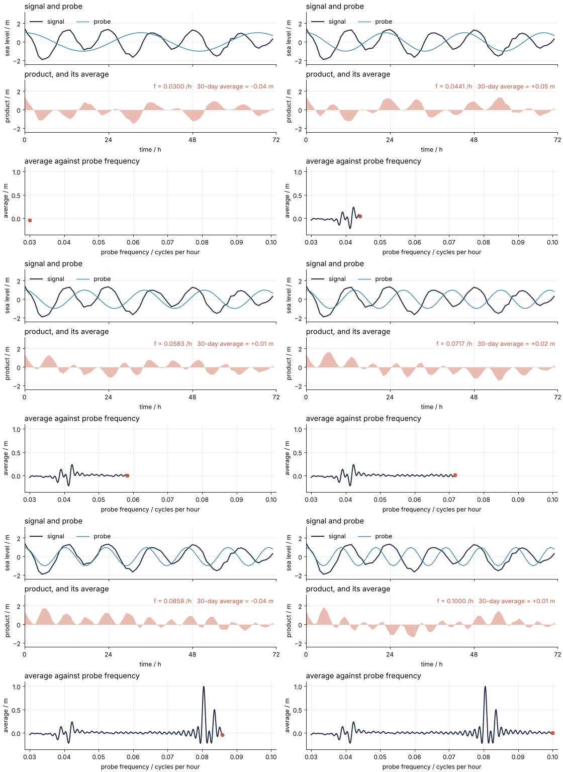
Your own sweep over a dose, a temperature, or a rate constant has the same three parts: the thing, the operation on it, and the quantity traced out.
The setup holds the tide record of the Fourier tutorial and its probe average. INK, SECOND, and ACCENT are this site's colors as plain hex strings; put in your own. gif_info opens a GIF with Pillow, which is installed with Matplotlib, and reads what the file stores: the pixel size, the frame count n_frames, the delay of a frame info["duration"] in ms, and the size on disk. Every number about a GIF below is read back from a file, not computed from the settings.
import tempfile
from pathlib import Path

import numpy as np
import matplotlib.pyplot as plt
from matplotlib.animation import FuncAnimation, PillowWriter
from PIL import Image

plt.rcParams.update({
    "figure.figsize": (7, 3.6), "figure.dpi": 110,
    "axes.spines.top": False, "axes.spines.right": False,
    "axes.grid": True, "grid.alpha": 0.25,
    "font.size": 11, "lines.linewidth": 1.8,
})
INK, ACCENT, SECOND, MUTED = "#1f2a44", "#c8553d", "#2a7f9e", "#8a8f98"

# The tide record of the Fourier tutorial: M2, S2, K1, O1 plus noise.
rng = np.random.default_rng(42)
t = np.arange(0, 30 * 24, 1.0)                          # hours
period = np.array([12.4206, 12.0000, 23.9345, 25.8193])  # h
amplitude = np.array([1.00, 0.45, 0.30, 0.20])           # m
phase = np.array([0.0, 0.7, np.pi / 2, 1.2])
h = (amplitude * np.cos(2 * np.pi * t[:, None] / period + phase)).sum(axis=1)
h += 0.15 * rng.standard_normal(t.size)

def probe_average(f):
    return 2 * np.mean(h * np.cos(2 * np.pi * f * t))

window = t < 72                                          # the first three days, as in the panels
drafts = Path(tempfile.mkdtemp())                        # draft GIFs; only the final one goes to assets/

def gif_info(path):
    """Print and return what a GIF file stores: pixels, frames, delay per frame, and its size."""
    with Image.open(path) as im:
        delay = im.info["duration"]                      # ms, of the first frame
        info = dict(width=im.width, height=im.height, frames=im.n_frames, delay=delay)
    info["seconds"] = info["frames"] * delay / 1000
    info["kB"] = Path(path).stat().st_size / 1024
    print(f"{info['width']} x {info['height']} px, {info['frames']} frames at {delay} ms, "
          f"{info['seconds']:.1f} s, {info['kB']:,.0f} kB")
    return info

print(f"{t.size} hourly readings, sea level from {h.min():+.2f} to {h.max():+.2f} m")
720 hourly readings, sea level from -2.17 to +1.72 m
Step 1: Write the first FuncAnimation
Every FuncAnimation has three ingredients: a Figure, an update function that takes one argument and draws one frame, and frames, an iterable whose items, here probe frequencies, are handed to the update function one at a time. A fourth argument, interval, is the delay between frames in ms. Leave it out and it is 200 ms, which anim.save with the Pillow writer turns into 5 frames per second. The quickest update function clears every Axes and plots everything again, and that is what most first attempts do. The figure is made inside plt.style.context("default"), as in Matplotlib from the ground up, so you see Matplotlib's own settings:
with plt.style.context("default"):                       # Matplotlib's own settings, for this block only
    fig, (ax1, ax2, ax3) = plt.subplots(3, 1)
    sweep_f, sweep_v = [], []

    def update(f):
        probe = np.cos(2 * np.pi * f * t)
        for ax in (ax1, ax2, ax3):
            ax.clear()
        ax1.plot(t[window], h[window], label="signal")
        ax1.plot(t[window], probe[window], label="probe")
        ax1.legend()
        ax2.fill_between(t[window], 0, (h * probe)[window])
        sweep_f.append(f)
        sweep_v.append(probe_average(f))
        ax3.plot(sweep_f, sweep_v)
        ax3.plot(f, sweep_v[-1], "o")

    anim = FuncAnimation(fig, update, frames=np.linspace(0.03, 0.10, 200))
    anim.save(drafts / "first-try.gif", writer="pillow")
    plt.close(fig)

first_try = gif_info(drafts / "first-try.gif")
print(f"update was called {len(sweep_f)} times for 200 frames")
640 x 480 px, 200 frames at 200 ms, 40.0 s, 4,034 kB
update was called 201 times for 200 frames
40 s of playback and 3.9 MB, for a sweep that needs about 9 s, as Step 5 works out. The 201 calls of update for 200 frames come back in Step 3.
To see the result, open the file; print(drafts) gives its folder. A FuncAnimation left as the last line of a cell shows only a still, because the inline backend draws the figure once, as a PNG. In your own notebook, IPython.display.HTML(anim.to_jshtml()) plays it in the page. Here are three frames of the file:
Show code
fig, axs = plt.subplots(1, 3, figsize=(8, 2.25))
fig.subplots_adjust(left=0, right=1, top=1, bottom=0.12, wspace=0.03)   # the frames as large as the width allows
with Image.open(drafts / "first-try.gif") as im:
    for ax, n in zip(axs, [0, 100, 199]):
        im.seek(n)
        ax.imshow(im.convert("RGB"))
        ax.set_axis_off()
        ax.text(0.5, -0.06, f"frame {n}", transform=ax.transAxes, ha="center", va="top")
plt.show()
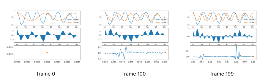
From one frame to the next the bottom axis stretches from 0.03 to the current frequency, the vertical ranges jump, and nothing says what a panel is. The eye reads every one of these motions as a change in the data.
Step 2: Draw the frame once and update the artists' data
Most of the figure never changes: the signal, the axis limits, the legend. Draw it once, before the animation, keep the artists, the objects a plotting call returns, and let the update function change only their data. ax.plot returns a list of Line2D objects, hence the comma in (probe_line,) = ax1.plot(...), and a line moves with set_data(x, y). ax.fill_between returns a FillBetweenPolyCollection, whose set_data(t, y1, y2) exists since Matplotlib 3.10; before that, remove() the fill in each frame and call fill_between again. ax.text returns a Text, changed with set_text.
The two other artists a sweep most often moves:
- Scatter.
ax.scatterreturns aPathCollection.set_offsetstakes an N x 2 array of new positions,set_arraynew values for the colormap to turn into colors: a dose-response cloud. - Image.
ax.imshowreturns anAxesImage, changed withset_data: the frames of a time-lapse. Fixvminandvmax, the data values at the two ends of the color scale, when you create it, or the scale changes with every frame.
For any other artist, print type(artist).__name__ of the returned object, as the cell below does for its three, and look up that class's set_ methods in the API reference.
The limits are set once: 0 to 72 h for the time panels, and -2.4 to 3.2 m, with headroom that keeps the legend off the signal. Padding of 0.0015 /h on each side of the bottom panel keeps the last dot whole. The printed average sits at 0.99, 0.95 with transform=ax2.transAxes: fractions of the panel's width and height, not data, so it stays in the top right corner whatever the limits. The frame values are now 110 instead of 200, for a reason Step 5 gives.
To look at one frame you do not need a GIF: call update by hand and show fig. Every later step checks its change this way. The traced curve still grows by one point per call, so to show it here the preview runs the sweep up to frames[79], the frame nearest the M2 tide:
frames = np.linspace(0.03, 0.10, 110)

fig, (ax1, ax2, ax3) = plt.subplots(3, 1, figsize=(7, 6.4), dpi=80, height_ratios=[1, 1, 1.3],
                                    layout="constrained")

# everything that holds still is drawn here, once
(signal_line,) = ax1.plot(t[window], h[window], label="signal")
(probe_line,) = ax1.plot([], [], label="probe")
ax1.legend(frameon=False, loc="upper left", ncol=2)
product_fill = ax2.fill_between(t[window], 0, 0, lw=0)
avg_text = ax2.text(0.99, 0.95, "", transform=ax2.transAxes, ha="right", va="top")
(sweep_line,) = ax3.plot([], [])
(dot,) = ax3.plot([], [], "o", ms=6)
for ax in (ax1, ax2):
    ax.set(xlim=(0, 72), ylim=(-2.4, 3.2), xticks=[0, 24, 48, 72])
ax3.set(xlim=(frames[0] - 0.0015, frames[-1] + 0.0015), ylim=(-0.35, 1.1))
sweep_f, sweep_v = [], []

def update(f):
    probe = np.cos(2 * np.pi * f * t)
    v = probe_average(f)
    probe_line.set_data(t[window], probe[window])
    product_fill.set_data(t[window], 0, (h * probe)[window])
    avg_text.set_text(f"f = {f:.4f} /h   30-day average = {v:+.2f} m")
    sweep_f.append(f)
    sweep_v.append(v)
    sweep_line.set_data(sweep_f, sweep_v)
    dot.set_data([f], [v])

print("artists:", ", ".join(type(a).__name__ for a in (probe_line, product_fill, avg_text)))
print(f"lines in the top panel before: {len(ax1.lines)}")
for f in frames[:80]:                                    # the sweep up to frames[79], no GIF
    update(f)
print(f"lines in the top panel after 80 updates: {len(ax1.lines)}")
plt.show()
artists: Line2D, FillBetweenPolyCollection, Text
lines in the top panel before: 2
lines in the top panel after 80 updates: 2
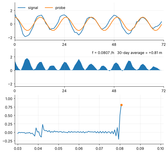
The top panel holds two lines before and after 80 updates: nothing piles up. The bottom curve, though, joins the 80 frame values and reaches 0.81 m, where the Fourier tutorial's spectrum has 1.00 m.
Step 3: Trace the spectrum from a fine grid, not from the frames
The frames sample the sweep for the eye; the traced curve need not stop at them. The cell computes the probe average on 1,500 frequencies and measures the M2 peak on that fine curve, walking down both sides from the top until the value falls below half the maximum. The distance between the two points, the width at half height, goes next to the spacing of the frames:
f_fine = np.linspace(0.03, 0.10, 1500)
avg_fine = np.array([probe_average(x) for x in f_fine])
avg_frames = np.array([probe_average(x) for x in frames])

# width of the M2 peak at half its height: walk down both sides from the top
top = avg_fine.argmax()
left, right = top, top
while avg_fine[left] > avg_fine[top] / 2:
    left -= 1
while avg_fine[right] > avg_fine[top] / 2:
    right += 1
print(f"frame spacing             {frames[1] - frames[0]:.5f} /h")
print(f"M2 peak, width at half    {f_fine[right] - f_fine[left]:.5f} /h")
print(f"highest value, 110 frames {avg_frames.max():.2f} m")
print(f"highest value, fine grid  {avg_fine.max():.2f} m")
frame spacing             0.00064 /h
M2 peak, width at half    0.00089 /h
highest value, 110 frames 0.81 m
highest value, fine grid  1.00 m
The peak is 0.00089 /h wide at half its height, not even one and a half frame spacings of 0.00064 /h. A curve through the 110 frame values cuts across its top at 0.81 m. On the fine grid it reaches 1.00 m, the amplitude of M2 in the record. What matters here holds for any sweep: a feature narrower than a few frame spacings, a sharp resonance, a narrow dose window, a phase transition, is flattened or lost when the curve is drawn through the frames. Compute the traced quantity once on its own grid and show the part up to the current frame; the dot and the printed number stay at the frame value.
The new update depends on f alone, which also settles the 201 calls of Step 1. Without an init_func argument, save draws an initial frame by calling the update function with the first frame value, so the lists of Step 1 got one point too many, and a second save would have appended all of them again. Without lists the number of calls does not matter, and a single call is a full preview:
def update(f):
    probe = np.cos(2 * np.pi * f * t)
    v = probe_average(f)
    probe_line.set_data(t[window], probe[window])
    product_fill.set_data(t[window], 0, (h * probe)[window])
    avg_text.set_text(f"f = {f:.4f} /h   30-day average = {v:+.2f} m")
    shown = f_fine <= f
    sweep_line.set_data(f_fine[shown], avg_fine[shown])
    dot.set_data([f], [v])

update(frames[79])
fig
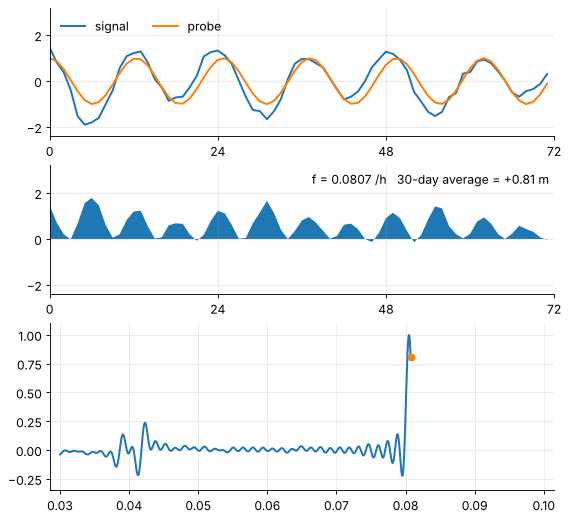
The dot sits at 0.81 m, the value at this frame's frequency, just past a curve that has already been up to 1.00 m.
Step 4: Name each panel and give each color one meaning
In an animation the eye has no time for a caption. Each panel gets a short title with loc="left", and the number that matters, the frequency and the 30-day average, is printed in the panel where it is made. Each color gets one meaning across the three panels. The data is INK, the signal above as well as the traced curve below. The probe is SECOND. What the sweep produces is ACCENT: the product, the printed average, and the dot.
Axis labels give quantity and unit, and the time axis is labeled once, under the product, with the top panel's tick labels hidden by tick_params(labelbottom=False). All of it goes onto the artists that already exist. Only the legend is made again, because it copies the colors of the lines when it is created:
signal_line.set_color(INK)
probe_line.set(color=SECOND, lw=1.2)
product_fill.set(color=ACCENT, alpha=0.4)
avg_text.set_color(ACCENT)
sweep_line.set_color(INK)
dot.set_color(ACCENT)
ax1.legend(frameon=False, loc="upper left", ncol=2)     # drawn again, to pick up the new colors

ax1.set_title("signal and probe", loc="left")
ax2.set_title("product, and its average", loc="left")
ax3.set_title("average against probe frequency", loc="left")
ax1.set(ylabel="sea level / m")
ax1.tick_params(labelbottom=False)                       # the time axis is labeled once, below the product
ax2.set(ylabel="product / m", xlabel="time / h")
ax3.set(ylabel="average / m", xlabel="probe frequency / cycles per hour")
fig
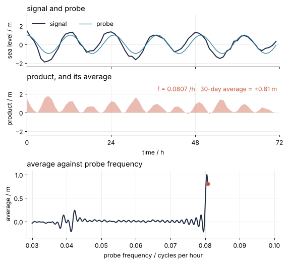
This is the finished frame. Read from top to bottom it tells the mechanism without a caption: the probe over the signal, their product shaded, and its average landing as the dot on the curve below.
Step 5: Choose the frame count and the frame rate
Playback length is the number of frames divided by the frame rate. At 12 frames per second, 110 frames last about 9 s: long enough to follow the dot from one end to the other, short enough that the loop starts again before attention goes. Twice the frames at the same rate would double both the length and the file. PillowWriter(fps=12) sets the rate in place of the 200 ms default, and a clip of the first 12 frames, one second, shows what the file stores:
anim = FuncAnimation(fig, update, frames=frames[:12])    # one second of the sweep
anim.save(drafts / "clip-80dpi.gif", writer=PillowWriter(fps=12))
clip = gif_info(drafts / "clip-80dpi.gif")
print(f"110 frames at {clip['delay']} ms play for {110 * clip['delay'] / 1000:.1f} s, "
      f"at exactly 12 fps it would be {110 / 12:.1f} s")
560 x 512 px, 12 frames at 80 ms, 1.0 s, 158 kB
110 frames at 80 ms play for 8.8 s, at exactly 12 fps it would be 9.2 s
The file says 80 ms, not 83.3. A GIF stores the delay of each frame in hundredths of a second, so 1000/12 ms becomes 8 hundredths, and the GIF plays at 12.5 fps: 8.8 s for 110 frames instead of 9.2 s. In a loop nobody misses the 0.4 s. When you need an exact rate, to match a clock drawn in the frame, pick one whose delay is a whole number of hundredths: 10, 20, 25, or 50 fps.
Step 6: Size the GIF: 560 pixels wide and under 2 MB
The pixel width is the figure width in inches times the dpi, so 7 in at 80 dpi gives 560 px; Matplotlib from the ground up explains the dpi for print. This site's text column is at most 768 px wide and a phone shows far less, so the browser shrinks a large GIF anyway. The question is how many pixels are worth their bytes.
The file size is about the number of frames times the bytes per frame. A GIF frame holds at most 256 colors, and Pillow stores each frame after the first only inside the rectangle that changed since the previous one, compressed. So a frame costs more the more pixels it has and the more of them change, one more reason for the fixed stage of Step 2. Measure on the clip, multiply, then render:
anim.save(drafts / "clip-100dpi.gif", writer=PillowWriter(fps=12), dpi=100)
clip_100 = gif_info(drafts / "clip-100dpi.gif")
for info in (clip, clip_100):
    per_frame = info["kB"] / info["frames"]
    print(f"{info['width']} px wide: {per_frame:5.1f} kB per frame, "
          f"{110 * per_frame:,.0f} kB for 110 frames")
700 x 640 px, 12 frames at 80 ms, 1.0 s, 218 kB
560 px wide:  13.2 kB per frame, 1,453 kB for 110 frames
700 px wide:  18.2 kB per frame, 2,003 kB for 110 frames
At 700 px a frame costs 18.2 kB against 13.2 kB at 560 px, 38 % more, and the projection for 110 frames is 2,003 kB, just under the 2 MB limit of this site's animations (2,048 kB, since the code counts 1,024 bytes to the kB). At 560 px it is 1,453 kB. The full render below comes out at 1,576 kB, 8 % above its projection, and 8 % on top of 2,003 kB would cross the limit. So the GIF is 560 px wide. For your own, keep the projection at least 10 % under the limit before you pay for the full render.
Design principles
Draw once, then change data. A frame rebuilt from nothing can change anything, and in a first attempt it does: the limits, the tick labels, the place of the legend. A fixed stage leaves the parameter as the only thing that moves, so every motion the viewer sees means something (Step 2).
Fix every limit before the first frame. The eye cannot tell a rescaled axis from a change in the data. The same holds for a color scale, which is why an image gets its vmin and vmax at creation, and for anything else that adapts to the data by default (Steps 1 and 2).
The frames sample the parameter, not the result. The frame count is set by how long a viewer will watch, the resolution of the traced curve by the narrowest feature in it, and the two have nothing to do with each other. An update that depends on the frame value alone can be called in any order and any number of times, which is what save and a preview both do (Step 3).
One mechanism, three panels at most, one meaning per color. The thing, the operation on it, the quantity traced out. A fourth panel, or a color that means two things, sends the viewer to the legend while the frames move on (Step 4).
Budget playback and bytes before rendering. Frames over frame rate gives the length, frames times bytes per frame gives the size, and a one-second clip measures both. A GIF knows time only in hundredths of a second (Steps 5 and 6).
Full source
The complete script that renders assets/probe-sweep.gif. It brings its own imports and data, so you can save the cell as scene.py and run it with python scene.py outside the notebook. For your own sweep, change five things: the data, the artists and their setters (the list in Step 2), update, the frame values, and the three titles. The rest is the stage.
# scene.py: renders assets/probe-sweep.gif. Run it with `python scene.py`.
from pathlib import Path

import numpy as np
import matplotlib.pyplot as plt
from matplotlib.animation import FuncAnimation, PillowWriter
from PIL import Image

OUT = Path("assets") / "probe-sweep.gif"
INK, ACCENT, SECOND = "#1f2a44", "#c8553d", "#2a7f9e"
plt.rcParams.update({"axes.spines.top": False, "axes.spines.right": False,
                     "axes.grid": True, "grid.alpha": 0.25, "font.size": 11})

# ---- data: the tide record of the Fourier tutorial, and what the sweep traces
rng = np.random.default_rng(42)
t = np.arange(0, 30 * 24, 1.0)                                       # hours
period = np.array([12.4206, 12.0000, 23.9345, 25.8193])              # h
amplitude = np.array([1.00, 0.45, 0.30, 0.20])                       # m
phase = np.array([0.0, 0.7, np.pi / 2, 1.2])
h = (amplitude * np.cos(2 * np.pi * t[:, None] / period + phase)).sum(axis=1)
h += 0.15 * rng.standard_normal(t.size)

def probe_average(f):
    return 2 * np.mean(h * np.cos(2 * np.pi * f * t))

frames = np.linspace(0.03, 0.10, 110)                                # the parameter, one value per frame
f_fine = np.linspace(0.03, 0.10, 1500)                               # the traced curve, on its own grid
avg_fine = np.array([probe_average(x) for x in f_fine])
window = t < 72

# ---- figure, drawn once
fig, (ax1, ax2, ax3) = plt.subplots(3, 1, figsize=(7, 6.4), dpi=80, height_ratios=[1, 1, 1.3],
                                    layout="constrained")
ax1.plot(t[window], h[window], color=INK, lw=1.8, label="signal")
(probe_line,) = ax1.plot([], [], color=SECOND, lw=1.2, label="probe")
ax1.legend(frameon=False, loc="upper left", ncol=2)
product_fill = ax2.fill_between(t[window], 0, 0, color=ACCENT, alpha=0.4, lw=0)
avg_text = ax2.text(0.99, 0.95, "", transform=ax2.transAxes, ha="right", va="top", color=ACCENT)
(sweep_line,) = ax3.plot([], [], color=INK, lw=1.8)
(dot,) = ax3.plot([], [], "o", color=ACCENT, ms=6)
for ax in (ax1, ax2):
    ax.set(xlim=(0, 72), ylim=(-2.4, 3.2), xticks=[0, 24, 48, 72])
ax1.set(ylabel="sea level / m")
ax1.tick_params(labelbottom=False)                                   # time is labeled once, below
ax2.set(ylabel="product / m", xlabel="time / h")
ax3.set(ylabel="average / m", xlabel="probe frequency / cycles per hour",
        xlim=(frames[0] - 0.0015, frames[-1] + 0.0015), ylim=(-0.35, 1.1))
ax1.set_title("signal and probe", loc="left")
ax2.set_title("product, and its average", loc="left")
ax3.set_title("average against probe frequency", loc="left")

# ---- one frame: a function of the frame value alone
def update(f):
    probe = np.cos(2 * np.pi * f * t)
    v = probe_average(f)
    probe_line.set_data(t[window], probe[window])
    product_fill.set_data(t[window], 0, (h * probe)[window])
    avg_text.set_text(f"f = {f:.4f} /h   30-day average = {v:+.2f} m")
    shown = f_fine <= f
    sweep_line.set_data(f_fine[shown], avg_fine[shown])
    dot.set_data([f], [v])

# ---- render, and read back what was written
OUT.parent.mkdir(exist_ok=True)
FuncAnimation(fig, update, frames=frames).save(OUT, writer=PillowWriter(fps=12))
plt.close(fig)
with Image.open(OUT) as im:
    delay = im.info["duration"]
    print(f"{OUT}: {im.width} x {im.height} px, {im.n_frames} frames at {delay} ms, "
          f"{im.n_frames * delay / 1000:.1f} s, {OUT.stat().st_size / 1024:,.0f} kB")
assets/probe-sweep.gif: 560 x 512 px, 110 frames at 80 ms, 8.8 s, 1,576 kB
560 x 512 px, 110 frames at 80 ms, 8.8 s of playback, and 1,576 kB: under the 2 MB limit, and 39 % of the 4,034 kB the first attempt wrote for a picture that said less.
Further reading
- The Matplotlib documentation: the
matplotlib.animationreference forFuncAnimationandPillowWriter, the user guide page Animations using Matplotlib, and the collections reference forFillBetweenPolyCollection.set_dataand the setters of a scatter. - Nicolas P. Rougier, Scientific Visualization: Python + Matplotlib (2021), free online, which has a chapter on animation.
- Related tutorials on this site: The Fourier transform: asking a signal how much of each frequency it contains, where this animation is used; Matplotlib from the ground up: a two-panel figure for one journal column for Figure, Axes, and dpi; and The Fourier transform in Julia: asking a signal how much of each frequency it contains, which builds the same animation with Makie's
Observableandrecord. A Julia version of this tutorial, on Makie animation, is planned. - Download the notebook. It was executed with the library versions in the header.