Colormaps: why a rainbow scale draws features that are not in the data
Afterwards you can say what makes a colormap perceptually uniform, measure the lightness along any colormap, and pick a sequential or diverging map that fits.
- Topic
- Visualization
- Field
- Cross-disciplinary
- Prerequisites
- none beyond Python basics
- Libraries
matplotlib 3.11.2numpy 2.5.3
py-colormaps.ipynb, executed with the versions above. The download needs a free account
Run it yourself. In a terminal, this installs exactly the versions above:
pip install numpy==2.5.3 matplotlib==3.11.2 jupyterlabThe question
Here is a square plate, 10 cm on a side, at a room temperature of 20 °C, with a heater under its center that holds a hot spot of 80 °C. Its temperature, drawn twice, with two different colormaps:
Show code
import numpy as np
import matplotlib
import matplotlib.pyplot as plt

plt.rcParams.update({
    "figure.figsize": (8, 3.6), "figure.dpi": 110,
    "axes.spines.top": False, "axes.spines.right": False,
    "axes.grid": True, "grid.alpha": 0.25,
    "font.size": 11, "lines.linewidth": 1.8,
})
INK, ACCENT, SECOND, MUTED = "#1f2a44", "#c8553d", "#2a7f9e", "#8a8f98"

# A 10 cm plate at 20 °C with a heater under its center. Everything is computed,
# nothing is random, so there is no seed.
T_AMB, T_PEAK, SIGMA = 20.0, 80.0, 2.0              # °C, °C, cm
x = np.linspace(-5, 5, 201)                         # cm; 201 points put the center on the grid
xx, yy = np.meshgrid(x, x)
T = T_AMB + (T_PEAK - T_AMB) * np.exp(-(xx**2 + yy**2) / (2 * SIGMA**2))


def lightness(rgb):
    """CIELAB lightness L*, 0 for black to 100 for white, of sRGB colors given as values 0 to 1.

    Any array whose last axis is RGB (or RGBA) works: a colormap sampled at 256 positions, an exported
    lookup table divided by 255, a whole image. Formalization explains the three lines."""
    c = np.asarray(rgb, dtype=float)[..., :3]
    lin = np.where(c <= 0.04045, c / 12.92, ((c + 0.055) / 1.055) ** 2.4)    # stored value -> light
    Y = lin @ [0.2126, 0.7152, 0.0722]                                        # light -> luminance
    return np.where(Y > 216 / 24389, 116 * np.cbrt(Y) - 16, Y * 24389 / 27)   # luminance -> lightness


def gray_of(rgb):
    """The sRGB gray of the same lightness: what a black-and-white print keeps of a color."""
    L = lightness(rgb)
    Y = np.where(L > 8, ((L + 16) / 116) ** 3, L * 27 / 24389)
    g = np.where(Y <= 0.0031308, 12.92 * Y, 1.055 * Y ** (1 / 2.4) - 0.055)
    return np.repeat(g[..., None], 3, axis=-1)


fig, axes = plt.subplots(1, 2, figsize=(8, 3.6), layout="constrained")
for ax, name in zip(axes, ["jet", "viridis"]):
    im = ax.imshow(T, cmap=name, vmin=20, vmax=80, extent=[-5, 5, -5, 5],
                   origin="lower", interpolation="nearest")
    ax.set(xlabel="x / cm", ylabel="y / cm")
    ax.grid(False)
    fig.colorbar(im, ax=ax, label="T / °C", shrink=0.9)
plt.show()
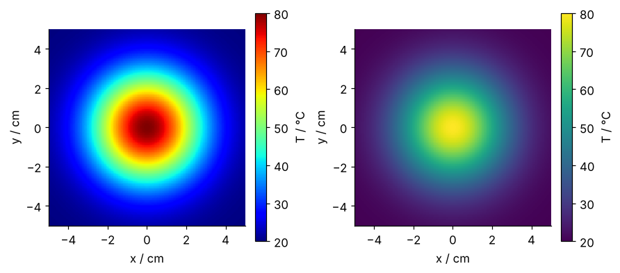
A colormap is a list of colors, 256 of them for most of Matplotlib's maps; Fiji and ImageJ call the same thing a lookup table. To draw a value, Matplotlib first turns it into a position between 0 and 1 with the limits vmin and vmax, position \(= (T - v_\text{min}) / (v_\text{max} - v_\text{min})\), and paints the color found at that position. With the limits 20 and 80 °C used here, 20 °C is position 0, 50 °C is 0.5, and 80 °C is 1. In Fiji, the display range, the minimum and maximum under Brightness/Contrast, does the job of vmin and vmax. From here on every feature is located by its position, and \(T = 20 + 60 \cdot\) position turns it back into a temperature.
The left panel uses jet, the rainbow map that was MATLAB's default until 2014 and is still common in journals. The right panel uses viridis, Matplotlib's default since version 2.0. Both draw the same 40,401 temperatures with the same limits. On the right you see a hill. On the left you see a bright cyan ring, a broad green band, a yellow ring, and a dark red cap, and anyone reading it as a map would say the plate has two edges and a separate hot cap on top.
The data has no edge anywhere. The temperature falls smoothly from the center, without a step or a plateau. So where do the rings come from? Which property of a colormap decides whether it draws features into data, and can you measure that property before you plot?
The idea: the eye reads lightness, not hue
A color on a screen carries three things: how light it is, which hue it has, and how strong the hue is, its saturation. To a good approximation, the eye takes shape and order from lightness alone. Hue tells regions apart but does not rank them: nobody would say green is more than red. A map whose lightness rises steadily with position therefore draws a hill as a hill.
A map can draw something that is not in the data in two ways. At a turn, lightness stops rising and falls, or the reverse, and the picture gets a bright or a dark ring. At a bend, a steep climb suddenly levels off, and the eye puts an edge there as well, whether or not the curve also changes direction at that point. A turn draws a ring only when it is deep enough to see. jet has one visible ring of each kind, the yellow and the cyan, plus a faint ring near the edge of the plate that comes from a second, smaller bend.
jet walks through blue, cyan, green, yellow, and red, each at full saturation, and fully saturated hues are not equally light. Here they are on the scale of lightness, L*, which runs from 0 for black to 100 for white, computed with the function lightness from the first cell, which Formalization takes apart:
colors = {"blue": (0, 0, 1), "red": (1, 0, 0), "green": (0, 1, 0), "cyan": (0, 1, 1),
          "yellow": (1, 1, 0), "black": (0, 0, 0), "white": (1, 1, 1),
          "jet at 0": matplotlib.colormaps["jet"](0.0), "jet at 1": matplotlib.colormaps["jet"](1.0)}
for name, rgb in colors.items():
    print(f"{name:9s} RGB {tuple(round(float(v), 2) for v in rgb[:3])!s:17s} L* {float(lightness(rgb)):5.1f}")
blue      RGB (0.0, 0.0, 1.0)   L*  32.3
red       RGB (1.0, 0.0, 0.0)   L*  53.2
green     RGB (0.0, 1.0, 0.0)   L*  87.7
cyan      RGB (0.0, 1.0, 1.0)   L*  91.1
yellow    RGB (1.0, 1.0, 0.0)   L*  97.1
black     RGB (0.0, 0.0, 0.0)   L*   0.0
white     RGB (1.0, 1.0, 1.0)   L* 100.0
jet at 0  RGB (0.0, 0.0, 0.5)   L*  12.9
jet at 1  RGB (0.5, 0.0, 0.0)   L*  25.4
From blue through cyan to yellow, lightness rises by 65; from yellow on to red it falls by 44. Yellow is the lightest color there is at full saturation, so the yellow ring is the brightest thing in the picture, and both ends of jet are darker than any of the five hues it walks through.
Follow a line through the summit, from one edge of the plate to the other, and compute the lightness of the color each point gets:
Show code
row = T[100, :]                                     # the line y = 0 through the summit
position = (row - 20) / 60
L_jet = lightness(matplotlib.colormaps["jet"](position))
L_vir = lightness(matplotlib.colormaps["viridis"](position))
i_peak = np.argmax(L_jet[:100])                     # the jet peak on the left flank

fig, (ax1, ax2) = plt.subplots(2, 1, figsize=(8, 4.4), sharex=True, layout="constrained")
ax1.plot(x, row, color=INK)
ax1.set(ylabel="T / °C", ylim=(15, 85))
ax2.plot(x, L_jet, color=ACCENT)
ax2.plot(x, L_vir, color=SECOND)
for xr in [x[i_peak], -x[i_peak]]:
    ax2.axvline(xr, color=MUTED, lw=1, ls="--")
ax2.text(-x[i_peak] + 0.15, L_jet[i_peak] + 7, f"jet, {L_jet[i_peak]:.1f} at x = ±{abs(x[i_peak]):.1f} cm",
         color=ACCENT, va="bottom")
ax2.text(0, L_jet[100] - 4, f"jet, {L_jet[100]:.1f}", color=ACCENT, ha="center", va="top")
ax2.text(0, L_vir[100] - 4, f"viridis, {L_vir[100]:.1f}", color=SECOND, ha="center", va="top")
ax2.set(xlabel="x / cm", ylabel="L*", ylim=(0, 118), xlim=(-5, 5), yticks=[0, 25, 50, 75, 100])
plt.show()
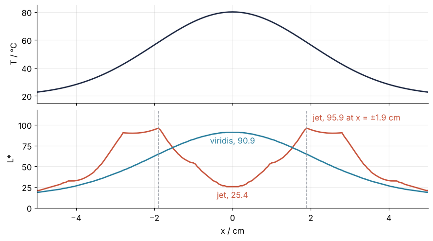
The temperature has one peak. Under viridis lightness has one peak too, at the summit, where it reaches 90.9. Under jet it is brightest at x = ±1.9 cm and falls to 25.4 at the summit: two bright peaks and a dark middle where the data has one peak.
To see where that shape comes from, slide a marker along jet's positions from 0 to 1, mark on the plate where that value sits, and record the lightness of its color:
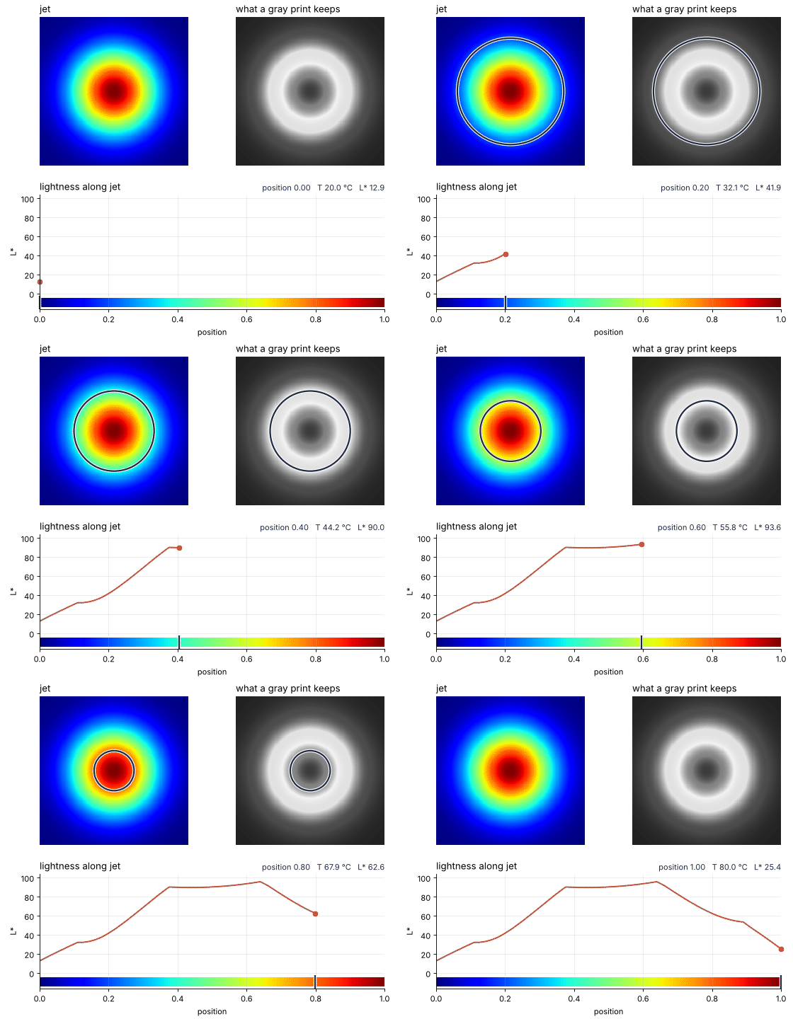
How I built this: Visualization tutorial "Animating a colorbar sweep", planned.
Jet's lightness curve, and where its rings come from
The last frame of the animation is jet's lightness curve, and it explains every band in the first figure. Here are its landmarks, each with the temperature it stands for and the radius on the plate where that temperature lies. The hot spot is a Gaussian, \(T = 20 + 60\, e^{-r^2/2\sigma^2}\) °C with a width of \(\sigma = 2\) cm, so a position sits at \(r = \sigma\sqrt{-2 \ln(\text{position})}\):
Show code
pos = np.linspace(0, 1, 256)
L = lightness(matplotlib.colormaps["jet"](pos))
L_v = lightness(matplotlib.colormaps["viridis"](pos))


def at(p):
    """Index of the colormap entry nearest to position p."""
    return int(np.argmin(np.abs(pos - p)))


landmarks = {"bottom": 0.0, "flat run of blue": 0.118, "end of the climb": 0.376,
             "bottom of the notch": 0.439, "peak": 0.639, "top": 1.0}
print(f"{'jet':22s} position     L*   T / °C   r / cm")
for label, p in landmarks.items():
    i = at(p)
    # position 0 (20 °C) lies outside the plate, whose corners are at 20.1 °C
    r_text = f"{SIGMA * np.sqrt(-2 * np.log(pos[i])):6.2f}" if 0 < pos[i] < 1 else ("  none" if pos[i] == 0 else "  0.00")
    print(f"{label:22s} {pos[i]:8.3f} {L[i]:6.1f} {20 + 60 * pos[i]:8.1f} {r_text}")
i1, i2 = at(0.376), at(0.639)
print(f"\nfrom 0.376 to 0.639:  jet L* changes by {L[i2] - L[i1]:4.1f},  viridis L* by {L_v[i2] - L_v[i1]:4.1f}")
jet                    position     L*   T / °C   r / cm
bottom                    0.000   12.9     20.0   none
flat run of blue          0.118   32.3     27.1   4.14
end of the climb          0.376   90.4     42.6   2.80
bottom of the notch       0.439   89.9     46.4   2.57
peak                      0.639   95.9     58.4   1.89
top                       1.000   25.4     80.0   0.00

from 0.376 to 0.639:  jet L* changes by  5.5,  viridis L* by 19.4
From position 0 to 0.376 lightness climbs by 77.5. Over the next quarter of the scale, up to 0.639, it changes by only 5.5, with a shallow dip to 89.9 on the way. At 0.639 it peaks at 95.9, then falls by 70.5 to 25.4 at the top.
The curve turns three times. The turn at 0.639 is the peak, and it is the yellow ring, at 58.4 °C and r = 1.89 cm. At 0.376 two things happen at once. The steep climb stops, a bend, and the eye sees it as the cyan ring, at 42.6 °C and r = 2.80 cm; a bright edge seen where a ramp of light abruptly levels off is called a Mach band. At the same position the curve also turns, into a notch only 0.5 deep that turns back up at 0.439. That is less than viridis climbs in two of its 256 entries, and no eye sees it. The ring comes from the bend, not from the notch. The flat run of pure blue at 0.118 shows that a bend needs no turn at all: lightness never falls there, and it still draws the faint outer ring at r = 4.14 cm.
Between 42.6 and 58.4 °C, a quarter of the temperature range, lightness barely changes, so those temperatures hide in a band of nearly equal light; over the same values viridis changes by 19.4. A black-and-white print keeps only lightness, so here is the plate as one would print it, in jet, viridis, and cividis, a variant of viridis designed to read the same for people with red-green color blindness:
Show code
fig, axes = plt.subplots(1, 3, figsize=(8, 2.9), layout="constrained")
for ax, name in zip(axes, ["jet", "viridis", "cividis"]):
    ax.imshow(gray_of(matplotlib.colormaps[name]((T - 20) / 60)), extent=[-5, 5, -5, 5],
              origin="lower", interpolation="nearest")
    ax.set_axis_off()
    ax.text(0.5, -0.03, name, transform=ax.transAxes, ha="center", va="top")   # the map, named under its print
plt.show()
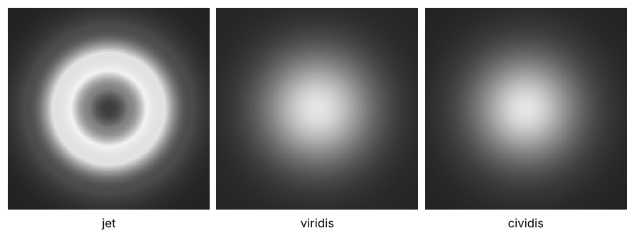
In gray, jet turns the hill into a crater, a bright annulus around a dark center, with the faint outer ring still there. viridis and cividis print as a hill, brightest at the summit. The hill has not changed; only the lightness assigned to each temperature has.
Formalization
Lightness has a standard definition: L*, the first coordinate of the CIE 1976 L*a*b* color space (CIELAB), built so that equal steps in L* look roughly equally different. Getting there from a color as a file stores it takes three steps.
The stored numbers for red, green, and blue, from 0 to 1, are not proportional to the light the screen emits. They are spaced along a curve so that 256 levels are enough in the darks (the third step says why), and the first step undoes that curve:
with a short straight piece, \(c/12.92\), below that, as the sRGB standard prescribes. The result is light intensity, the quantity a camera pixel records in a micrograph.
The second step weighs the three intensities into one number, the luminance,
The eye is far more sensitive to green than to blue, and the green weight is why green and yellow are light and blue is dark. \(Y\) runs from 0 to 1 and is still a physical amount of light, not how light the color looks.
The third step is the eye's response, which is compressive:
again with a short straight piece near black, where a cube root would be too steep. A gray with 18 % of white's luminance looks halfway to white, and one with half of it looks three quarters of the way:
Show code
def L_of_Y(Y):
    return np.where(Y > 216 / 24389, 116 * np.cbrt(Y) - 16, Y * 24389 / 27)


def linear(c):
    return np.where(c <= 0.04045, c / 12.92, ((c + 0.055) / 1.055) ** 2.4)


print(f"gray with 18 % of white's luminance:  L* {float(L_of_Y(0.18)):5.1f}")
print(f"gray with 50 % of white's luminance:  L* {float(L_of_Y(0.5)):5.1f}")
print(f"stored sRGB 0.5:  luminance Y {float(linear(0.5)):.3f},  L* {float(lightness((0.5, 0.5, 0.5))):5.1f}")

Y_v = linear(matplotlib.colormaps["viridis"](pos)[:, :3]) @ [0.2126, 0.7152, 0.0722]
print(f"viridis, per entry:  L* steps {np.diff(L_v).min():.2f} to {np.diff(L_v).max():.2f},"
      f"  Y steps {np.diff(Y_v).min():.4f} to {np.diff(Y_v).max():.4f}")
before, after = np.diff(L)[i1 - 10:i1].mean(), (L[i2] - L[i1]) / (i2 - i1)
print(f"jet, L* per entry:  {before:.2f} before the bend,  {after:.2f} after it,  a factor of {before / after:.0f}")
gray with 18 % of white's luminance:  L*  49.5
gray with 50 % of white's luminance:  L*  76.1
stored sRGB 0.5:  luminance Y 0.214,  L*  53.4
viridis, per entry:  L* steps 0.28 to 0.35,  Y steps 0.0006 to 0.0064
jet, L* per entry:  1.04 before the bend,  0.08 after it,  a factor of 13
Middle gray as stored, sRGB 0.5, emits only 0.214 of white's light and still looks about halfway, L* 53.4. Luminance is what an instrument measures, and lightness what a reader sees. A map whose steps are to look even must be even in L*, not in Y. The other two coordinates, a* and b*, carry hue and saturation; nothing here needs them.
The function lightness in the first cell is these three steps, one line each, and takes rows of red, green, and blue from 0 to 1. For a Matplotlib map, hand it matplotlib.colormaps[name](np.linspace(0, 1, 256)); the fourth column, opacity, is ignored. For a Fiji lookup table, Image > Color > Show LUT and then List give 256 rows of 0 to 255; divide the red, green, and blue columns by 255.
Monotonic. For data with an order and no special middle, L* must not turn. A turn deep enough to see draws a ring the data does not have: jet's yellow ring. viridis runs from 14.9 to 90.9 and cividis from 13.9 to 91.2 without a single turn.
Even steps. A map can rise all the way and still bend. Equal steps in position should be equal steps in L*, or one part of the range is stretched and another squeezed. That is what draws jet's cyan ring: its lightness gains 1.04 per entry just before the bend and 0.08 per entry after it, a factor of 13. viridis gains 0.28 to 0.35 per entry throughout, while its luminance steps vary tenfold, from 0.0006 to 0.0064. A map that is monotonic with even steps is called perceptually uniform. viridis was designed for even steps in CAM02-UCS, a color space in which a step counts hue and saturation as well as lightness. L* is the part that carries the shape.
Three kinds of map. The shape of the L* curve is the kind of map:
- Sequential. For data that runs from low to high, L* rises throughout:
viridis,cividis,inferno. - Diverging. For data with a special value, such as zero or an ambient temperature, L* turns once, on purpose, at that value.
RdBu_r(the suffix_rreverses a map) runs from 20.1 at the blue end to 97.1 at the white center and 20.0 at the red end. Its turn marks something real only with limits symmetric about that value, such as ±60 K around the 20 °C ambient for the plate with a cooler in the next section. - Cyclic. For angles and phases, L* returns to its start:
twilighthas 87.6 and 87.5 at its ends and 11.9 in the middle.
jet fits none of the three. Its turns and bends sit at the same positions, 0.38 and 0.64, of whatever range you give it, values that mean nothing in any data.
See it in code
The whole method fits in one cell: sample each map at 256 evenly spaced positions, compute L*, and count the turns. The eight maps include gray and a black-to-green map built like Fiji's Green lookup table. Below the report, the four maps of this tutorial each sit beside a field drawn in them, RdBu_r beside the plate with a cooler 5 cm from the heater.
Show code
from matplotlib.colors import LinearSegmentedColormap

maps = {name: matplotlib.colormaps[name] for name in ["jet", "turbo", "viridis", "cividis", "gray"]}
maps["black_green"] = LinearSegmentedColormap.from_list("black_green", ["black", (0, 1, 0)], N=256)
maps["RdBu_r"] = matplotlib.colormaps["RdBu_r"]
maps["twilight"] = matplotlib.colormaps["twilight"]


def turns(L):
    """Indices where L* changes direction. Equal neighbors are dropped first:
    a run of equal values has no direction, and would otherwise count as two turns."""
    d = np.diff(L)
    moving = np.flatnonzero(d != 0)
    flips = np.flatnonzero(np.sign(d[moving][1:]) != np.sign(d[moving][:-1]))
    return moving[flips] + 1


for name, cmap in maps.items():
    Lm = lightness(cmap(pos))
    k = turns(Lm)
    line = f"{name:12s} L* {Lm[0]:5.1f} -> {Lm[-1]:5.1f}   "
    if len(k) == 0:
        steps = np.diff(Lm)
        line += f"no turns   steps {steps.min():.2f} to {steps.max():.2f}"
    else:
        where = ", ".join(f"{pos[i]:.3f} (L* {Lm[i]:.1f})" for i in k)
        line += f"{len(k)} turn{'s' if len(k) > 1 else ' '} at {where}"
    print(line)

# The diverging panel gets a field with a real zero: heater on the left, cooler on the right,
# drawn as the difference from the 20 °C ambient.
dT = (60 * np.exp(-((xx + 2.5)**2 + yy**2) / (2 * SIGMA**2))
      - 60 * np.exp(-((xx - 2.5)**2 + yy**2) / (2 * SIGMA**2)))
rows = [("jet", T, 20, 80, "T / °C"), ("viridis", T, 20, 80, "T / °C"),
        ("cividis", T, 20, 80, "T / °C"), ("RdBu_r", dT, -60, 60, "ΔT / K")]

fig, axes = plt.subplots(4, 2, figsize=(7.5, 8), width_ratios=[2.3, 1], layout="constrained")
for (name, field, lo, hi, unit), (axL, axF) in zip(rows, axes):
    Lm = lightness(maps[name](pos))
    axL.imshow(pos[None, :], cmap=name, aspect="auto", extent=[0, 1, -14, -4])
    color = ACCENT if name == "jet" else SECOND
    axL.plot(pos, Lm, color=color)
    axL.set(xlim=(0, 1), ylim=(-16, 104), ylabel="L*")
    axL.text(0.01, 98, name, va="top", color=color)
    if name == "jet":
        k = turns(Lm)
        axL.plot(pos[k], Lm[k], "o", color=ACCENT, ms=6)
        axL.axvline(pos[k[0]], color=MUTED, lw=1, ls="--")
        axL.text(pos[k[0]] - 0.01, 45, "bend", color=MUTED, ha="right")
        axL.text(pos[k[2]] + 0.02, Lm[k[2]], f"peak {pos[k[2]]:.2f}", color=ACCENT, va="center")
        x0, x1 = pos[k[0]], pos[k[1]]                      # a bracket under both turns of the notch
        axL.plot([x0, x0, x1, x1], [85, 79, 79, 85], color=ACCENT, lw=1)
        axL.text(x0 + 0.008, 75, "notch, 0.5 deep", color=ACCENT, va="top")
    if name == "RdBu_r":
        axL.axvline(0.5, color=MUTED, lw=1, ls="--")
        axL.text(0.51, 45, "0 K", color=MUTED)
    im = axF.imshow(field, cmap=name, vmin=lo, vmax=hi, extent=[-5, 5, -5, 5],
                    origin="lower", interpolation="nearest")
    axF.set_axis_off()
    fig.colorbar(im, ax=axF, label=unit, fraction=0.08)
axes[-1, 0].set_xlabel("position")
for ax in axes[:-1, 0]:
    ax.tick_params(labelbottom=False)
plt.show()
jet          L*  12.9 ->  25.4   3 turns at 0.376 (L* 90.4), 0.439 (L* 89.9), 0.639 (L* 95.9)
turbo        L*  12.0 ->  24.5   1 turn  at 0.494 (L* 90.9)
viridis      L*  14.9 ->  90.9   no turns   steps 0.28 to 0.35
cividis      L*  13.9 ->  91.2   no turns   steps 0.20 to 0.39
gray         L*   0.0 -> 100.0   no turns   steps 0.27 to 0.51
black_green  L*   0.0 ->  87.7   no turns   steps 0.20 to 0.44
RdBu_r       L*  20.1 ->  20.0   1 turn  at 0.498 (L* 97.1)
twilight     L*  87.6 ->  87.5   1 turn  at 0.502 (L* 11.9)
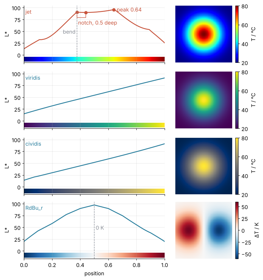
The count first drops the steps where L* does not change, because a run of equal values has no direction; without that, jet's flat run of blue adds two false turns, five in all. It then finds the three turns read off by eye above. It flags 0.376 for the invisible notch that starts there, not for the cyan ring, and it misses the bend at 0.118. A turn in the count rules a map out for ordered data, but a count of zero does not rule it in: plot the curve and look for bends.
gray and the black-to-green map never turn, so they keep the order of the intensities. Their steps are less even than those of viridis, 0.27 to 0.51 for gray against 0.28 to 0.35, so equal differences in signal do not look quite equal. turbo, the redesigned rainbow Google published in 2019, still turns once, at 0.494, and its ends differ in lightness, 12.0 against 24.5. It is neither sequential nor a proper diverging map, whose ends match, so do not use it for ordered data.
Where it shows up
A colormap stands between a measurement and its reader wherever a quantity is drawn over a plane or against two variables.
- Geology and geography: elevation maps. A rainbow-tinted elevation map draws a bright contour wherever its scale puts yellow and an edge where blue gives way to cyan, and neither has anything to do with the terrain. Crameri, Shephard and Heron collect such cases from the geosciences in Nature Communications (2020) and offer maps that avoid them.
- Physics and engineering: temperature and flow fields. CFD and finite-element postprocessors and thermal cameras commonly offer a rainbow palette, which gives every smooth hot spot on a circuit board the rings of the plate above. The tutorial on the heat equation with py-pde draws the same kind of plate in
inferno, a sequential map from black through red to pale yellow. - Biology: micrographs. A fluorescence image is a measured intensity, so its lookup table must keep lightness in the order of the signal, which
grayand Fiji's Green do. A rainbow lookup table draws boundaries between cells that the signal does not have; the cell-counting tutorial withscipy.ndimageshows its micrographs ingrayandcividis. - Signal processing and acoustics: spectrograms. Many published spectrograms draw power against time and frequency in
jet, so that a formant or a bird's whistle seems to begin where its power crosses into yellow. Inviridisorinfernothe same spectrogram shows the power rising smoothly.
In every case the check before you publish is the same: plot the map's L* against position, and keep the map only if the curve rises without a bend or has its one turn at the value your data treats as special.
Further reading
- Matplotlib, Choosing Colormaps, for the catalog of maps by kind.
- Kovesi, "Good colour maps: how to design them", arXiv:1509.03700 (2015).
- Crameri, Shephard and Heron, "The misuse of colour in science communication", Nature Communications 11, 5444 (2020).
- Wilke, Fundamentals of Data Visualization, the chapters on color scales.
- Related tutorials on this site: Matplotlib from the ground up: a two-panel figure for one journal column for the figure itself, py-pde from the ground up: the heat equation on a square plate for the same kind of plate in
inferno, and Counting cells with scipy.ndimage: how many are there, and how large? for micrographs ingrayandcividis. Planned: Animating a colorbar sweep, how the animation above was built. - Download the notebook. It was executed with the library versions in the header.