PCA with scikit-learn: sixty absorption spectra in two dimensions
Afterwards you can standardize many measured variables, reduce them to a few with PCA in scikit-learn, choose how many to keep, and read scores and loadings.
- Topic
- Machine learning
- Field
- Biology, Chemistry
- Prerequisites
- none beyond Python basics
- Libraries
matplotlib 3.11.2numpy 2.5.3sklearn 1.9.1
py-pca.ipynb, executed with the versions above. The download needs a free account
Run it yourself. In a terminal, this installs exactly the versions above:
pip install numpy==2.5.3 scikit-learn==1.9.1 matplotlib==3.11.2 jupyterlabThe problem: sixty spectra, one hundred numbers each
You have measured 60 samples, 20 each of three compounds, as UV-Vis absorption spectra at 100 wavelengths between 250 and 646 nm. Each sample is a row of 100 numbers, and the whole data set is a 60 × 100 matrix. You cannot plot 100 axes, and any two wavelengths you pick by hand separate the compounds only in part. Principal component analysis (PCA) builds new axes instead: the directions in the 100-dimensional space along which the samples differ most. The same matrix shape turns up as gene expression profiles, metabolite panels, or element concentrations in rock samples, one row per sample and one column per measured variable, and everything below carries over to them.
The spectra here are simulated, so that you know what is in them. Each compound has three absorption bands, and from sample to sample four things vary. A concentration factor scales the whole spectrum by about 8 %, drawn from a lognormal distribution, which keeps it positive. Each band's height varies by 5 % and its position by 2 nm. Every reading carries noise of 0.01 absorbance units, and every spectrum a small baseline offset.
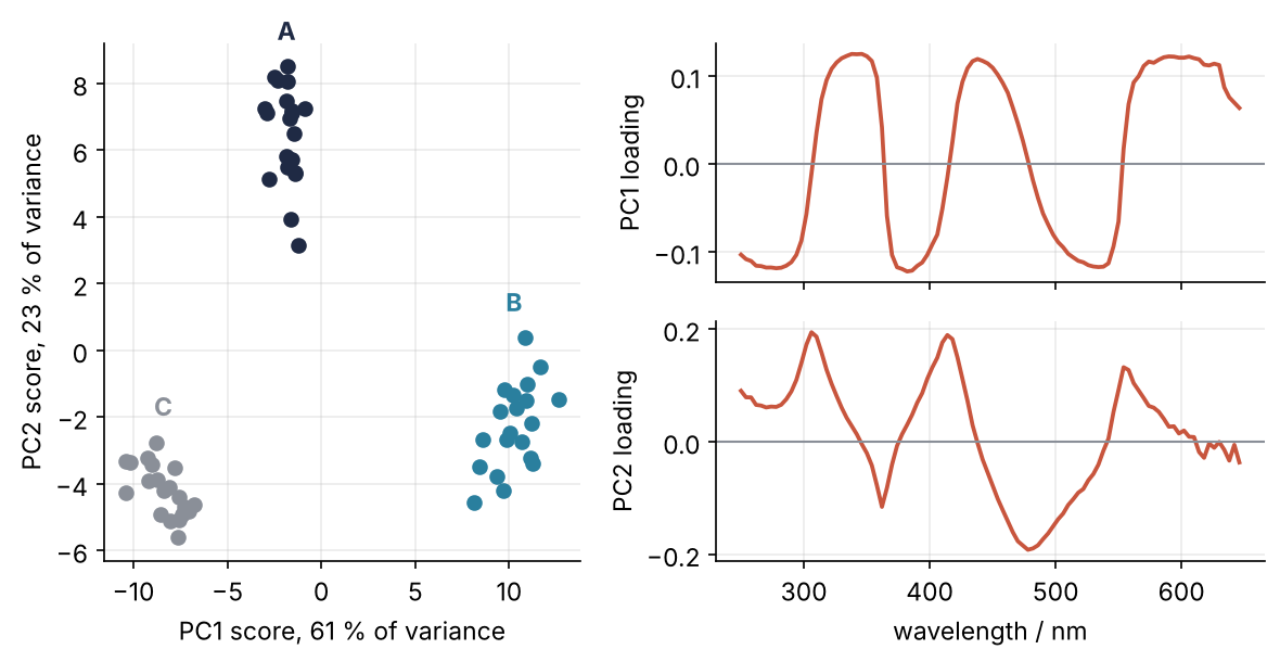
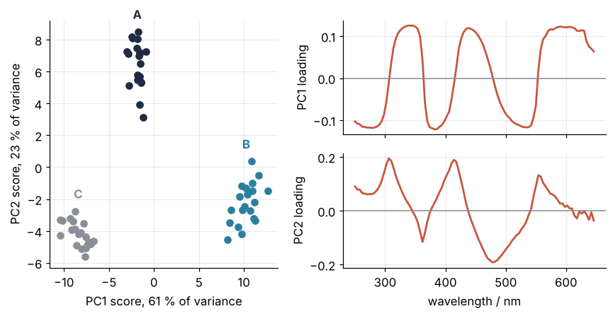
This is where we end up. On the left, every dot is one spectrum, placed by its coordinates along the first two directions PCA found. The sixty samples fall into three clusters, one per compound, although PCA was never told which sample is which. The two directions carry 84 % of the variation in the data. On the right, the loadings show which wavelengths make up each direction, and they point at the bands where the compounds differ. Five steps lead from the raw matrix to that figure.
Setup
import numpy as np
import matplotlib.pyplot as plt
from sklearn.preprocessing import StandardScaler       # pip install scikit-learn; it imports as sklearn
from sklearn.decomposition import PCA

plt.rcParams.update({
    "figure.figsize": (7, 3.6), "figure.dpi": 110,
    "axes.spines.top": False, "axes.spines.right": False,
    "axes.grid": True, "grid.alpha": 0.25,
    "font.size": 11, "lines.linewidth": 1.8,
})
INK, ACCENT, SECOND, MUTED = "#1f2a44", "#c8553d", "#2a7f9e", "#8a8f98"
COMPOUNDS = {"A": INK, "B": SECOND, "C": MUTED}

SEED = 85
wavelength = np.arange(250, 650, 4.0)                    # nm, 100 columns
BANDS = {                                                # (center / nm, width / nm, height / absorbance)
    "A": [(300, 25, 0.8), (420, 30, 0.5), (540, 35, 0.3)],
    "B": [(320, 25, 0.6), (450, 30, 0.7), (560, 35, 0.25)],
    "C": [(290, 20, 0.7), (400, 30, 0.3), (500, 40, 0.6)],
}

def make_spectra(conc_sd=0.08, n_per=20, seed=SEED):
    rng = np.random.default_rng(seed)
    X, compound, conc = [], [], []
    for name, bands in BANDS.items():
        for _ in range(n_per):
            c = rng.lognormal(0, conc_sd)                # concentration factor of this sample
            a = np.zeros_like(wavelength)
            for center, width, height in bands:
                h = height * rng.normal(1, 0.05)
                shift = rng.normal(0, 2)
                a += h * np.exp(-0.5 * ((wavelength - center - shift) / width) ** 2)
            a = c * a + rng.normal(0, 0.01, wavelength.size) + rng.normal(0, 0.005)
            X.append(a)
            compound.append(name)
            conc.append(c)
    return np.array(X), np.array(compound), np.array(conc)

X, compound, conc = make_spectra()                       # your own matrix goes here: rows samples, columns variables
print(f"X: {X.shape[0]} samples × {X.shape[1]} wavelengths, compounds {', '.join(COMPOUNDS)}")
X: 60 samples × 100 wavelengths, compounds A, B, C
Step 1: Plot the spectra and two wavelengths against each other
Start by looking at the matrix the obvious way: all the spectra on one axes, and the absorbance at two wavelengths against each other.
picked = [302, 450]                                      # nm, chosen by eye
cols = [np.flatnonzero(wavelength == w)[0] for w in picked]

fig, (ax1, ax2) = plt.subplots(1, 2, figsize=(8, 3.4))
for name, color in COMPOUNDS.items():
    rows = compound == name
    ax1.plot(wavelength, X[rows].T, color=color, lw=1, alpha=0.5)
    ax2.plot(X[rows, cols[0]], X[rows, cols[1]], "o", ms=4, color=color)
    ax2.text(X[rows, cols[0]].mean(), X[rows, cols[1]].max() + 0.02, name,
             color=color, ha="center", fontweight="bold")
for w in picked:
    ax1.axvline(w, color=MUTED, lw=1, ls="--")
ax1.set(xlabel="wavelength / nm", ylabel="absorbance")
ax2.set(xlabel=f"absorbance at {picked[0]} nm", ylabel=f"absorbance at {picked[1]} nm")
fig.tight_layout()
plt.show()

for name in COMPOUNDS:
    rows = compound == name
    print(name, "  ".join(f"{w} nm: {X[rows, j].min():.2f} to {X[rows, j].max():.2f}" for w, j in zip(picked, cols)))
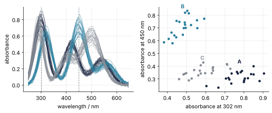
A 302 nm: 0.60 to 0.90  450 nm: 0.23 to 0.40
B 302 nm: 0.38 to 0.59  450 nm: 0.58 to 0.83
C 302 nm: 0.46 to 0.73  450 nm: 0.29 to 0.43
The spectra overlap everywhere except around 450 nm, where B absorbs strongly. That one wavelength sets B apart in the scatter, but A and C share the range from 0.29 to 0.40 at 450 nm and from 0.60 to 0.73 at 302 nm, and their clouds run into each other. Another pair would separate another pair of compounds, and there are 4,950 pairs to choose from. PCA does not choose: it builds each new axis from all 100 columns at once.
Step 2: Standardize the columns with StandardScaler
PCA looks for the directions in which the samples spread most, so whatever sets the size of a column's spread also sets its weight. Standardizing gives every column the same say. It does two things to each column: it subtracts the column's mean (centering) and divides by the column's standard deviation (scaling), so that every column ends up with mean 0 and standard deviation 1.
scaler = StandardScaler()
Z = scaler.fit_transform(X)

print("wavelength   mean_    scale_   |  mean after  sd after")
for w in [302, 450, 562, 646]:
    j = np.flatnonzero(wavelength == w)[0]
    print(f"{w:6.0f} nm  {scaler.mean_[j]:7.3f}  {scaler.scale_[j]:7.4f}   |  {Z[:, j].mean():10.1e}  {Z[:, j].std():8.3f}")
wavelength   mean_    scale_   |  mean after  sd after
   302 nm    0.614   0.1403   |     2.0e-15     1.000
   450 nm    0.460   0.1838   |     2.0e-16     1.000
   562 nm    0.228   0.0405   |     1.0e-16     1.000
   646 nm    0.007   0.0146   |     1.3e-16     1.000
fit_transform learns the means and standard deviations from X and applies them in one call; what it learned sits in the attributes with a trailing underscore, mean_ and scale_. That is the pattern of every scikit-learn estimator, explained in Classification with scikit-learn: telling two populations apart.
Before scaling, the column at 302 nm spreads 0.14 absorbance units from sample to sample, and the column at 646 nm, where nothing absorbs, spreads 0.015, the noise. After scaling both spread by exactly 1. The weak band at 562 nm now counts as much as the strong one at 302 nm, which is the point, and the empty wavelengths count as much as the bands, which is the cost.
So the rule depends on what your columns are. When they carry different units or very different sizes, concentrations next to temperatures or gene counts, standardize, always. When they share one unit and one noise level, like the columns of a spectrum, center only: the usual choice in spectroscopy, because it keeps the strong bands strong and the empty wavelengths quiet. Skip the scaler and pass X to PCA, which centers by itself. This tutorial standardizes because that carries over to every matrix, and Steps 4 and 5 show what centering only gives here.
Step 3: Fit PCA and read the explained variance
First what PCA computes. A direction is a unit vector w of 100 weights, one per wavelength. Projecting a sample onto it is the weighted sum Z[i] @ w, one number per sample, and the variance along w is the variance of those 60 numbers. The total variance is the sum of the 100 column variances, which after standardizing is exactly 100. PCA finds the direction of largest variance, the first principal component (PC1), then the direction of largest variance perpendicular to it (PC2, so that w1 @ w2 is zero up to rounding), and so on, at most 60 of them, because 60 samples span no more than 60 directions. Their variances add up to the total, and explained_variance_ratio_ is each one's share. The linear algebra that finds them is done for you.
pca = PCA(svd_solver="full").fit(Z)                      # exact; on large data the default may pick a randomized solver
ratio = pca.explained_variance_ratio_

print("share of variance / %:", np.round(100 * ratio[:6], 1))
print("cumulative / %:       ", np.round(100 * np.cumsum(ratio[:6]), 1))

proj = Z @ pca.components_[0]                            # the 60 projections onto PC1
print(f"PC1 by the definition: {proj.var() / Z.var(axis=0).sum():.4f}   scikit-learn: {ratio[0]:.4f}")
share of variance / %: [60.7 23.   7.5  1.7  1.4  0.9]
cumulative / %:        [60.7 83.7 91.2 92.8 94.3 95.1]
PC1 by the definition: 0.6071   scikit-learn: 0.6071
The hand check gives 0.6071, as scikit-learn does. Plotted against the component number, the shares drop off a cliff:
k = np.arange(1, 11)
fig, ax = plt.subplots(figsize=(7, 3.4))
ax.plot(k, 100 * np.cumsum(ratio[:10]), color=INK, lw=1.2, alpha=0.6)
ax.text(10, 100 * ratio[:10].sum() - 7, "cumulative", color=INK, alpha=0.8, ha="right")
ax.plot(k, 100 * ratio[:10], "o", ms=6, color=INK)
for i in range(3):
    ax.text(k[i] + 0.25, 100 * ratio[i], f"{100 * ratio[i]:.1f} %", va="center")
ax.axhline(100 * ratio[3], color=MUTED, lw=1, ls="--")
ax.text(10, 100 * ratio[3] + 3, "noise floor", color=MUTED, ha="right")
ax.set(xlabel="principal component", ylabel="share of variance / %", xticks=k, ylim=(0, 100))
plt.show()
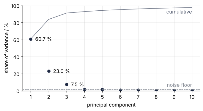
PC1 takes 60.7 %, PC2 23.0 %, PC3 7.5 %, and from PC4 on every component holds under 2 %, a flat floor of noise. The rule: keep the components above the floor, at the elbow of this plot, not a fixed percentage. Here that is three. PCA(n_components=3) keeps them, and PCA(0.95, svd_solver="full") keeps as many as reach 95 %, which on this data is six, three of them noise. The plot of Step 4 uses two because those two separate the compounds; the third is about something else.
Step 4: Plot the scores and color them by compound
The scores are each sample's coordinates along the components, the projections of Step 3 for every component at once. transform computes them:
S = pca.transform(Z)
print(S.shape, np.allclose(S, Z @ pca.components_.T))
(60, 60) True
Plot PC1 against PC2 and color the dots by compound. The colors come from the labels after the fit; PCA never saw them.
def label(i):
    return f"PC{i + 1} score, {100 * ratio[i]:.0f} % of variance"

fig, ax = plt.subplots(figsize=(5.5, 4.5))
for name, color in COMPOUNDS.items():
    rows = compound == name
    ax.plot(S[rows, 0], S[rows, 1], "o", ms=6, color=color)
    ax.text(S[rows, 0].mean(), S[rows, 1].max() + 0.8, name, color=color, ha="center", fontweight="bold")
ax.set(xlabel=label(0), ylabel=label(1), aspect="equal")
plt.show()

for name in COMPOUNDS:
    rows = compound == name
    print(f"{name}: center PC1 {S[rows, 0].mean():+6.2f}   PC2 {S[rows, 1].mean():+6.2f}")
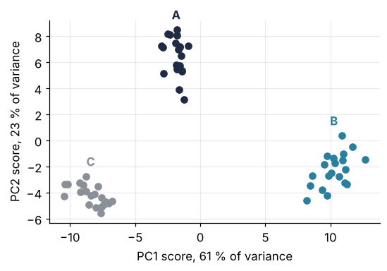
A: center PC1  -1.85   PC2  +6.48
B: center PC1 +10.26   PC2  -2.28
C: center PC1  -8.41   PC2  -4.20
Three clusters with clear space between them. PC1 sets B (center at +10.3) apart from C (−8.4), with A in the middle, and PC2 lifts A (+6.5) above both. The third component is not a compound. Its scores follow the concentration factor that scales each simulated spectrum:
for i in range(4):
    print(f"PC{i + 1}: correlation with concentration r = {np.corrcoef(S[:, i], conc)[0, 1]:+.2f}")
PC1: correlation with concentration r = -0.02
PC2: correlation with concentration r = +0.08
PC3: correlation with concentration r = +0.86
PC4: correlation with concentration r = +0.10
A correlation coefficient r of +1 would mean the scores rise in lockstep with the concentration and 0 that they ignore it; PC3 has 0.86, the others at most 0.10. A component can be a physical effect without being a substance.
A new sample goes through the fitted scaler and the fitted PCA, never a refit, so that it lands on the same map. Three fresh spectra, one per compound:
X_new, compound_new, _ = make_spectra(n_per=1, seed=SEED + 2)
for name, s in zip(compound_new, pca.transform(scaler.transform(X_new))):
    print(f"{name}: PC1 {s[0]:+6.2f}   PC2 {s[1]:+6.2f}")
A: PC1  -1.58   PC2  +8.38
B: PC1 +11.09   PC2  -4.41
C: PC1  -9.13   PC2  -4.78
Each lands in its own cluster. Both transform calls want a 2-D array, so a single spectrum x goes in as x.reshape(1, -1).
Last, the comparison Step 2 promised: centering only.
pca_c = PCA(svd_solver="full").fit(X)
S_c = pca_c.transform(X)
ratio_c = pca_c.explained_variance_ratio_
print(f"centered only: PC1 {100 * ratio_c[0]:.1f} %, PC2 {100 * ratio_c[1]:.1f} %, "
      f"together {100 * ratio_c[:2].sum():.1f} % (standardized: {100 * ratio[:2].sum():.1f} %)")
for name in COMPOUNDS:
    rows = compound == name
    print(f"{name}: PC1 {S_c[rows, 0].mean():+.2f} ± {S_c[rows, 0].std():.2f}   PC2 {S_c[rows, 1].mean():+.2f} ± {S_c[rows, 1].std():.2f}")
centered only: PC1 58.9 %, PC2 32.9 %, together 91.7 % (standardized: 83.7 %)
A: PC1 +0.19 ± 0.11   PC2 -1.00 ± 0.10
B: PC1 -1.26 ± 0.08   PC2 +0.38 ± 0.14
C: PC1 +1.07 ± 0.16   PC2 +0.62 ± 0.12
The cluster centers lie about 2 apart in the plane, in absorbance units now rather than standard deviations, and no cluster spreads by more than 0.16, so the three compounds separate as cleanly as before. The two components now carry 91.7 % instead of 83.7 %, and that is not a better fit. The total is a different number, since the empty wavelengths add almost nothing to it once they are no longer scaled up, so shares compare only within one preprocessing.
Step 5: Read the loadings and build the final figure
The loadings are the rows of pca.components_, one weight per wavelength. They are the unit vectors w of Step 3:
print(pca.components_.shape, f"length of row 0: {np.linalg.norm(pca.components_[0]):.6f}")

print("\nwavelength   mean A   mean B   mean C  |  PC1 loading  PC2 loading")
for w in [290, 306, 322, 402, 414, 450, 478, 502, 622]:
    j = np.flatnonzero(wavelength == w)[0]
    m = [X[compound == name, j].mean() for name in COMPOUNDS]
    print(f"{w:6d} nm  {m[0]:7.2f}  {m[1]:7.2f}  {m[2]:7.2f}  |  {pca.components_[0, j]:+11.3f}  {pca.components_[1, j]:+11.3f}")
(60, 100) length of row 0: 1.000000

wavelength   mean A   mean B   mean C  |  PC1 loading  PC2 loading
   290 nm     0.72     0.30     0.69  |       -0.112       +0.089
   306 nm     0.76     0.53     0.51  |       -0.011       +0.194
   322 nm     0.53     0.61     0.21  |       +0.108       +0.103
   402 nm     0.40     0.20     0.34  |       -0.091       +0.132
   414 nm     0.48     0.34     0.34  |       -0.015       +0.189
   450 nm     0.31     0.71     0.36  |       +0.110       -0.078
   478 nm     0.14     0.48     0.54  |       +0.004       -0.192
   502 nm     0.18     0.23     0.61  |       -0.089       -0.138
   622 nm     0.02     0.06     0.00  |       +0.112       -0.003
Put them under the mean spectra, on one wavelength axis:
means = {name: X[compound == name].mean(axis=0) for name in COMPOUNDS}

fig, axes = plt.subplots(3, 1, figsize=(7, 6.2), sharex=True)
for (name, color), w in zip(COMPOUNDS.items(), [302, 450, 498]):   # nm, a band where each curve stands alone
    axes[0].plot(wavelength, means[name], color=color)
    j = np.flatnonzero(wavelength == w)[0]
    axes[0].text(w + 8, means[name][j] + 0.02, name, color=color, fontweight="bold", va="bottom")
axes[0].set(ylabel="absorbance", ylim=(-0.03, 0.95))
for i, ax in enumerate(axes[1:]):
    ax.plot(wavelength, pca.components_[i], color=ACCENT)
    ax.axhline(0, color=MUTED, lw=1)
    ax.set(ylabel=f"PC{i + 1} loading")
axes[2].set(xlabel="wavelength / nm")
fig.tight_layout()
plt.show()
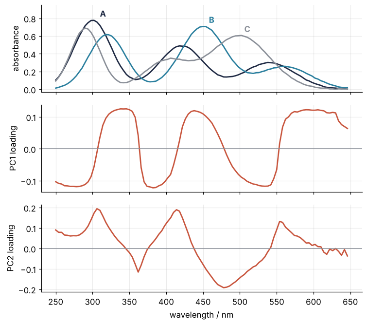
The PC1 loading does not look like a band at all. It runs in flat plateaus of about +0.11 wherever B absorbs more than C (322, 450, 622 nm) and about −0.1 wherever C absorbs more (290, 402, 502 nm). So a high PC1 score means B-like and a low one C-like, as in the scores plot. PC2 rises at A's strong bands, 306 and 414 nm, and falls to −0.19 at 478 nm, where B and C absorb and A hardly does, so A sits at the top.
The plateaus come from the standardizing. Every column has standard deviation 1, so a column earns weight not by being large but by rising and falling with the scores: a standardized loading is the correlation r between its column and the scores, divided by the spread of the scores. Compare 450 and 622 nm, beside the centered-only fit of Step 4:
sd1 = S[:, 0].std()
for w in [450, 622]:
    j = np.flatnonzero(wavelength == w)[0]
    r = np.corrcoef(Z[:, j], S[:, 0])[0, 1]
    print(f"{w} nm: r = {r:+.2f}, r / {sd1:.2f} = {r / sd1:+.3f}, PC1 loading {pca.components_[0, j]:+.3f}"
          f"   centered only {pca_c.components_[0, j]:+.3f}")
difference = means["B"] - means["C"]
print(f"centered-only PC1 loading against mean B minus mean C: r = {np.corrcoef(pca_c.components_[0], difference)[0, 1]:+.2f}")
450 nm: r = +0.85, r / 7.79 = +0.110, PC1 loading +0.110   centered only -0.158
622 nm: r = +0.87, r / 7.79 = +0.112, PC1 loading +0.112   centered only -0.022
centered-only PC1 loading against mean B minus mean C: r = -0.99
B and C differ by 0.06 in absorbance at 622 nm and by 0.35 at 450 nm, yet r is 0.87 and 0.85 and both loadings sit at 0.11. A standardized loading says where the samples differ reliably, not by how much. Centered only, 622 nm drops to a seventh of 450 nm, and the PC1 loading follows the difference of the mean spectra of B and C (r = −0.99): band shapes, quiet where nothing absorbs. Its sign came out opposite, which changes nothing: flip a row of components_ and its scores flip too, mirroring the plot.
The final figure puts the scores beside the two loadings:
fig = plt.figure(figsize=(8, 4.2))
gs = fig.add_gridspec(2, 2, width_ratios=[1, 1.15])
ax_s = fig.add_subplot(gs[:, 0])
for name, color in COMPOUNDS.items():
    rows = compound == name
    ax_s.plot(S[rows, 0], S[rows, 1], "o", ms=6, color=color)
    ax_s.text(S[rows, 0].mean(), S[rows, 1].max() + 0.8, name, color=color, ha="center", fontweight="bold")
ax_s.set(xlabel=label(0), ylabel=label(1))
ax_top = fig.add_subplot(gs[0, 1])
ax_bot = fig.add_subplot(gs[1, 1], sharex=ax_top)
for i, ax in enumerate([ax_top, ax_bot]):
    ax.plot(wavelength, pca.components_[i], color=ACCENT)
    ax.axhline(0, color=MUTED, lw=1)
    ax.set(ylabel=f"PC{i + 1} loading")
ax_top.tick_params(labelbottom=False)
ax_bot.set(xlabel="wavelength / nm")
fig.tight_layout()
plt.show()
Pitfalls
Not scaling variables in different units. Add one column of another kind to the spectra, say the mass of each sample in mg, run PCA without the scaler, and the first component is that column:
mass = np.random.default_rng(SEED + 1).normal(50, 5, size=len(X))    # mg, its own generator
X_mass = np.column_stack([X, mass])

raw = PCA(svd_solver="full").fit(X_mass)
std = PCA(svd_solver="full").fit(StandardScaler().fit_transform(X_mass))
print(f"without scaler: PC1 {100 * raw.explained_variance_ratio_[0]:.1f} %, loading on mass {raw.components_[0, -1]:+.3f}")
print(f"with scaler:    PC1 to PC3", np.round(100 * std.explained_variance_ratio_[:3], 1), "%")
print(f"variance of the mass column {mass.var():.1f} mg², of all 100 wavelengths together {X.var(axis=0).sum():.2f}")
without scaler: PC1 93.7 %, loading on mass +1.000
with scaler:    PC1 to PC3 [60.1 22.8  7.4] %
variance of the mass column 23.5 mg², of all 100 wavelengths together 1.59
PC1 claims 93.7 % of the variance with a loading of 1.000 on the mass and nothing left for the 100 wavelengths. Variance carries the unit squared, and a mass spread of 23.5 mg² outweighs the 1.59 that all the absorbances add up to. With the scaler, as Step 2 prescribes for mixed units, the shares return to 60.1, 22.8, and 7.4 %. PCA subtracts the column means itself and keeps them in pca.mean_, so with this class you cannot forget to center. You can forget to scale.
Reading a component as a compound. The PC2 loading peaks at A's bands, and it is tempting to call it "the spectrum of A". It is not a spectrum: it dips below zero, and components are perpendicular directions ordered by variance, while real spectra overlap and are never negative. Read a loading as the place where the samples differ, next to the mean spectra as in Step 5, with an arbitrary sign. For the pure spectra of the substances in a mixture you need a method built for non-negative parts, such as NMF in scikit-learn or MCR-ALS in chemometrics.
Expecting PCA to find your groups. PCA ranks directions by variance, not by your labels, and the largest variation need not be the one you care about. Raise the sample-to-sample concentration spread from 8 % to 35 %:
X35, compound35, conc35 = make_spectra(conc_sd=0.35)
Z35 = StandardScaler().fit_transform(X35)
pca35 = PCA(svd_solver="full").fit(Z35)
S35 = pca35.transform(Z35)
print("shares / %:", np.round(100 * pca35.explained_variance_ratio_[:3], 1),
      f"  PC1 against concentration r = {np.corrcoef(S35[:, 0], conc35)[0, 1]:+.2f}")
print("     sd of PC1 within compound    PC2 at 35 %")
print("        at 8 %      at 35 %")
for name in COMPOUNDS:
    s8, s35 = S[compound == name], S35[compound35 == name]
    print(f"  {name}    {s8[:, 0].std():5.2f}       {s35[:, 0].std():5.2f}      {s35[:, 1].mean():+5.1f} ± {s35[:, 1].std():.1f}")
shares / %: [43.1 40.5 11.1]   PC1 against concentration r = +0.98
     sd of PC1 within compound    PC2 at 35 %
        at 8 %      at 35 %
  A     0.55        5.52       -1.2 ± 1.0
  B     1.11        6.47       +7.7 ± 2.0
  C     1.07        7.29       -6.6 ± 3.5
PC1 now follows the concentration (r = 0.98), and the two first components carry 43.1 % and 40.5 %. The standard deviation of the PC1 scores within one compound, in the same dimensionless units as the score axes, grows from between 0.55 and 1.11 to between 5.52 and 7.29, so along PC1 the three compounds lie on top of each other. They separate along PC2 alone, B cleanly, A and C only in part, because C spreads by 3.5 there. Look beyond the first two components, remove a known nuisance before the fit (the first Variation), and when the labels are what you want, use a supervised classifier as in Classification with scikit-learn.
Variations
- Normalize spectra first. Divide each row of
Xby its sum before the scaler,X / X.sum(axis=1, keepdims=True), to remove the concentration, and watch PC3 sink from 7.5 % into the noise floor. - A pipeline for new samples.
make_pipeline(StandardScaler(), PCA(2))fromsklearn.pipelinekeeps the scaler and the PCA together, so a new sample cannot skip one of them. - Denoise with a few components. With
n_components=3,pca.inverse_transform(pca.transform(Z))rebuilds every spectrum from three components and drops the noise floor;scaler.inverse_transformturns the result back into absorbance. - Too many rows for memory.
IncrementalPCAfromsklearn.decompositionfits batch by batch withpartial_fit, for data that does not fit in memory at once.
Cheat sheet
scaler = StandardScaler()                     # skip both lines for same-unit spectra and use Z = X
Z = scaler.fit_transform(X)                   # X: rows samples, columns variables
pca = PCA(n_components=3, svd_solver="full")  # int, or a fraction such as 0.95 of the variance
pca.fit(Z)                                    # centers by itself, never scales
pca.explained_variance_ratio_                 # share of each component; np.cumsum for the running total
S = pca.transform(Z)                          # scores: (n_samples, n_components)
pca.components_                               # loadings: one row per component, unit length, sign arbitrary
S_new = pca.transform(scaler.transform(x_new))  # new samples, 2-D; without the scaler pca.transform(x_new)
Z_back = pca.inverse_transform(S)             # reconstruction from the kept components
Further reading
- The scikit-learn User Guide, Decomposing signals in components, the section on PCA, and the
PCAreference with the list of solvers. - Jolliffe, Principal Component Analysis (Springer, 2nd edition 2002), for the theory and for the choice between centering and standardizing.
- Bro and Smilde, "Principal component analysis", Analytical Methods 6, 2812 (2014), open access, from chemometrics; its section on preprocessing ties scaling to variables in different units.
- James, Witten, Hastie, Tibshirani, and Taylor, An Introduction to Statistical Learning, with Applications in Python (Springer, 2023), chapter 12.
- Related tutorials on this site: Classification with scikit-learn: telling two populations apart for the estimator pattern and pipelines; Eigenvalues with numpy.linalg: normal modes of coupled oscillators, for the linear algebra underneath, since the components are the eigenvectors of a matrix built from the data; seaborn from the ground up: three cell lines in four views for comparing three groups; planned: the same PCA in Julia with MultivariateStats.jl.
- Download the notebook. It was executed with the library versions in the header.