seaborn from the ground up: three cell lines in four views
Afterwards you can compare groups and distributions from a DataFrame with seaborn, choose between box, violin, strip, and ECDF plots, and style them for print.
- Topic
- Visualization
- Field
- Biology, Chemistry
- Prerequisites
- none beyond Python basics
- Libraries
matplotlib 3.11.2numpy 2.5.3pandas 3.0.6seaborn 0.13.2
py-seaborn.ipynb, executed with the versions above. The download needs a free account
Run it yourself. In a terminal, this installs exactly the versions above:
pip install numpy==2.5.3 pandas==3.0.6 seaborn==0.13.2 matplotlib==3.11.2 jupyterlabThe problem: is line C larger, or only more variable?
A lab has measured the projected area of 200 cells in each of three cell lines, A, B, and C, from microscope images, and wants to know whether line C is larger than line B. The first figure everyone draws is a bar chart of the means, and seaborn draws it in one call: 123, 154, and 159 µm². The thin line on each bar is seaborn's default error bar, a 95 % confidence interval of the mean found by resampling the cells 1,000 times, which is called the bootstrap. For B it runs from 150 to 159 µm², for C from 150 to 168 µm². The chart invites a verdict: B and C are about the same, C perhaps a little larger.
That is half right, and it hides the important half. C is not larger than B in the middle: it has the same median to within 1 µm², 150.6 against B's 151.5 µm², and more than twice the spread, an interquartile range of 86 µm² against 41 µm². Of C's cells, 23.5 % lie above 200 µm² (B: 8 %) and 19.5 % below 100 µm² (B: 2 %). C's slightly higher mean comes from its long right tail, not from typical cells being larger. A chemist with particle diameters from three synthesis batches meets the same figure. How such areas come out of an image is the subject of Counting cells with scipy.ndimage; here they are generated.
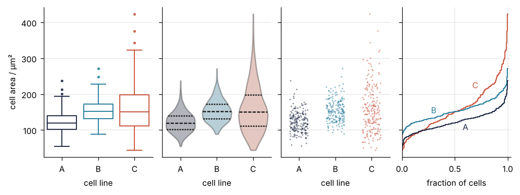
This is where we end up: the same 600 cells at the width of a two-column journal page, in four views that each answer a different question. Step 6 draws it with four seaborn calls, first as a 2 × 2 grid for the screen, then as this row, inside a block that switches Matplotlib to print settings.
Setup
Matplotlib looks up the default look of every figure, from font size to which frame lines show, in one dictionary, plt.rcParams, under keys such as "font.size". The style block below is a plt.rcParams.update({...}) call: it changes those defaults for every later figure. with plt.rc_context({...}): changes them only for the figures made inside the with block and puts the old values back at its end. Importing seaborn changes none of these settings.
The areas are log-normal: their logarithm is normally distributed, so they are positive and skewed to the right, as cell areas are. sigma is the typical factor of variation: 0.2 means a factor of about 1.2 up or down around the median, 0.4 about 1.5. B and C are drawn with the same median. The data arrive as wide, a pandas DataFrame, a table with named columns, one per cell line, as a spreadsheet has them (more in pandas from the ground up).
import warnings
from pathlib import Path

import numpy as np
import pandas as pd
import matplotlib.pyplot as plt
import seaborn as sns

# seaborn 0.13.2 still passes vert= to Matplotlib's boxplot; harmless until Matplotlib 3.13
warnings.filterwarnings("ignore", message="vert: bool was deprecated")

plt.rcParams.update({
    "figure.figsize": (7, 3.6), "figure.dpi": 110,
    "axes.spines.top": False, "axes.spines.right": False,
    "axes.grid": True, "grid.alpha": 0.25,
    "font.size": 11, "lines.linewidth": 1.8,
})
INK, ACCENT, SECOND, MUTED = "#1f2a44", "#c8553d", "#2a7f9e", "#8a8f98"
LINES = {"A": INK, "B": SECOND, "C": ACCENT}   # one color per cell line, in every figure

SEED = 781
rng = np.random.default_rng(SEED)
np.random.seed(SEED)   # seaborn draws the strip plot's jitter from NumPy's global generator

n = 200
wide = pd.DataFrame({
    "A": rng.lognormal(np.log(120), 0.25, n),   # median 120 µm², the reference
    "B": rng.lognormal(np.log(150), 0.20, n),   # shifted up
    "C": rng.lognormal(np.log(150), 0.40, n),   # shifted like B, twice as wide
})
Path("assets").mkdir(exist_ok=True)

print(wide.shape)
print(wide.head(3).round(1))
(200, 3)
       A      B      C
0  161.1  188.1   78.6
1  140.0  173.0  252.4
2  105.7  147.0   51.2
Step 1: Turn the spreadsheet into long format with melt
seaborn wants its data in long format: one row per cell, with one column naming the line and one holding the area. Then any column can be assigned to x, y, or hue by its name. A table with one column per line is wide format, and melt turns it into long:
long = wide.melt(var_name="line", value_name="area")
print(wide.shape, "->", long.shape)
print(long.head(3).round(1))
(200, 3) -> (600, 2)
  line   area
0    A  161.1
1    A  140.0
2    A  105.7
Three columns of 200 became two columns of 600. Now the bar chart. fig, ax = plt.subplots() makes one figure with one set of axes, and every seaborn call in this tutorial draws onto the axes it is handed through ax= (more in Matplotlib from the ground up):
fig, ax = plt.subplots()
sns.barplot(long, x="line", y="area", hue="line", palette=LINES, legend=False,
            seed=SEED, saturation=1, alpha=0.45, err_kws={"color": INK, "linewidth": 1.5}, ax=ax)
ax.set(xlabel="cell line", ylabel="mean cell area / µm²")
plt.show()

means = long.groupby("line")["area"].mean()
for line, mean in means.items():
    print(f"{line}: mean {mean:5.1f} µm²")
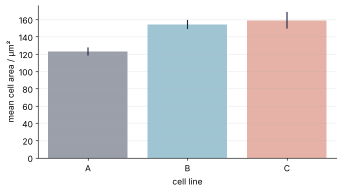
A: mean 122.7 µm²
B: mean 153.9 µm²
C: mean 158.5 µm²
hue assigns colors from a column. Here it names the same column as x, because we want one color per line, and seaborn 0.13 warns that a palette without hue is deprecated and will stop working in 0.14. legend=False drops the legend that would repeat the x labels, and the Variations show hue doing work of its own. seed=SEED fixes the resampling, so the interval is the same on every run, and groupby("line") computes the mean per line. The bars stand at 123, 154, and 159 µm², and the intervals of B and C overlap from 150 to 159 µm².
Step 2: Draw the histograms with hue, stat, and common_norm
Here hue does something x cannot: one call draws three histograms on one set of axes, told apart only by color.
fig, ax = plt.subplots()
sns.histplot(long, x="area", hue="line", palette=LINES, binwidth=10, element="step",
             fill=False, stat="density", common_norm=False, ax=ax)
ax.set(xlabel="cell area / µm²", ylabel="density / µm⁻²")
sns.move_legend(ax, "upper right", frameon=False, title="cell line")
plt.show()
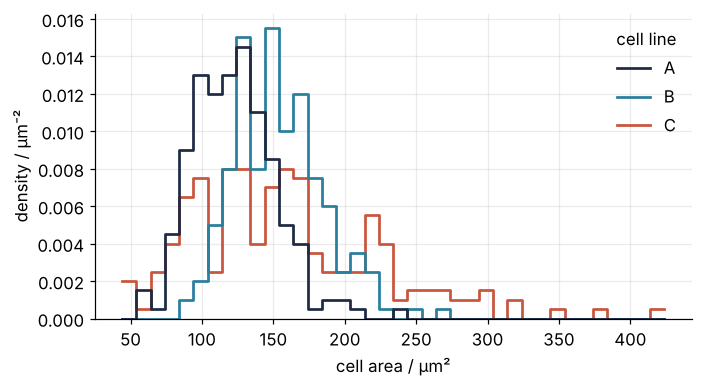
With stat="density" the height of a bar times its width, 10 µm², is the fraction of the line's cells in that bar. The y axis is therefore in µm⁻², and each histogram has an area of 1. The alternatives are stat="count", "percent", and "probability".
common_norm decides what "each" means there. The default, True, divides by all cells of all lines together, so each line gets an area equal to its share of the cells. With 200 cells per line that is a third and only scales the curves; it matters when the groups are unequal. The cell below keeps only the first 50 cells of C, draws the histogram both ways, and adds up height times width of the bars seaborn drew for each line:
Show code
uneven = pd.concat([long[long["line"] != "C"], long[long["line"] == "C"].head(50)])
for common_norm in [True, False]:
    fig, ax = plt.subplots()
    sns.histplot(uneven, x="area", hue="line", binwidth=10, stat="density",
                 common_norm=common_norm, ax=ax)
    plt.close(fig)
    # seaborn adds the bars of the last line first
    areas = {line: sum(bar.get_height() * bar.get_width() for bar in bars)
             for line, bars in zip("ABC", ax.containers[::-1])}
    print(f"common_norm={common_norm!s:5}  " + "  ".join(f"{k}: {v:.3f}" for k, v in areas.items()))
common_norm=True   A: 0.444  B: 0.444  C: 0.111
common_norm=False  A: 1.000  B: 1.000  C: 1.000
With the default, the 50 cells of C get a ninth of the area and draw a flatter curve, though their shape is the same. Compare shapes with common_norm=False. Even then, three overlapping outlines are hard to read: C is lower and broader, and that is about all the histogram says.
Step 3: Compare medians and quartiles with a box plot, and show every cell with a strip plot
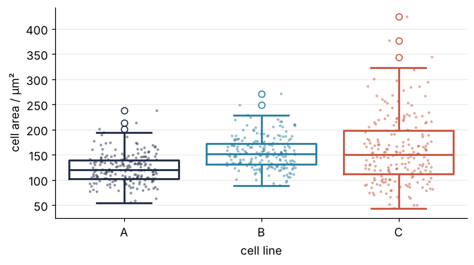
A box plot draws the middle half of the cells as a box, from the first to the third quartile, and the median as a line across it. The whiskers reach to the farthest cell within 1.5 times the interquartile range beyond the box (whis), and the circles are cells beyond them, not errors. A strip plot on top shows every cell, each shifted sideways by a small random amount, the jitter, so that dots do not pile up.
fig, ax = plt.subplots()
sns.boxplot(long, x="line", y="area", hue="line", palette=LINES, legend=False,
            fill=False, ax=ax)
sns.stripplot(long, x="line", y="area", hue="line", palette=LINES, legend=False,
              size=2.5, alpha=0.5, jitter=0.25, ax=ax)
ax.set(xlabel="cell line", ylabel="cell area / µm²")
plt.show()

quartiles = long.groupby("line")["area"].quantile([0.25, 0.5, 0.75]).unstack()
quartiles["IQR"] = quartiles[0.75] - quartiles[0.25]
print(quartiles.round(1))
       0.25    0.5   0.75   IQR
line
A     102.6  119.7  140.0  37.4
B     131.4  151.5  172.0  40.6
C     111.7  150.6  197.9  86.2
The printed quartiles are the box edges, and the 0.5 column holds the medians. B's box is A's moved up by about 30 µm². C's median sits at B's, 150.6 against 151.5 µm², and its box is twice as tall, with an interquartile range of 86 µm² against 41 µm².
Step 4: Show the shape with a violin plot
A box reduces each line to five numbers; a violin shows the whole shape. Each cell contributes a small bell-shaped bump centered at its area, and the bumps are added up into one smooth curve, a kernel density estimate. The width of each bump is the bandwidth, which seaborn chooses from the data and bw_adjust scales (2 is smoother, 0.5 bumpier). The violin is that curve drawn on both sides of a vertical line.
fig, ax = plt.subplots()
sns.violinplot(long, x="line", y="area", hue="line", palette=LINES, legend=False,
               inner="quart", alpha=0.35, ax=ax)
sns.stripplot(long, x="line", y="area", hue="line", palette=LINES, legend=False,
              size=2.5, alpha=0.5, jitter=0.25, ax=ax)
ax.axhline(0, color=MUTED, lw=1)
ax.set(xlabel="cell line", ylabel="cell area / µm²")
plt.show()
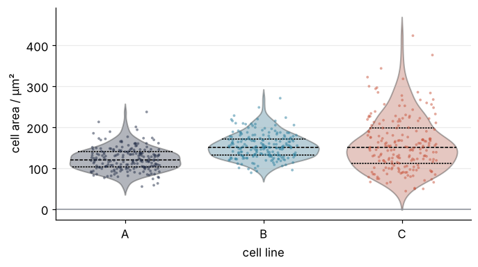
The longer dashes inside each violin mark the median and the shorter dashes the quartiles of Step 3. All three lines are skewed to the right, and C's tail reaches past 400 µm². At the bottom, C's violin runs below its smallest cell, down to the zero line; the pitfalls say why, and how far past zero it goes.
Step 5: Separate shift from spread with the ECDF
The ECDF, the empirical cumulative distribution function, gives for each area the fraction of the line's cells at or below it. Each cell lifts its line's curve by 1/200 at its own area, so there are no bins and no bandwidth to choose.
fig, ax = plt.subplots()
sns.ecdfplot(long, x="area", hue="line", palette=LINES, legend=False, ax=ax)
for x in [100, 200]:
    ax.axvline(x, color=MUTED, lw=1, ls="--")
for line, f, dx in [("A", 0.6, -8), ("B", 0.3, 8), ("C", 0.85, 8)]:   # where each curve is alone
    ax.text(wide[line].quantile(f) + dx, f, line, color=LINES[line], va="center",
            ha="right" if dx < 0 else "left")
ax.set(xlabel="cell area / µm²", ylabel="fraction of cells", ylim=(0, 1.03))
plt.show()

for line, area in wide.items():
    print(f"{line}: below 100 µm² {100 * (area < 100).mean():4.1f} %   above 200 µm² {100 * (area > 200).mean():4.1f} %"
          f"   median {area.median():5.1f} µm²")
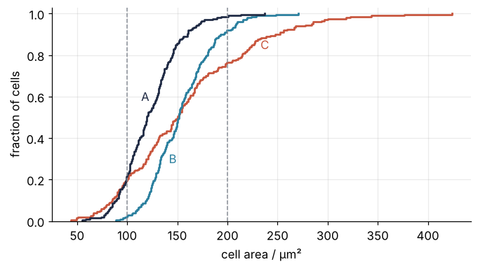
A: below 100 µm² 22.0 %   above 200 µm²  1.5 %   median 119.7 µm²
B: below 100 µm²  2.0 %   above 200 µm²  8.0 %   median 151.5 µm²
C: below 100 µm² 19.5 %   above 200 µm² 23.5 %   median 150.6 µm²
Read one number first: B's curve passes 0.5 at its median, 151.5 µm². B's curve is A's moved right by about 30 µm². C's curve crosses B's at 0.5, the shared median, and rises more slowly, so C's cells spread further on both sides: 19.5 % of them lie below 100 µm² against 2 % of B's, and 23.5 % above 200 µm² against 8 %. Every number in the second paragraph of this page can be read off this one figure.
Step 6: Put the four views side by side at journal size
The figure for print is one row of four panels, 17.8 cm wide for a two-column journal page, with 8 pt text. That row is too small to read on a phone, so this web page first draws the same views as a 2 × 2 grid, 7 by 6 inches (figsize is in inches). Both come from one function that draws the four views onto any four Axes. The violins get cut=0, which ends them at the smallest and largest cell, where Step 4's ran past the data; the pitfalls say why. The three categorical calls share one dict, the ECDF gets y="area" so that sharey=True can give all four panels one area axis, and layout="constrained" makes Matplotlib fit the labels inside the figure.
CAT = dict(x="line", y="area", hue="line", palette=LINES, legend=False)

def four_views(axs, dot):
    box, violin, strip, ecdf = axs
    sns.boxplot(long, **CAT, fill=False, fliersize=dot, ax=box)
    sns.violinplot(long, **CAT, inner="quart", cut=0, alpha=0.35, ax=violin)
    sns.stripplot(long, **CAT, size=dot, alpha=0.5, jitter=0.25, ax=strip)
    sns.ecdfplot(long, y="area", hue="line", palette=LINES, legend=False, ax=ecdf)
    for line, f, dy in [("A", 0.6, -8), ("B", 0.3, 8)]:   # as in Step 5, turned
        ecdf.text(f, wide[line].quantile(f) + dy, line, color=LINES[line], ha="center",
                  va="bottom" if dy > 0 else "top")
    ecdf.text(0.72, wide["C"].quantile(0.85), "C", color=LINES["C"], ha="right", va="center")
    for ax in axs:
        left = ax.get_subplotspec().is_first_col()   # one area label per row
        ax.set(xlabel="cell line", ylabel="cell area / µm²" if left else "")
    ecdf.set(xlabel="fraction of cells", xlim=(0, 1.03), xticks=[0, 0.5, 1])

fig, axs = plt.subplots(2, 2, figsize=(7, 6), sharey=True, layout="constrained")
four_views(axs.ravel(), dot=2.5)
plt.show()
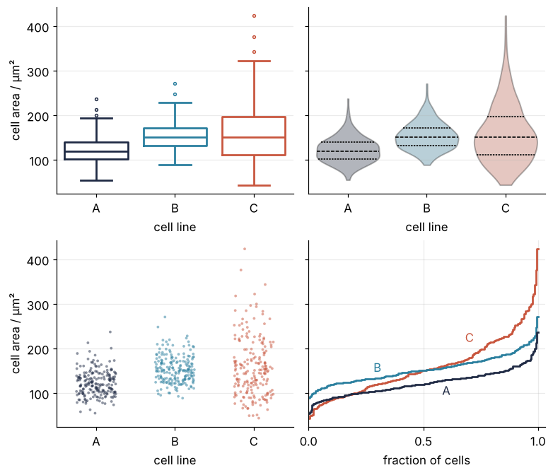
The turned ECDF has the fraction on the x axis: from an area on the y axis, read across to the curve and down to the fraction of cells below it.
For print, the settings are written out in PRINT and used with rc_context, so they hold only inside the block and the page figures keep the site style. Other rcParams keys can join it for another journal (where these numbers come from). The same function fills the row:
PRINT = {"font.size": 8, "lines.linewidth": 1.0, "axes.linewidth": 0.6,
         "xtick.major.width": 0.6, "ytick.major.width": 0.6}

with plt.rc_context(PRINT):
    fig, axs = plt.subplots(1, 4, figsize=(17.8 / 2.54, 6.5 / 2.54), sharey=True,
                            layout="constrained")
    four_views(axs, dot=1.5)
    fig.savefig("assets/four-views.pdf", metadata={"CreationDate": None})
    plt.close(fig)   # shown at the top of the page, at print size

w, h = fig.get_size_inches() * 2.54
print(f"assets/four-views.pdf: {w:.1f} x {h:.1f} cm")
assets/four-views.pdf: 17.8 x 6.5 cm
savefig keeps the size you asked for unless you pass bbox_inches="tight", which fits the file around what is drawn and changes its size. For a journal leave it out: the PDF keeps its 17.8 × 6.5 cm, and 8 pt text prints at 8 pt. The row is the figure at the top of this page. The box plot gives medians, quartiles, and outliers at a glance; the violin, the shape; the strip, every cell and how many there are; the ECDF, shift against spread and the fraction above any area, without bins or smoothing.
Pitfalls
A violin that claims cells of negative area. In Step 4, C's violin reaches below zero, although no cell is smaller than 44 µm². The cause is the bumps of Step 4: those of the smallest cells reach past them, and seaborn draws the curve out to cut=2 bandwidths beyond the extreme cells. So the lowest point of the violin is the smallest cell minus two bandwidths, and half the gap between them is the bandwidth seaborn chose. The cell below reads the lowest point of C's outline, which Matplotlib keeps as a list of points after drawing, with the default and with cut=0:
Show code
smallest = wide["C"].min()
bottom = {}
for cut in [2, 0]:
    fig, ax = plt.subplots()
    sns.violinplot(long, x="line", y="area", hue="line", legend=False, cut=cut, ax=ax)
    plt.close(fig)
    bottom[cut] = ax.collections[2].get_paths()[0].vertices[:, 1].min()   # the third violin is C
print(f"smallest cell of C:          {smallest:5.1f} µm²")
print(f"C's violin with cut=2 ends at {bottom[2]:5.1f} µm², {smallest - bottom[2]:.1f} µm² below it:"
      f" two bandwidths of {(smallest - bottom[2]) / 2:.1f} µm²")
print(f"C's violin with cut=0 ends at {bottom[0]:5.1f} µm²")
smallest cell of C:           44.0 µm²
C's violin with cut=2 ends at  -1.6 µm², 45.6 µm² below it: two bandwidths of 22.8 µm²
C's violin with cut=0 ends at  44.0 µm²
C's violin ends at -1.6 µm², 45.6 µm² below its smallest cell: two bandwidths of 22.8 µm². The fix is cut=0, which ends each violin at the extreme cells, with the strip on top so that the reader sees where the cells are.
sns.set_theme() throws away your style. It looks like a harmless first line of a plotting script, and it overwrites Matplotlib's settings with seaborn's own. The cell runs it inside plt.rc_context(), which with no dict changes nothing on entry and only puts every setting back at the end, so the later cells are untouched:
with plt.rc_context():
    before = dict(plt.rcParams)
    sns.set_theme()
    after = dict(plt.rcParams)
changed = [k for k in before if before[k] != after[k]]
print(f"{len(changed)} of {len(before)} settings changed, among them")
for k in ["font.size", "axes.facecolor", "axes.spines.top", "axes.spines.right"]:
    print(f"  {k:18s} {before[k]!s:>6} -> {after[k]!s}")
37 of 339 settings changed, among them
  font.size            11.0 -> 12.0
  axes.facecolor      white -> #EAEAF2
  axes.spines.top     False -> True
  axes.spines.right   False -> True
The font grows, the background turns gray, and the top and right frame lines come back, 37 settings changed by one call. Do not call it, or call it before your own rcParams.update, or pass your settings to it as rc=.
Cell lines stored as numbers. With line coded as 1, 2, and 3, hue treats it as a quantity: the colors run on a sequential palette from pale pink to dark purple, as for three doses of a drug, and line 3 looks like more of line 1. Store the lines as strings, or as pd.Categorical, pandas' column type for labels from a fixed set, or pass the palette as a dict keyed by the values, which also fixes the colors.
Variations
- A second factor. If your table has another column, say
treatmentwith treated and untreated cells, keepx="line"and givehuethat column: the box of each line splits in two, side by side. - One panel per line.
sns.displot(long, x="area", col="line", stat="density", binwidth=10)draws each line's histogram in its own panel with shared axes, which removes the overlap that made Step 2 hard to read. - A log axis.
log_scale=Trueinhistplotandecdfplot. On a log axis a log-normal distribution is symmetric about its median, so C's extra spread shows evenly on both sides of the median it shares with B. - Is the gap real? The largest vertical gap between two ECDFs is the Kolmogorov-Smirnov statistic, and
scipy.stats.ks_2samp(wide["B"], wide["C"])turns it into a test. scipy.stats from the ground up covers comparing two samples.
Cheat sheet
long = wide.melt(var_name="line", value_name="area")        # one row per observation
kw = dict(x="line", y="area", hue="line", palette=LINES, legend=False)   # palette without hue: deprecated
sns.barplot(long, **kw, seed=SEED, ax=ax)                    # mean, bootstrap 95 % CI; seed it
sns.histplot(long, x="area", hue="line", stat="density", common_norm=False, ax=ax)
sns.boxplot(long, **kw, fill=False, ax=ax)                 # whiskers: 1.5 IQR (whis)
sns.violinplot(long, **kw, cut=0, inner="quart", ax=ax)    # cut=0: no tail past the data
sns.stripplot(long, **kw, jitter=0.25, ax=ax)              # jitter uses np.random.seed
sns.ecdfplot(long, x="area", hue="line", ax=ax)            # no bins, no bandwidth
sns.move_legend(ax, "upper right", frameon=False)
with plt.rc_context(PRINT): fig, axs = plt.subplots(1, 4, sharey=True)   # print settings here only
Further reading
- The seaborn user guide: Data structures accepted by seaborn, Visualizing distributions of data, and Visualizing categorical data; the references for
boxplot,violinplot, andecdfplot. - Michael L. Waskom, "seaborn: statistical data visualization", Journal of Open Source Software 6(60), 3021 (2021).
- Claus O. Wilke, Fundamentals of Data Visualization (O'Reilly, 2019, free online), the chapters on distributions.
- Related tutorials on this site: Matplotlib from the ground up: a two-panel figure for one journal column for Figure and Axes and print sizes, pandas from the ground up: a week of temperature logs for DataFrames, scipy.stats from the ground up: is the difference between two samples real?, and Counting cells with scipy.ndimage: how many are there, and how large?.
- Download the notebook. It was executed with the library versions in the header.