Posterior predictive band from emcee samples: the counts to expect
Afterwards you can turn emcee samples into a credible band for a model curve and a predictive band for new data, and check the model by the points outside.
- Topic
- Bayesian inference
- Field
- Chemistry, Physics
- Prerequisites
- Fit a curve to data with error bars and draw a confidence band, MCMC with emcee: the half-life and background of a counting experiment
- Libraries
emcee 3.1.6matplotlib 3.11.2numpy 2.4.3
py-posterior-predictive-band.ipynb, executed with the versions above. The download needs a free account
Run it yourself. In a terminal, this installs exactly the versions above:
pip install emcee==3.1.6 numpy==2.4.3 matplotlib==3.11.2 jupyterlabThe problem
You have 60 one-minute counts from a decaying source and thousands of emcee samples of its rate curve. You want the counts with a 95 % credible band for the curve, a wider 95 % posterior predictive band for the next count, and the number of points outside that band against the number a correct model leaves there. One predictive draw takes a row of the chain, computes its curve, and draws a Poisson count at each time around it; the curves make the credible band, the counts the predictive band, the prediction band of the confidence-band recipe. The example is the experiment of MCMC with emcee, same seed, same chain. Swap in your own model, log-posterior, and data.
The code
import numpy as np
import matplotlib.pyplot as plt
import emcee

# ---- data: replace t and N with your own measurements
def rate(t, A, T_half, B):
    return A * 2.0 ** (-t / T_half) + B

rng = np.random.default_rng(93)
t = np.arange(60) + 0.5                                   # interval midpoints / min
N = rng.poisson(rate(t, 40.0, 10.0, 3.0))                 # counts in each minute

# ---- model and log-posterior: replace rate and log_prob with your own
def log_prob(theta):
    A, T_half, B = theta
    if not (0 < A < 1000 and 0 < T_half < 100 and 0 < B < 100):
        return -np.inf                                    # flat prior inside the walls
    mu = rate(t, *theta)
    return np.sum(N * np.log(mu) - mu)

# ---- sample
B_guess = N[-10:].mean()
guess = np.array([N[0] - B_guess, 15.0, B_guess])
nwalkers, ndim = 32, 3
p0 = guess * (1 + 0.01 * rng.standard_normal((nwalkers, ndim)))
sampler = emcee.EnsembleSampler(nwalkers, ndim, log_prob)
sampler.random_state = np.random.RandomState(93).get_state()   # the only seed it obeys
sampler.run_mcmc(p0, 5000)
tau = sampler.get_autocorr_time().max()
discard, thin = int(5 * tau), int(tau / 2)
flat = sampler.get_chain(discard=discard, thin=thin, flat=True)

# ---- bands
rows = flat[rng.choice(len(flat), 4000, replace=False)]
curves = np.array([rate(t, *row) for row in rows])        # one curve per row, shape (4000, 60)
pred = rng.poisson(curves)                                # one new count per curve and time
c_lo, c_med, c_hi = np.percentile(curves, [2.5, 50, 97.5], axis=0)
p_lo, p_hi = np.percentile(pred, [2.5, 97.5], axis=0)

# ---- check: points outside the predictive band
outside = (N < p_lo) | (N > p_hi)
share = ((pred < p_lo) | (pred > p_hi)).mean(axis=0)      # each time's chance of falling outside
expected = share.sum()
spread = np.sqrt((share * (1 - share)).sum())

# ---- report and plot
print(f"rows kept: {len(flat)}, drawn: {len(rows)} (discard = {discard}, thin = {thin})")
for k in [0, -1]:
    print(f"t = {t[k]:4.1f} min: credible band {c_hi[k] - c_lo[k]:4.1f}, "
          f"predictive band {p_hi[k] - p_lo[k]:4.1f} counts/min wide")
print(f"outside the predictive band: {outside.sum()} of {t.size}, expected {expected:.1f} ± {spread:.1f}")

fig, ax = plt.subplots(figsize=(7, 4), dpi=110)
ax.fill_between(t, p_lo, p_hi, step="mid", color="#2a7f9e", alpha=0.15, lw=0, label="95 % predictive band")
band = ax.fill_between(t, c_lo, c_hi, color="#c8553d", alpha=0.30, lw=0)
curve, = ax.plot(t, c_med, color="#c8553d", lw=1.8)
ax.plot(t, N, "o", color="#1f2a44", ms=4, label="counts")
ax.plot(t[outside], N[outside], "o", mfc="none", mec="#c8553d", ms=10, mew=1.5, label="outside the predictive band")
ax.set(xlabel="t / min", ylabel="counts per minute", xlim=(0, 60), ylim=(-2, None))
ax.spines[["top", "right"]].set_visible(False)
ax.grid(alpha=0.25)
handles, labels = ax.get_legend_handles_labels()            # curve and its band share one entry
ax.legend(handles[:1] + [(band, curve)] + handles[1:], labels[:1] + ["median curve, 95 % credible band"] + labels[1:],
          frameon=False)
plt.show()
rows kept: 6912, drawn: 4000 (discard = 229, thin = 22)
t =  0.5 min: credible band 11.4, predictive band 28.0 counts/min wide
t = 59.5 min: credible band  2.1, predictive band  8.0 counts/min wide
outside the predictive band: 2 of 60, expected 2.0 ± 1.4
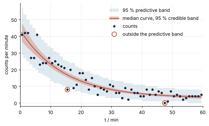
Two of the 60 counts fall outside the predictive band, against 2.0 ± 1.4 expected: the model passes. At the last minute the predictive band is almost four times as wide as the credible band, because there the scatter of a single count outweighs the uncertainty of the curve.
The knobs
The 4,000 rows are the draws, and their number sets how clean the edges are: the 2.5th and 97.5th percentiles of 100 draws fall between the third and fourth most extreme ones, so the edges come out ragged and move with the seed, as in Uncertainty propagation by sampling with NumPy. The chain holds about 3,300 independent samples, as the emcee tutorial printed, so drawing many more rows than that adds little to the credible band. Thinning to every 22nd step saves memory and moves the band only within its noise, and discarding the first 5 τ, here 229 steps, keeps the burn-in out of it (see Pitfalls). The level is the list handed to np.percentile: [2.5, 97.5] for 95 %, [16, 84] for 68 %.
The credible band says where the expected count \(\mu(t)\) lies given the data, and it shrinks as you measure longer. The predictive band adds the Poisson scatter of a new count around each sampled curve, and it never shrinks below the Poisson width, however long you measure. The outside count checks the model against the expected count printed next to it, not against the 3 that 5 % of 60 suggests. It is a coarse check, not a test with a p-value, and because the measured points helped make the posterior, a correct model leaves slightly fewer outside than expected.
Counts are whole numbers, so many draws land exactly on an edge of the band, and a count on an edge is inside. At the last minutes, where \(\mu\) is about 3.6, the lower edge is 0 and nothing can fall below it. Each point's chance \(p\) of falling outside, the share of its 4,000 predictive counts beyond the band, therefore runs from 1.4 % to 4.7 %, and the 60 chances sum to the 2.0; for the same reason a [16, 84] band leaves about a quarter of the points outside, not a third. The ±1.4 is the square root of the summed \(p(1 - p)\), the variance of a count of independent yes-or-no outcomes. More outside than the expected count plus two spreads means the model or its noise is wrong, and far fewer means the noise model is too wide.
Pitfalls
The cell below measures three mistakes on the posterior already in memory: a band built from the parameter percentiles, a band drawn with the burn-in left in, and Gaussian noise in place of the Poisson draw.
lo_par, hi_par = np.percentile(flat, [2.5, 97.5], axis=0)
print(f"t = 59.5 min, band from parameter percentiles: {rate(t, *lo_par)[-1]:.1f} to {rate(t, *hi_par)[-1]:.1f}, "
      f"from curves: {c_lo[-1]:.1f} to {c_hi[-1]:.1f} counts/min")
gap = np.abs(rate(t, *np.median(flat, axis=0)) - c_med).max()
print(f"curve of the median parameters vs median curve: at most {gap:.2f} counts/min apart")

everything = sampler.get_chain(flat=True)                 # no discard, no thin
rows_all = everything[rng.choice(len(everything), 4000, replace=False)]
c_hi_all = np.percentile([rate(t, *row) for row in rows_all], 97.5, axis=0)
print(f"upper credible edge at t = 59.5 min: {c_hi_all[-1]:.2f} with burn-in, {c_hi[-1]:.2f} without "
      f"({100 * (c_hi_all[-1] - c_hi[-1]) / (c_hi[-1] - c_lo[-1]):.0f} % of the band width)")

g_lo = np.percentile(curves + np.sqrt(curves) * rng.standard_normal(curves.shape), 2.5, axis=0)
print(f"Gaussian noise, lower edge at t = 59.5 min: {g_lo[-1]:.2f} counts/min (lowest of all times: {g_lo.min():.2f})")
t = 59.5 min, band from parameter percentiles: 1.5 to 6.2, from curves: 2.6 to 4.7 counts/min
curve of the median parameters vs median curve: at most 0.05 counts/min apart
upper credible edge at t = 59.5 min: 4.79 with burn-in, 4.68 without (5 % of the band width)
Gaussian noise, lower edge at t = 59.5 min: -0.29 counts/min (lowest of all times: -0.29)
A band from the parameter percentiles. Plugging the 2.5th percentiles of \(A\), \(T_{1/2}\), and \(B\) into the model, and then the 97.5th, gives a band more than twice as wide as the band of the curves at the last minute. The parameters are correlated, \(r(T_{1/2}, B) = -0.84\) in the emcee tutorial, so all three at their low ends together is a combination the posterior almost never visits. The curve of the median parameters is a milder version of the same mistake: here it is within 0.05 counts/min of the median curve, but the gap grows with the skew and the correlation of the posterior. Take percentiles of the curves, never of the parameters.
A band drawn from the burn-in. Without discard, the first 50 or so steps, where the walkers are still leaving the 15-minute start, end up in the draws. They are about 1 % of the rows. Many already sit inside the posterior, but over a third have a half-life above its 97.5th percentile, and they push the upper edge up at the late times, here by 5 % of the band width. A worse start pushes harder. Keep discard and look at the traces once.
Gaussian noise for counts. Replacing rng.poisson(curves) by curves + np.sqrt(curves) * rng.standard_normal(curves.shape) gives a lower edge of −0.29 counts/min at the last minute, the lowest of any time and a negative count. Draw the noise from the likelihood the posterior used. For data with Gaussian error bars sigma that is curves + sigma * rng.standard_normal(curves.shape), and for counts it is the Poisson draw.