CairoMakie from the ground up: a two-panel figure for one journal column
Afterwards you can build a CairoMakie figure from Figure, Axis, and GridLayout, link the axes of two panels, and save it at a journal's column width.
- Topic
- Visualization
- Field
- Cross-disciplinary
- Prerequisites
- none beyond Julia basics
- Libraries
CairoMakie 0.15.15Printf 1.11.0Random 1.11.0julia 1.13.1
jl-cairomakie.ipynb, executed with the versions above. The download needs a free account
Run it yourself. In the Julia 1.13.1 REPL, this installs exactly the versions above:
using Pkg
Pkg.add([
    PackageSpec(name="CairoMakie", version="0.15.15"),
    PackageSpec(name="IJulia"),
])
The problem: a spectrum, its model, and its residuals in one journal column
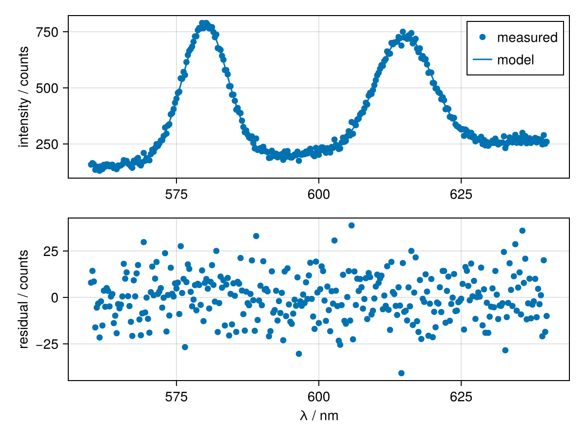
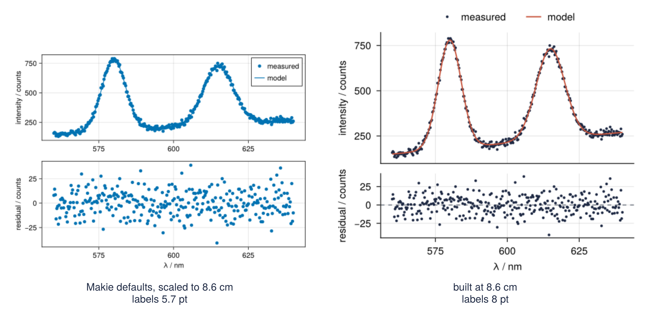
An emission spectrum, the model fitted to it, and the residuals go into a paper as one figure, and the figure has to fit one column of a two-column journal: 8.6 cm in the Physical Review journals, about 8.3 cm in the ACS and RSC journals; your journal's guide has its own number. In CairoMakie the quick version is a scatter, a lines!, and a second scatter, and it comes out 600 by 450 units. A unit is Makie's measure for every size in a figure, which CairoMakie writes into a PDF as 0.75 pt unless told otherwise. So the PDF is 450 pt wide, 15.9 cm, and the journal shrinks it by a factor of 0.542. The axis labels, 14 units and so 10.5 pt, print at 5.7 pt. A point is 1/72 inch, the same point your word processor sizes its fonts in, and many figure guides accept nothing under 8 pt. The two panels also stand equally tall, each with its own wavelength axis.
A chromatogram under its fitted peaks, or a diffraction pattern under its refinement, has the same three parts and the same problem.
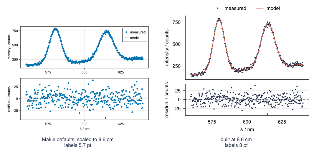
This is where we end up. The right half is a Figure with two Axis panels in its grid, built at 8.6 by 7.6 cm with every size in points and saved as a PDF and a 600 dpi PNG; Step 6 sets it beside the quick version at the same printed width. You need Julia's arrays, functions, and broadcasting with the dot, and nothing about Makie. CairoMakie is the Makie backend that writes files; GLMakie draws the same code into a window.
Setup
Install CairoMakie once with import Pkg; Pkg.add("CairoMakie"); Random and Printf ship with Julia. The theme is the look of every figure on this site, bound to the name SITE because Step 4 builds the print theme on top of it. Step 1 sets it aside to show what Makie does on its own. Julia's Xoshiro draws other numbers than NumPy's generator, so the noise differs from the Python version of this figure while the spectrum has the same shape.
using CairoMakie, Random, Printf

const INK, ACCENT, SECOND, MUTED = "#1f2a44", "#c8553d", "#2a7f9e", "#8a8f98"
SITE = Theme(
    size = (770, 396), fontsize = 17,
    palette = (color = [INK, ACCENT, SECOND, MUTED],),
    Axis = (topspinevisible = false, rightspinevisible = false, xgridvisible = true, ygridvisible = true),
    Lines = (linewidth = 2.5,),
)
set_theme!(SITE)

gauss(lam, a, mu, sigma) = a * exp(-0.5 * ((lam - mu) / sigma)^2)

rng = Xoshiro(3)
lam = range(560, 640, length = 321)                                   # wavelength / nm
model = @. 150 + 1.5 * (lam - 560) + gauss(lam, 600, 580, 4) + gauss(lam, 500, 615, 5)
counts = model .+ 12 .* randn(rng, length(lam))                       # the measured spectrum
resid = counts .- model

mkpath("assets")
@printf("%d points from %.0f to %.0f nm, largest reading %.0f counts\n",
        length(lam), first(lam), last(lam), maximum(counts))
321 points from 560 to 640 nm, largest reading 789 counts
Step 1: Draw the figure the quick way and shrink it to a column
The quick version leans on a convenience: scatter without a figure creates one, with an Axis and the plot, and returns all three. The code runs inside with_theme(Theme()), which puts Makie's factory defaults in force for one block instead of the setup's theme. The do turns the indented lines into a function that with_theme calls with that theme active, and its last value, fig, comes out. fig[2, 1] is the cell in row 2, column 1 of the figure's grid, below the spectrum in fig[1, 1]; the row comes first, as in a matrix. axis = (...) hands the new Axis its labels as a named tuple.
before = with_theme(Theme()) do
    fig, ax, sc = scatter(lam, counts; label = "measured")
    lines!(ax, lam, model; label = "model")
    ax.ylabel = "intensity / counts"
    axislegend(ax)
    scatter(fig[2, 1], lam, resid; axis = (xlabel = "λ / nm", ylabel = "residual / counts"))
    fig
end

w, h = size(before.scene)                                  # in units
label = content(before[2, 1]).xlabelsize[]                 # the bottom panel's x label
w_pt = w * 0.75                                            # CairoMakie's default for a PDF
scale = 8.6 / (w_pt / 72 * 2.54)
@printf("%d x %d units, label %g units\n", w, h, label)
@printf("PDF %.0f pt = %.1f cm wide, scaled to 8.6 cm by %.3f: labels %.1f pt -> %.1f pt\n",
        w_pt, w_pt / 72 * 2.54, scale, label * 0.75, label * 0.75 * scale)
before
600 x 450 units, label 14 units
PDF 450 pt = 15.9 cm wide, scaled to 8.6 cm by 0.542: labels 10.5 pt -> 5.7 pt
xlabelsize is an attribute, a container whose value can change (an Observable); the empty index [] takes out the value it holds now, and setting one is a plain assignment, as ax.ylabel = ... above.
On screen the figure passes, apart from a model line drawn in the dots' own blue, which hides it. In print the labels end at 5.7 pt; wherever this tutorial says 8 pt, use your journal's number. The residuals get as much height as the spectrum, and both panels carry a full row of wavelength numbers. Step 6 sets before beside the finished figure.
Step 2: Build the Figure and place each Axis in its grid
Built piece by piece, the figure gives you a handle on every part. Figure() is the whole canvas: it carries the size, and it is what save writes out. Its layout is a GridLayout, a grid of cells that grows as you put things into it. Axis(fig[2, 1]) creates one panel in that cell, with its own limits, labels, and plots. The functions whose names end in ! draw into an Axis that already exists; scatter without the ! makes Figure, Axis, and plot together, which is what Step 1 got back.
fig = Figure()
ax1 = Axis(fig[1, 1]; ylabel = "intensity / counts")
ax2 = Axis(fig[2, 1]; xlabel = "λ / nm", ylabel = "residual / counts")
scatter!(ax1, lam, counts; color = INK, markersize = 6, label = "measured")
lines!(ax1, lam, model; color = ACCENT, label = "model")
axislegend(ax1; framevisible = false)
scatter!(ax2, lam, resid; color = INK, markersize = 6)

println(typeof(fig.layout), " with ", size(fig.layout), " (rows, columns)")
fig
GridLayout with (2, 1) (rows, columns)
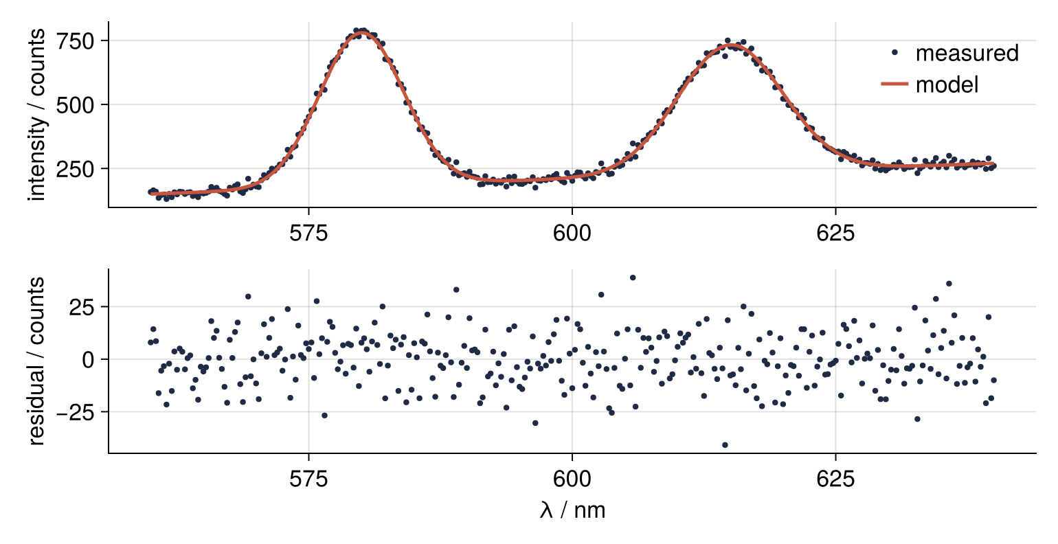
Every property of an Axis is an attribute. You pass it as a keyword when the Axis is created, Axis(...; xlabel = "λ / nm"), or assign it afterwards, ax2.xlabel = "λ / nm" (where Matplotlib has set_xlabel). The grid holds two rows and one column, one panel in each. The figure now has the site's look, and both faults of Step 1 are still there: two wavelength axes and two panels of equal height.
Step 3: Link the x axes and give the residuals less height
Both panels are drawn by one function that receives the two Axis objects, so the same lines serve the screen figure here and the column figure in Step 4. Dots are sized like fonts and must shrink with the figure, so markersize is a required keyword; a bare markersize inside passes it on under its own name. A dashed gray line at zero gives the residuals a baseline to read the scatter against.
function draw_spectrum!(ax1, ax2; markersize)
    scatter!(ax1, lam, counts; color = INK, markersize, label = "measured")
    lines!(ax1, lam, model; color = ACCENT, label = "model")
    hlines!(ax2, 0; color = MUTED, linewidth = 1, linestyle = :dash)
    scatter!(ax2, lam, resid; color = INK, markersize)
end

fig = Figure()
ax1 = Axis(fig[1, 1]; ylabel = "intensity / counts")
ax2 = Axis(fig[2, 1]; xlabel = "λ / nm", ylabel = "residual / counts")
draw_spectrum!(ax1, ax2; markersize = 6)
axislegend(ax1; framevisible = false)
linkxaxes!(ax1, ax2)
hidexdecorations!(ax1; grid = false)
rowsize!(fig.layout, 2, Auto(0.5))
rowgap!(fig.layout, 8)
xlims!(ax2, 556, 644)                          # set on the bottom panel only

xmin, xmax = minimum(ax1.finallimits[])[1], maximum(ax1.finallimits[])[1]
@printf("top panel x range: %.0f to %.0f nm\n", xmin, xmax)
fig
top panel x range: 556 to 644 nm
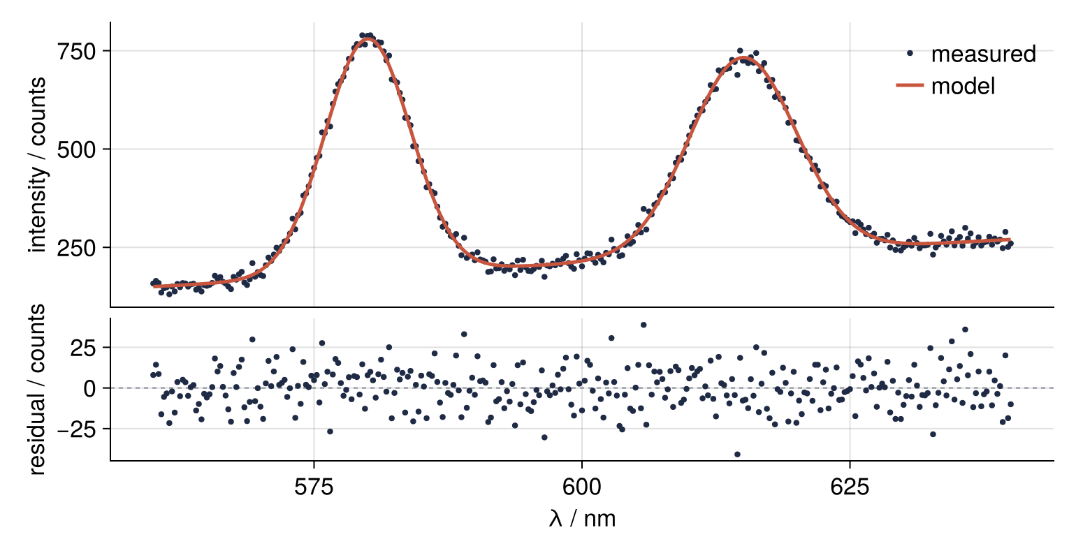
Four calls do the work. linkxaxes! makes the panels share their x limits: set on the bottom panel, reported by the top one. hidexdecorations! removes the top panel's x label, tick labels, and ticks; grid = false spares its grid. Every row is Auto() by default, a share of 1 of the height, so Auto(0.5) for the residuals leaves the spectrum two thirds. rowgap! narrows the space between the rows from 18 units to 8. The GridLayout itself reserves room for tick and axis labels, so nothing is cut off and there is no layout option to switch on (Matplotlib's constrained layout does this job there).
Step 4: Size the figure and its text in points
Makie measures figure, fonts, lines, and markers in one unit, and only save decides what a unit is: pt_per_unit for a PDF or SVG, 0.75 by default, and px_per_unit for a PNG, 2 by default. With pt_per_unit = 1 a unit is a point, and a figure built in points prints at the size you built.
JOURNAL holds the print settings: the column size in points, 8 pt text, and thinner lines and legend symbols, since weights chosen for a 17-unit screen font look heavy next to 8 pt text. A section named after an element type, such as Axis = (...), sets the defaults of every element of that type.
A figure reads the theme once, when Figure() runs, and every Axis, plot, and legend added later takes its defaults from that copy. So the build sits inside with_theme with Figure() as its first line. That block sees only the theme you pass, not the one set_theme! set, so the site's colors must come along: merge(JOURNAL, SITE) joins the two, and where both set a value the first wins.
COLUMN = round.(Int, (8.6, 7.6) .* 72 ./ 2.54)        # points; Makie keeps whole units
JOURNAL = Theme(
    size = COLUMN, fontsize = 8, figure_padding = 4,
    Axis = (spinewidth = 0.6, xtickwidth = 0.6, ytickwidth = 0.6, xticksize = 3, yticksize = 3,
            xgridwidth = 0.5, ygridwidth = 0.5),
    Lines = (linewidth = 1.0,),
    Legend = (patchsize = (12, 8),),
)

fig, ax1, ax2, leg = with_theme(merge(JOURNAL, SITE)) do
    fig = Figure()
    ax1 = Axis(fig[1, 1]; ylabel = "intensity / counts")
    ax2 = Axis(fig[2, 1]; xlabel = "λ / nm", ylabel = "residual / counts")
    draw_spectrum!(ax1, ax2; markersize = 3)
    leg = axislegend(ax1; framevisible = false)
    linkxaxes!(ax1, ax2)
    hidexdecorations!(ax1; grid = false)
    rowsize!(fig.layout, 2, Auto(0.5))
    rowgap!(fig.layout, 8)
    xlims!(ax2, 556, 644)
    fig, ax1, ax2, leg
end
fig
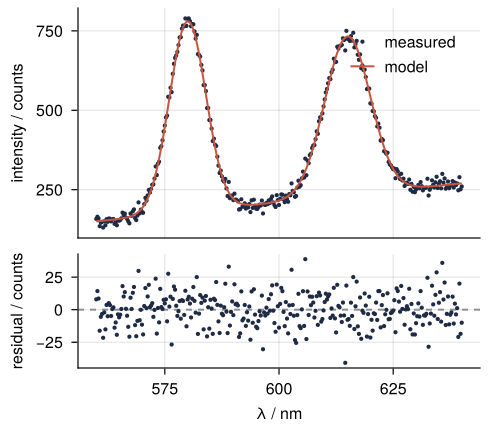
To check, collect the font size of every label; getproperty(ax, s) is ax.xlabelsize with the name held in a variable:
font_sizes(axes, leg) = Set(Float64[leg.labelsize[];
    [getproperty(ax, s)[] for ax in axes for s in (:xlabelsize, :ylabelsize, :xticklabelsize, :yticklabelsize)]])

@printf("%d x %d pt = %.2f x %.2f cm, ", COLUMN..., (COLUMN ./ 72 .* 2.54)...)
println("font sizes ", font_sizes((ax1, ax2), leg))
244 x 215 pt = 8.61 x 7.58 cm, font sizes Set([8.0])
The size is within 0.2 mm of 8.6 by 7.6 cm, and every label is 8. But axislegend puts the legend in a fixed corner, top right by default, and never looks for empty space. The hidden cell counts the data points under it there and, moved for a moment, at the top left:
Show code
function points_under(leg, ax)
    box = leg.layoutobservables.computedbbox[]               # figure units, margin included
    l, r, b, t = leg.margin[]
    lo, hi = minimum(box) .+ (l, b), maximum(box) .- (r, t)
    corner = minimum(ax.scene.viewport[])                    # the panel's origin in the figure
    xy = [Makie.project(ax.scene, Point2f(x, y)) .+ corner for (x, y) in zip(lam, counts)]
    return count(p -> all(lo .<= p .<= hi), xy)
end

panel_h = ax1.scene.viewport[].widths[2]
legend_h = leg.layoutobservables.computedbbox[].widths[2] - sum(leg.margin[][3:4])
@printf("legend %.0f of the panel's %d units of height\n", legend_h, panel_h)
@printf("data points under the legend, top right: %d\n", points_under(leg, ax1))
leg.halign = :left
@printf("data points under the legend, top left:  %d\n", points_under(leg, ax1))
leg.halign = :right;
legend 34 of the panel's 115 units of height
data points under the legend, top right: 24
data points under the legend, top left:  26
The legend takes almost a third of the panel's height. At the top right it covers the summit of the 615 nm peak, at the top left that of the 580 nm one. The least bad corner depends on where the peaks are.
Step 5: Give the legend a cell of its own
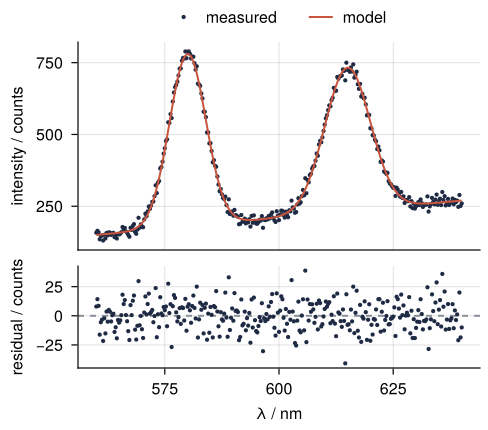
A legend inside a narrow panel lands wherever its corner is, whatever the data does there; a cell of its own ends the gamble. fig[0, 1] is the cell above row 1: the grid grows a row, and the panels give up the height it needs. Legend(fig[0, 1], ax1) collects the labeled plots of ax1, tellwidth = false keeps it from setting the width of its column, and padding = 0 drops the 6 units of space a legend keeps on every side of its entries, so that it sits one row gap above the panel it labels.
fig, ax1, ax2, leg = with_theme(merge(JOURNAL, SITE)) do
    fig = Figure()
    ax1 = Axis(fig[1, 1]; ylabel = "intensity / counts")
    ax2 = Axis(fig[2, 1]; xlabel = "λ / nm", ylabel = "residual / counts")
    draw_spectrum!(ax1, ax2; markersize = 3)
    leg = Legend(fig[0, 1], ax1; orientation = :horizontal, framevisible = false, tellwidth = false, padding = 0)
    linkxaxes!(ax1, ax2)
    hidexdecorations!(ax1; grid = false)
    rowsize!(fig.layout, 2, Auto(0.5))       # row 2 is still the residuals
    rowgap!(fig.layout, 8)
    xlims!(ax2, 556, 644)
    fig, ax1, ax2, leg
end
heights = [ax.scene.viewport[].widths[2] for ax in (ax1, ax2)]
println(size(fig.layout), " (rows, columns); panel heights ", heights, " units")
fig
(3, 1) (rows, columns); panel heights [104, 51] units
Show code
@printf("data points under the legend: %d\n", points_under(leg, ax1))
data points under the legend: 0
No point is covered, in this spectrum or any other. Adding row 0 renumbers nothing, so rowsize! still finds the residuals in row 2, at half the spectrum's height. A corner legend can also be rescued by raising the panel's top with ylims! until the data clears it, and with only a handful of points I would drop the legend and write the names beside the curves with text!. This is the figure to save.
Step 6: Save a PDF and a 600 dpi PNG, and check their size
For a plot, send the PDF: it stores lines and letters, not pixels, and no zoom blurs them. If the journal insists on a raster file, line art needs 600 dpi or more, twice the 300 dpi that suits photographs. With a unit at one point, px_per_unit = 600 / 72 is 600 dpi. pdf_version = "1.4" asks Cairo, the library under CairoMakie, for an older file layout that keeps each page dictionary, where the page size sits, in plain text for the check below to read.
The PNG check reads raw bytes. Every PNG opens with an 8-byte signature and the 8-byte header of its first chunk, and bytes 17 to 24 hold the width and the height as two 32-bit integers, most significant byte first. reinterpret views those eight bytes as two UInt32, and ntoh (network to host order) puts the bytes into the order your processor expects.
save("assets/spectrum-column.pdf", fig; pt_per_unit = 1, pdf_version = "1.4")
save("assets/spectrum-column.png", fig; px_per_unit = 600 / 72)
println("font sizes after saving: ", font_sizes((ax1, ax2), leg))

w, h = ntoh.(reinterpret(UInt32, read("assets/spectrum-column.png")[17:24]))
@printf("PNG: %d x %d px = %.2f x %.2f cm at 600 dpi\n", w, h, w / 600 * 2.54, h / 600 * 2.54)
font sizes after saving: Set([8.0])
PNG: 2033 x 1792 px = 8.61 x 7.59 cm at 600 dpi
The 2033 by 1792 pixels are the 244 by 215 points times 600/72, rounded. A PDF keeps each page's size in an entry named /MediaBox: four numbers, the lower-left and the upper-right corner of the page in points. Cairo puts the lower-left corner at 0 0, so the last two are width and height:
box = match(r"/MediaBox \[([^\]]*)\]", read("assets/spectrum-column.pdf", String))
x0, y0, width_pt, height_pt = parse.(Float64, split(box[1]))
@printf("PDF: %.0f x %.0f pt = %.2f x %.2f cm\n", width_pt, height_pt, width_pt / 72 * 2.54, height_pt / 72 * 2.54)
PDF: 244 x 215 pt = 8.61 x 7.58 cm
Neither file needs resizing at the journal: the page is the 8.6 cm you asked for, and labels built at 8 pt print at 8 pt. Print the PDF with scaling switched off and measure it.
Last, Step 1's quick figure reduced to 8.6 cm, next to the saved one. The cell that draws this does nothing but place two images side by side, so its code is hidden until you open it.
Show code
width = round(Int, 8.6 / 2.54 * 150)                       # 8.6 cm at 150 pixels per inch
images = [
    (colorbuffer(before; px_per_unit = width / size(before.scene)[1]),
     @sprintf("Makie defaults, scaled to 8.6 cm\nlabels %.1f pt", label * 0.75 * scale)),
    (colorbuffer(fig; px_per_unit = width / COLUMN[1]), "built at 8.6 cm\nlabels 8 pt"),
]
comparison = Figure(figure_padding = 10, backgroundcolor = :white)
for (i, (img, caption)) in enumerate(images)
    rows, cols = size(img)
    ax = Axis(comparison[1, i]; width = cols, height = rows, valign = :bottom)   # bottoms aligned
    hidedecorations!(ax); hidespines!(ax)
    image!(ax, rotr90(img))
    tightlimits!(ax)
    Label(comparison[2, i], caption; color = INK)
end
colgap!(comparison.layout, 30)
rowgap!(comparison.layout, 6)                              # captions close under the pictures
resize_to_layout!(comparison)
comparison
Pitfalls
A PDF a quarter smaller than the figure you built. Leave out pt_per_unit and the page shrinks:
path = tempname() * ".pdf"
save(path, fig; pdf_version = "1.4")                         # no pt_per_unit
x0, y0, w, h = parse.(Float64, split(match(r"/MediaBox \[([^\]]*)\]", read(path, String))[1]))
@printf("PDF: %.0f x %.0f pt = %.2f x %.2f cm, so 8-unit labels print at %.0f pt\n",
        w, h, w / 72 * 2.54, h / 72 * 2.54, 8 * w / COLUMN[1])
rm(path)
PDF: 183 x 161 pt = 6.46 x 5.68 cm, so 8-unit labels print at 6 pt
By default a Makie unit stands for a screen pixel, and CairoMakie gives it 0.75 pt, the size a web browser gives a pixel. A figure sized for the screen thus keeps its look in a document; a figure sized in points loses a quarter of its width. Pass pt_per_unit = 1 to every vector save.
A print theme that changes nothing. Create the figure at the column size first and draw into it inside the block, and the block has no effect:
early = Figure(size = COLUMN)
top, bottom, early_leg = with_theme(merge(JOURNAL, SITE)) do
    a1 = Axis(early[1, 1]; ylabel = "intensity / counts")
    a2 = Axis(early[2, 1]; xlabel = "λ / nm", ylabel = "residual / counts")
    draw_spectrum!(a1, a2; markersize = 3)
    a1, a2, Legend(early[0, 1], a1; orientation = :horizontal, framevisible = false, tellwidth = false)
end
println("font sizes ", font_sizes((top, bottom), early_leg))
font sizes Set([17.0])
Every label is 17 units, the site's screen size, on a page 244 units wide. The figure took its theme when it was created, before the block began, and the panels and the legend take theirs from the figure, by Step 4's rule. Nothing warns you, and the labels come out more than twice the size you set. Make Figure() the first line inside the block. Anything you add to that figure after the block closes is safe, because it follows the figure too.
hidexdecorations! takes the grid along. Called without keywords, it hides the top panel's vertical grid lines along with its labels and ticks, and the grid then stops at the edge of the residual panel. Its keywords grid and minorgrid default to true, which means hide those too. Write hidexdecorations!(ax1; grid = false), as in Step 3.
Variations
- A full-width figure. Change the width in
COLUMNto 17.8 cm, both columns of the Physical Review journals. The fonts stay 8 pt, because they were never tied to the width. - Panels side by side. Add
ax3 = Axis(fig[2, 2])next to the residuals, drawhist!(ax3, resid; direction = :x), and calllinkyaxes!(ax2, ax3)andcolsize!(fig.layout, 2, Auto(0.3)): the distribution of the residuals on their own axis. - Irregular layouts. A
GridLayoutinside a cell (inner = GridLayout(fig[1, 2]), thenAxis(inner[1, 1])) or an Axis across two cells (Axis(fig[2, 1:2])). The grid nests, so any arrangement of panels is cells inside cells. - One theme for the whole paper. Put
JOURNALintojournal_theme.jl,includeit at the top of every plotting script, and callset_theme!(JOURNAL)once. The other convention keeps the default 0.75 and converts with constants,cm = 96 / 2.54andpt = 4 / 3units (96 units to the inch, at 0.75 pt each); either works if you stick to one.
Cheat sheet
COLUMN = round.(Int, (8.6, 7.6) .* 72 ./ 2.54)                  # cm -> pt; a unit is a point when saved below
fig = with_theme(Theme(size = COLUMN, fontsize = 8)) do       # Figure() takes the theme: create it inside
    fig = Figure()
    ax1, ax2 = Axis(fig[1, 1]; ylabel = "y / unit"), Axis(fig[2, 1]; xlabel = "x / unit")
    linkxaxes!(ax1, ax2); hidexdecorations!(ax1; grid = false)  # one x axis, grid kept
    rowsize!(fig.layout, 2, Auto(0.5)); rowgap!(fig.layout, 8)  # bottom row half a share
    Legend(fig[0, 1], ax1; orientation = :horizontal, framevisible = false, tellwidth = false, padding = 0); fig
end
save("fig.pdf", fig; pt_per_unit = 1)                         # the default 0.75 shrinks the page
save("fig.png", fig; px_per_unit = 600 / 72)                  # 600 dpi for line art
Further reading
- The Makie documentation: Getting started, the Figure page, the Layout tutorial, the Axis and Legend references, Themes, and Figure size, resolution, and units for
px_per_unitandpt_per_unit. - Simon Danisch and Julius Krumbiegel, "Makie.jl: Flexible high-performance data visualization for Julia", Journal of Open Source Software 6 (2021) 3349, for how Makie is built.
- Related tutorials on this site: Matplotlib from the ground up: a two-panel figure for one journal column, the same figure in Python; Numerical integration with QuadGK.jl: the area under a measured peak, for the area of such a spectrum; Fit a curve with error bars and draw a confidence band in Julia, for where a model and its residuals come from; and HypothesisTests.jl from the ground up: do two samples really differ?, another two-panel CairoMakie figure with
linkxaxes!androwsize!. - Download the notebook. It was executed with the library versions in the header.