Interactive figures with Plotly: ten minutes of ECG you can zoom into
Afterwards you can build a Plotly figure that zooms and shows values on hover, keep a static copy for the page or a paper, and say when interactivity helps.
- Topic
- Visualization
- Field
- Biology, Engineering, Physics
- Prerequisites
- none beyond Python basics
- Libraries
IPython 9.17.1kaleido 1.5.0numpy 2.5.3plotly 7.1.0scipy 1.18.1
py-plotly.ipynb, executed with the versions above. The download needs a free account
Run it yourself. In a terminal, this installs exactly the versions above:
pip install numpy==2.5.3 scipy==1.18.1 plotly==7.1.0 IPython==9.17.1 kaleido==1.5.0 jupyterlabThe problem: ten minutes of ECG in one figure
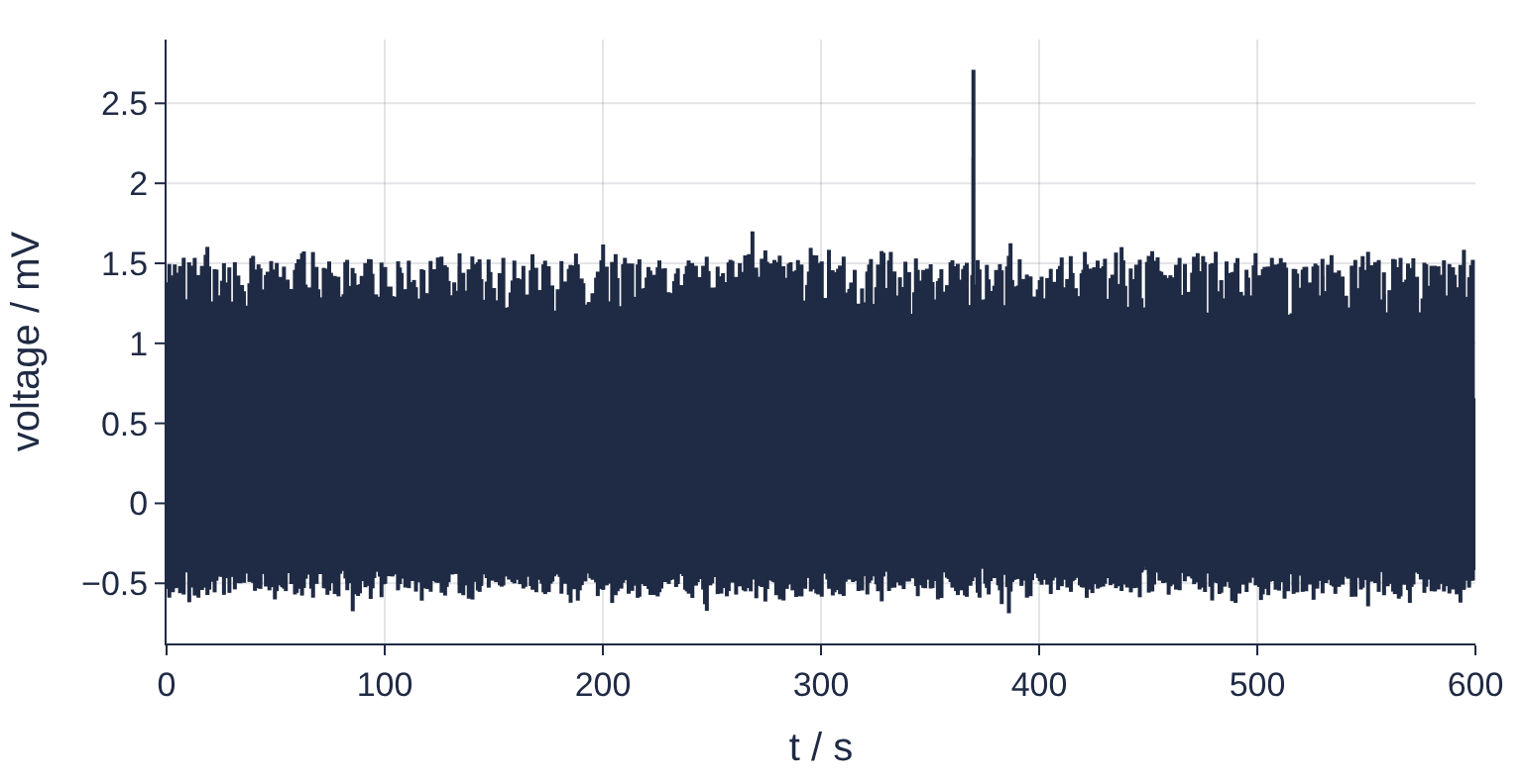
Ten minutes of one ECG lead at 500 samples per second is 300,000 samples and about 720 heartbeats, and somewhere in there one beat comes early. A static plot of the whole record at the width of a page turns 720 beats into a solid band with one spike sticking out. A plot of one beat loses the other 719, and neither tells you what the spike is. Plotly draws an interactive figure instead: you zoom into any second of the record, pan along it, read the time and voltage of a point by hovering over it, and drag a range slider underneath that keeps all ten minutes in view. The figure runs in the browser, inside a Jupyter notebook or as a single HTML file you can send to a colleague.
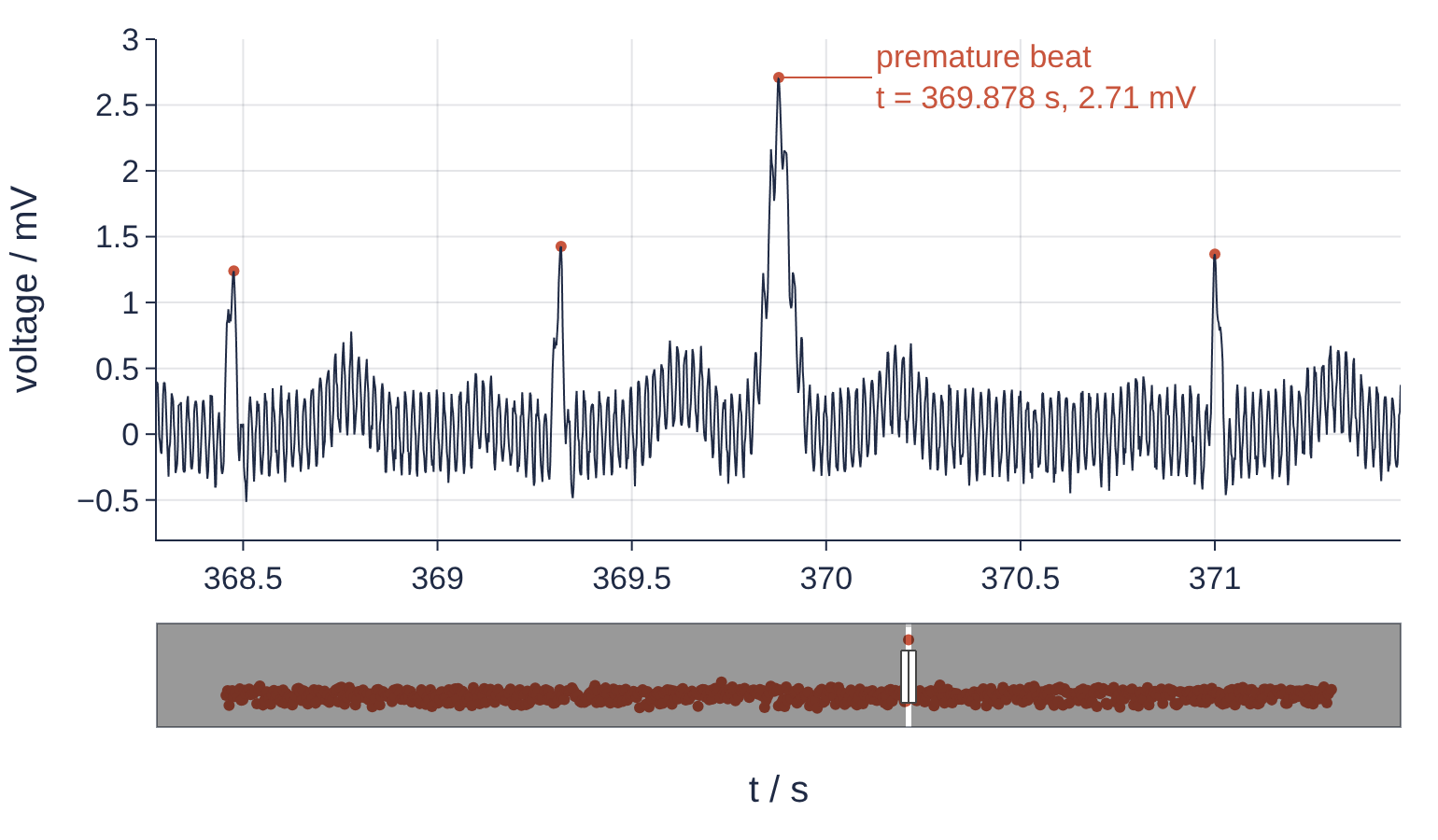
This is the static copy of the figure that Step 5 saves. The window sits on the premature beat, the label carries the time and voltage that hovering reads off, and the slider shows where in the ten minutes the window is. In the downloaded notebook the same figure zooms, pans, and answers on hover.
Setup
Plotly installs with pip together with Kaleido, the separate package that writes PNG and PDF files and needs a Chrome browser on the machine (Step 5):
pip install plotly kaleido
The record is the synthetic lead from Filtering with scipy.signal: mains hum and noise out of an ECG, five Gaussian waves per beat under 50 Hz hum and noise, made sixty times longer, with a 3 % jitter in the time between beats and one beat that comes 0.30 s early with a taller and wider R wave. A template is a stored set of layout defaults, the colors, font, grid, and size, that every new figure starts from. The renderer line makes every displayed figure store a PNG next to the interactive version, for this page and for the committed notebook; in your own notebook leave it out, because a plain fig.show() is interactive by default.
import numpy as np
import plotly.express as px
import plotly.graph_objects as go
import plotly.io as pio
from scipy.signal import find_peaks

pio.renderers.default = "plotly_mimetype+png"   # interactive in Jupyter, a picture on the page
pio.renderers["png"].scale = 2

INK, ACCENT, SECOND, MUTED = "#1f2a44", "#c8553d", "#2a7f9e", "#8a8f98"
axis = dict(showgrid=True, gridcolor="rgba(31, 42, 68, 0.12)", linecolor=INK,
            tickcolor=INK, zeroline=False)
pio.templates["scistack"] = go.layout.Template(layout=dict(
    width=770, height=396, margin=dict(l=70, r=20, t=20, b=60),
    colorway=[INK, ACCENT, SECOND, MUTED], font=dict(size=17, color=INK),
    xaxis=axis, yaxis=axis, showlegend=False,
    hoverlabel=dict(bgcolor="white", font_color=INK),
))
pio.templates.default = "simple_white+scistack"

fs = 500.0                                   # sampling rate, Hz
t = np.arange(0, 600, 1 / fs)                # ten minutes, s
rng = np.random.default_rng(42)

# (offset from the R peak / s, amplitude / mV, width / s) for P, Q, R, S, T
waves = [(-0.20, 0.15, 0.025), (-0.03, -0.15, 0.008), (0.0, 1.20, 0.010),
         (0.03, -0.25, 0.008), (0.30, 0.35, 0.050)]
rr_beats = 60 / 72 * (1 + 0.03 * rng.standard_normal(750))   # 72 beats per minute, 3 % jitter
r_times = 0.4 + np.cumsum(np.r_[0, rr_beats])
r_times = r_times[r_times < 599.5]
k_early = np.argmin(np.abs(r_times - 370))
r_times[k_early] -= 0.30                     # the premature beat

ecg = np.zeros_like(t)
for k, t_r in enumerate(r_times):
    near = slice(max(int((t_r - 0.5) * fs), 0), int((t_r + 0.6) * fs))   # one beat's waves
    for offset, amp, width in waves:
        if k == k_early and offset == 0.0:
            amp, width = 2.4, 0.03           # taller and wider R wave
        ecg[near] += amp * np.exp(-0.5 * ((t[near] - t_r - offset) / width) ** 2)
x = ecg + 0.30 * np.cos(2 * np.pi * 50 * t + 0.7) + 0.05 * rng.standard_normal(t.size)   # mV

# half the bytes of float64; Step 2 says why that matters
t, x = t.astype(np.float32), x.astype(np.float32)

print(f"{t.size:,} samples, {t.size / fs:.0f} s, {r_times.size} beats generated")
300,000 samples, 600 s, 720 beats generated
Step 1: Plot the whole record with plotly.express
plotly.express, imported as px, makes a complete figure in one call from arrays or from the columns of a table, and labels names the axes. On this page you see a picture of each figure, in the downloaded notebook the interactive one. The line after fig.show() prints what kind of object came back and how its one trace is drawn, which decides how many points the browser can handle.
fig = px.line(x=t, y=x, labels={"x": "t / s", "y": "voltage / mV"})
fig.show()
print(type(fig), fig.data[0].type)
<class 'plotly.graph_objs._figure.Figure'> scattergl
On the page that is a band, about one beat per pixel column. One spike sticks out near 370 s, but nothing in the band says whether it is a heartbeat or an artifact, or whether it came on time. In the notebook, drag a box around a few seconds and the beats come back.
The trace type reads scattergl: Express switched to WebGL by itself because the trace has more than 1,000 points. A normal trace is drawn as SVG, shapes the browser keeps on the page: a line is one long path through every point, and each marker is a shape of its own. A WebGL trace hands all points to the graphics card, which paints them onto one canvas and copes with hundreds of thousands. The figure behaves the same, with one exception that Step 3 deals with. And px.line returns a go.Figure, the object of plotly.graph_objects, so everything below applies to it: Express is the short route for data in columns, graph_objects the route for building a figure piece by piece.
Step 2: Build the figure from graph_objects with Scattergl
A Plotly figure is data, a list of traces, plus a layout. It travels as JSON: plain text that spells out every number of every trace and every layout setting, and the browser draws from that text. Every figure displayed in a notebook and every HTML file you share carries it, so its size is what your reader downloads.
An evenly sampled time axis need not be in that text as 300,000 numbers. x0 is the time of the first sample and dx the step between samples, and the browser computes the rest. go.Scattergl is the WebGL version of go.Scatter; the Plotly reference for px.line puts the threshold between the two at 1,000 points. The cell compares three ways of handing over the same record, then builds from the smallest the figure that Steps 3 to 5 extend:
def json_mb(fig):
    return len(fig.to_json()) / 1e6

versions = {
    "t and x in float64": go.Scattergl(x=t.astype(np.float64), y=x.astype(np.float64)),
    "t and x in float32": go.Scattergl(x=t, y=x),
    "x0, dx, x in float32": go.Scattergl(x0=0, dx=1 / fs, y=x),
}
for name, trace in versions.items():
    print(f"{name:21s} {json_mb(go.Figure(trace)):4.1f} MB")

fig = go.Figure(go.Scattergl(x0=0, dx=1 / fs, y=x, mode="lines", line=dict(color=INK, width=1)))
t and x in float64     7.0 MB
t and x in float32     3.4 MB
x0, dx, x in float32   1.7 MB
Single precision halves the text, and x0 with dx halves it again, to a quarter of the first version. Float32 keeps about seven significant digits, far more than a record with 0.05 mV of noise can use, which is why Setup cast the record. The Step 1 figure, with its explicit time axis, is the 3.4 MB version.
Step 3: Mark the R peaks and show their values on hover
find_peaks from scipy.signal returns the indices of local maxima: height=0.6 keeps those above 0.6 mV and distance=200 those at least 200 samples, 0.4 s, apart, which leaves the R waves. The peaks go into the figure as a second trace, a plain go.Scatter and not the Scattergl of Step 2, for two reasons: 720 points are few enough for SVG, and the range slider of Step 4 draws SVG traces only.
What a hover shows is set by hovertemplate. Inside %{...} goes the value, x or y, and after the colon its format, .3f for three decimals. <br> is an HTML line break, and <extra></extra> hides the box with the trace name that Plotly otherwise shows next to the label.
peaks, _ = find_peaks(x, height=0.6, distance=200)
t_r = peaks / fs
rr = np.diff(t_r)                            # R-R intervals; rr[k] ends at t_r[k + 1]
print(f"R peaks found {peaks.size}, beats generated {r_times.size}")
print(f"median  R-R {np.median(rr):.3f} s")
print(f"shortest R-R {rr.min():.3f} s, ending at t = {t_r[rr.argmin() + 1]:.3f} s")
print(f"longest  R-R {rr.max():.3f} s, ending at t = {t_r[rr.argmax() + 1]:.3f} s")

k_ev = rr.argmin() + 1
t_ev, v_ev = t_r[k_ev], x[peaks[k_ev]]

hover = "t = %{x:.3f} s<br>%{y:.2f} mV<extra></extra>"
fig.data[0].hovertemplate = hover
fig.add_trace(go.Scatter(x=t_r, y=x[peaks], mode="markers", hovertemplate=hover,
                         marker=dict(color=ACCENT, size=6)))
print(f"hover on the premature R peak: t = {t_ev:.3f} s<br>{v_ev:.2f} mV")
R peaks found 720, beats generated 720
median  R-R 0.836 s
shortest R-R 0.560 s, ending at t = 369.878 s
longest  R-R 1.122 s, ending at t = 371.000 s
hover on the premature R peak: t = 369.878 s<br>2.71 mV
All 720 beats found, none extra. The shortest interval, 0.560 s against a median of 0.836 s, ends at 369.878 s, and the longest, 1.122 s, comes right after it: the premature beat and the pause that follows. np.diff of the peak times found the event from the data alone, so the same lines work on your own record, where nobody has told you when it happens. The last printed line is what hovering over that peak will show.
Step 4: Add a range slider and open on the event
update_layout changes the layout of this one figure, and where it sets something the template also sets, it wins. The x axis gets a title, the range slider, and an initial range, a 3.2 s window around the premature beat. That range is the view a reader sees first and the one a static export saves. The y axis gets a fixed range for the same reason: left alone, Plotly refits it whenever something is added, and the export would show other ticks than this view.
The slider strip has a y axis of its own, and by default it copies the main one, -0.8 to 3.0 mV. No R peak comes below 0.6 mV, so the lower part of the strip stays empty. rangemode="fixed" gives the strip its own range instead, 0.6 to 3.1 mV, the heights of the R peaks only. The row of dots then sits low and the early beat stands clear above it.
fig.update_layout(
    height=450,
    xaxis=dict(title="t / s", range=[t_ev - 1.6, t_ev + 1.6],
               rangeslider=dict(visible=True, thickness=0.15, bgcolor="white",
                                bordercolor=MUTED, borderwidth=1,
                                yaxis=dict(rangemode="fixed", range=[0.6, 3.1]))),
    yaxis=dict(title="voltage / mV", range=[-0.8, 3.0]),
)
fig.show()
Plotly accepts the same settings in a shorter spelling, in which each underscore steps one level into the nested dicts: fig.update_layout(xaxis_rangeslider_visible=True) is the same as fig.update_layout(xaxis=dict(rangeslider=dict(visible=True))). The rest of this tutorial uses the short form.
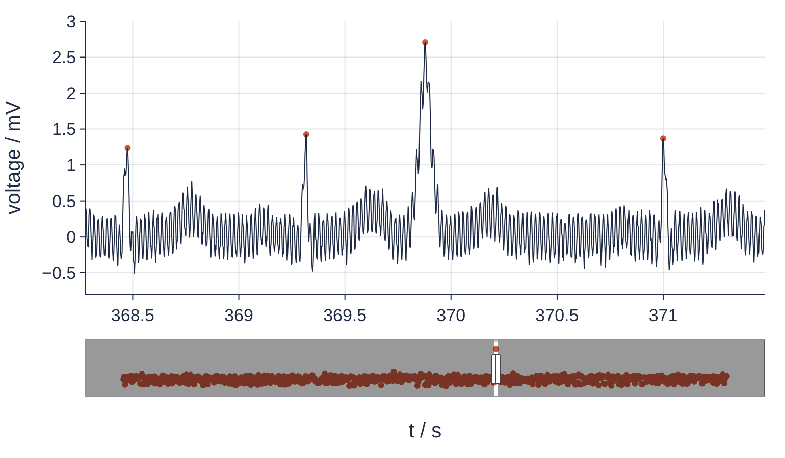
The main panel shows two beats at the usual spacing of about 0.84 s, then the early one 0.56 s after the last, taller and wider, then the pause of 1.12 s before the next. The slider holds all ten minutes as a row of R-peak dots, and one dot stands above the row at 370 s. Outside the window Plotly lays a gray shade over the slider, which no setting turns off, so the red dots look brown there; they are the same trace. In the notebook, drag the handles of the slider to move the window, double-click the plot to see everything, and hover a dot to read its time and voltage.
Step 5: Save a static copy and a file to share
A PNG cannot be hovered, so the number that hovering gave you goes into the figure as an annotation before export. ax=50, ay=0 put the label 50 pixels to the right of the point, level with it. write_image saves the current view through Kaleido, which starts Chrome in the background to draw it, and scale=2 doubles the pixels for a sharp print. write_html saves the interactive figure as one file. With include_plotlyjs=True the file carries plotly.js, the JavaScript library that draws Plotly figures, and opens offline; with "cdn" it loads plotly.js from the web when opened and is that much smaller.
import os
from IPython.display import Image

fig.add_annotation(x=t_ev, y=v_ev, text=f"premature beat<br>t = {t_ev:.3f} s, {v_ev:.2f} mV",
                   font_color=ACCENT, arrowcolor=ACCENT, ax=50, ay=0, xanchor="left", align="left")
fig.write_image("ecg-record.png", scale=2)
fig.write_html("ecg-record.html", include_plotlyjs=True)
fig.write_html("ecg-record-cdn.html", include_plotlyjs="cdn")
for name in ["ecg-record.png", "ecg-record.html", "ecg-record-cdn.html"]:
    print(f"{name:20s} {os.path.getsize(name) / 1e6:4.1f} MB")
Image("ecg-record.png", width=770)
ecg-record.png        0.2 MB
ecg-record.html       6.6 MB
ecg-record-cdn.html   1.7 MB
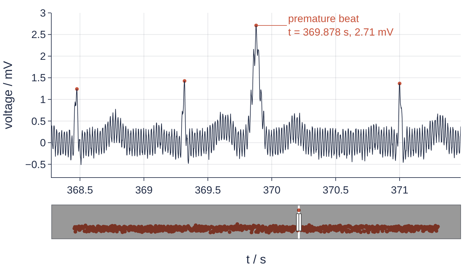
Image shows the file on disk, not the figure in memory, so the picture is what Kaleido drew: the Step 4 view plus the label, 369.878 s and 2.71 mV, the numbers Step 3 printed. With plotly.js inside, the HTML file is 6.6 MB; loading it from the web leaves 1.7 MB, almost all of it the data from Step 2. The time axis you did not send is the time axis nobody downloads.
Interactivity earns its place while you explore: ten minutes of a record, one event among 720 beats, found by dragging a slider instead of guessing where to look. A paper and a printed page show one view, so choose that view on purpose and write the number into it, as here, or draw it with Matplotlib.
Pitfalls
An empty range slider. On your own figure the slider strip under the plot is gray, with no trace in it, although the main panel is full. The figure holds only Scattergl traces, perhaps because px.line switched to WebGL above 1,000 points, and the slider draws SVG traces only (Step 3). Add a light SVG trace for it to draw: events or peaks as markers, as here, or for a record without events the minimum and maximum of each second as a thin go.Scatter, the envelope from Variations.
A notebook that grows by megabytes per cell. The .ipynb you commit or email is tens of MB, and the editor slows down. Every run of a cell that ends in fig.show() stores the figure's data again in the output, 1.7 MB each time for this record, and so does a cell whose last line is fig.add_trace(...) or fig.update_layout(...), because both return the figure. The habit of looking at the figure after each small change multiplies it. Beyond x0, dx, and float32 from Step 2: build the large figure in cells without output and show it once at the end, clear the outputs before you commit, and use include_plotlyjs="cdn" for HTML that will be opened online.
write_image stops with an error about Chrome. The call raises a RuntimeError whose message says "Kaleido requires Google Chrome to be installed." Kaleido 1.x no longer ships its own browser and looks for one installed on the machine. Run plotly_get_chrome once in a terminal, which downloads a Chrome for Kaleido, or set the environment variable BROWSER_PATH to the executable of a Chrome or Chromium you already have.
Variations
- Several leads at once.
plotly.subplots.make_subplots(rows=3, shared_xaxes=True), oneScatterglper row added withfig.add_trace(trace, row=r, col=1), and the slider on the bottom axis withxaxis3_rangeslider_visible=True. Give the bottom row its R peaks as ago.Scatter, as in Step 3. - Clock time instead of seconds. Give
xas datetimes, anumpy.datetime64array or a pandasdate_range, and add buttons for 10 s, 1 min, and everything withxaxis_rangeselector_buttons=[dict(count=10, step="second", stepmode="backward", label="10 s"), ...]. - A day instead of ten minutes. A 24 h Holter record is 43.2 million samples. Plot the minimum and maximum of each second, 86,400 pairs, as the overview, and the raw samples only for a window you cut out.
- A vector file for the journal.
fig.write_image("ecg.pdf")or.svg, withxaxis_rangeslider_visible=False. AScatterglline arrives in the file as an embedded picture, so draw the window you export withgo.Scatterfor a line that stays sharp at any zoom.
Cheat sheet
fig = px.line(x=t, y=x, labels={"x": "t / s", "y": "voltage / mV"})  # quick look; WebGL above 1,000 points
fig = go.Figure(go.Scattergl(x0=0, dx=1 / fs, y=x.astype(np.float32)))  # even axis: start and step, not an array
fig.add_trace(go.Scatter(x=t_r, y=v_r, mode="markers",
                         hovertemplate="t = %{x:.3f} s<br>%{y:.2f} mV<extra></extra>"))  # SVG: shows in the slider
fig.update_layout(xaxis_rangeslider_visible=True, xaxis_range=[a, b])  # slider; the view that opens and exports
fig.add_annotation(x=t0, y=v0, text="what hover told you")              # the page cannot be hovered
pio.renderers.default = "plotly_mimetype+png"                           # notebook keeps a picture too
fig.write_image("figure.png", scale=2)                                  # Kaleido; needs Chrome: plotly_get_chrome
fig.write_html("figure.html", include_plotlyjs="cdn")                   # True: works offline, a few MB larger
Further reading
- The Plotly documentation: Plotly Express and graph objects, high performance visualization with WebGL, hover text and formatting, range sliders and selectors, static image export, interactive HTML export, and theming and templates.
- Claus O. Wilke, Fundamentals of Data Visualization (O'Reilly, 2019, free online), for deciding what the one view of a figure should show.
- Related tutorials on this site: Filtering with scipy.signal: mains hum and noise out of an ECG for the record and
find_peaks, Matplotlib from the ground up: a two-panel figure for one journal column for the static paper figure, Zoom into a detail of a Matplotlib plot with an inset for overview and detail in one printed figure, and seaborn from the ground up: three cell lines in four views for statistical views of data in columns. - Download the notebook. It was executed with the library versions in the header, and it is the interactive version: every Plotly figure in it zooms and answers on hover.