Bayes' theorem: three counts above background, a rate that cannot be negative
Afterwards you can explain what prior, likelihood, and posterior are, compute the posterior of one parameter on a grid, and read a credible interval off it.
- Topic
- Bayesian inference
- Field
- Biology, Chemistry, Physics
- Prerequisites
- none beyond Python basics
- Libraries
matplotlib 3.11.2numpy 2.4.3scipy 1.18.1
py-bayes-theorem.ipynb, executed with the versions above. The download needs a free account
Run it yourself. In a terminal, this installs exactly the versions above:
pip install numpy==2.4.3 scipy==1.18.1 matplotlib==3.11.2 jupyterlabThe question
A detector next to a weak radioactive source clicks three times in 10 min. It would click without the source too: the background was measured for hours beforehand and is 0.1 counts per minute, so 1 of the 3 counts is expected from background alone. What is the source rate \(s\)? Bayes' theorem answers that question in a way the textbook formula cannot, and three clicks are enough to show the difference.
Show code
import numpy as np
import matplotlib.pyplot as plt
from scipy.stats import poisson, gamma

plt.rcParams.update({
    "figure.figsize": (8, 3), "figure.dpi": 110,
    "axes.spines.top": False, "axes.spines.right": False,
    "axes.grid": True, "grid.alpha": 0.25,
    "font.size": 11, "lines.linewidth": 1.8,
})
INK, ACCENT, SECOND, MUTED = "#1f2a44", "#c8553d", "#2a7f9e", "#8a8f98"

N, T, b = 3, 10.0, 0.1                       # counts, run time / min, background / per minute
rng = np.random.default_rng(231)
times = np.sort(rng.uniform(0, T, N))        # given the count, Poisson arrival times are uniform

fig, ax = plt.subplots()
ax.vlines(times, 0, 0.35, color=INK, lw=2.5)
ax.step(np.r_[0, times, T], np.r_[0, np.arange(1, N + 1), N], where="post", color=INK)
ax.plot([0, T], [0, b * T], color=MUTED, ls="--", lw=1)
ax.text(T + 0.1, N, "3 counts", va="center", color=INK)
ax.text(T + 0.1, b * T, "1 expected\nfrom background", va="center", color=MUTED)
ax.set(xlabel="t / min", ylabel="counts", xlim=(0, T), ylim=(0, 3.4), yticks=[0, 1, 2, 3])
plt.show()
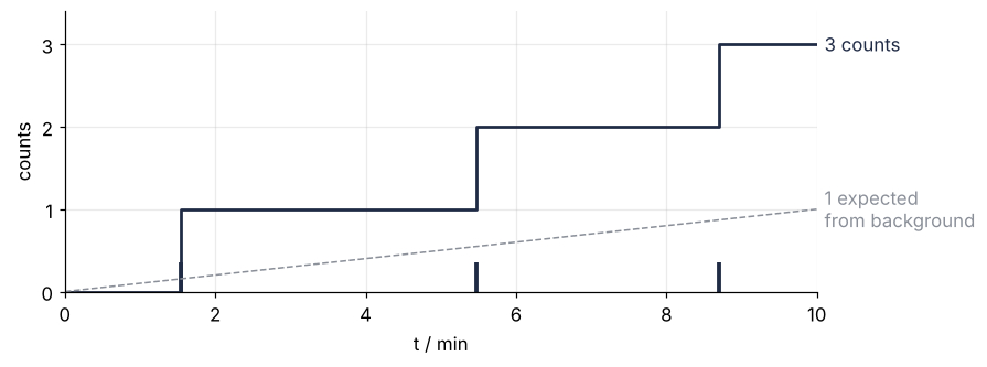
The textbook answer subtracts the expected background and gives the counting error \(\sqrt{N}\) to the three counts:
s_hat = (N - b * T) / T
err = np.sqrt(N) / T
print(f"s = {s_hat:.2f} ± {err:.2f} per minute")
print(f"95 % range: [{s_hat - 1.96 * err:.2f}, {s_hat + 1.96 * err:.2f}] per minute")
s = 0.20 ± 0.17 per minute
95 % range: [-0.14, 0.54] per minute
The range runs from -0.14 to 0.54 per minute, and a fifth of it lies below zero. A source cannot emit a negative number of decays, yet the recipe offers such rates as plausible as rates the same distance above the estimate of 0.20.
Two things are obvious. There are more counts than the background explains, 3 against 1, and the error bar of 0.17 is almost as large as the estimate. Waiting longer would help, but ten minutes is the run you have. The question this tutorial answers is less obvious: given three counts, how plausible is each value of \(s\), when \(s\) cannot be negative? The answer is a curve over \(s\), not a number with a ± attached.
The idea: ask each rate how likely it makes three counts
Counts of independent events in a fixed time follow the Poisson distribution. If \(\mu\) counts are expected, the probability of seeing exactly \(n\) is \(\mu^n e^{-\mu}/n!\), and its standard deviation is \(\sqrt{\mu}\), which is where the \(\sqrt{N}\) of the lab course comes from.
Turn this around. Pick a candidate source rate \(s\); the detector then expects \((s + b)T\) counts in the run, and the Poisson distribution says how probable exactly 3 of them are. Here are three candidates, with the bar at 3 counts picked out:
Show code
n = np.arange(11)
fig, axes = plt.subplots(3, 1, figsize=(8, 6), sharex=True)
for ax, s_c in zip(axes, [0.0, 0.2, 0.6]):
    pmf = poisson.pmf(n, (s_c + b) * T)
    ax.bar(n, pmf, color=[INK if k == N else MUTED for k in n], width=0.7)
    ax.set(ylabel="probability", ylim=(0, 0.42))
    ax.text(0.99, 0.92, f"s = {s_c:.1f} per minute   P(3 counts) = {pmf[N]:.3f}",
            transform=ax.transAxes, ha="right", va="top")
axes[-1].set(xlabel="counts in 10 min", xticks=n)
plt.show()
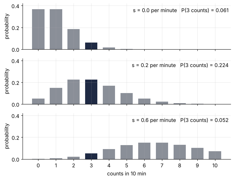
With no source at all, three counts happen with probability 0.061. At 0.2 per minute they happen with probability 0.224, and at 0.6 per minute, where 7 counts are expected, the probability falls back to 0.052. Each candidate rate answers the same question: how well do I explain what the detector saw?
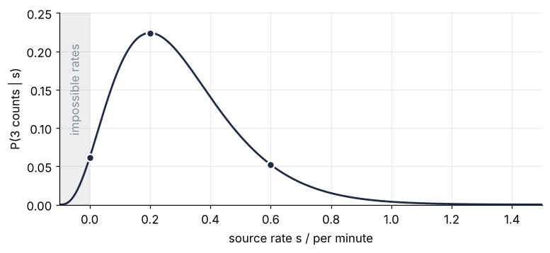
Now sweep \(s\) continuously and plot the probability of 3 counts against it. That curve is the likelihood, written \(P(3\ \text{counts} \mid s)\), where the bar reads "given": the probability of three counts given the rate \(s\).
Show code
s_l = np.linspace(-0.1, 1.5, 16001)
L = poisson.pmf(N, (s_l + b) * T)

fig, ax = plt.subplots(figsize=(8, 3.2))
ax.axvspan(-0.1, 0, color=MUTED, alpha=0.15, lw=0)
ax.text(-0.05, 0.15, "impossible rates", rotation=90, ha="center", va="center", color=MUTED)
ax.plot(s_l, L, color=INK)
ax.plot([0, 0.2, 0.6], poisson.pmf(N, (np.array([0, 0.2, 0.6]) + b) * T), "o", ms=7, mew=1.5, mec="white", color=INK)
ax.set(xlabel="source rate s / per minute", ylabel="P(3 counts | s)", xlim=(-0.1, 1.5), ylim=(0, 0.25))
plt.show()

ds_l = s_l[1] - s_l[0]
print(f"area under the likelihood, s ≥ -0.1:  {L.sum() * ds_l:.3f} per minute")
print(f"area under the likelihood, s ≥ 0:     {L[s_l >= 0].sum() * ds_l:.3f} per minute")
print(f"share of the area beyond s = 2:       {poisson.pmf(N, (np.linspace(2, 4, 20001) + b) * T).sum() * 1e-4 / (L.sum() * ds_l):.1e}")
area under the likelihood, s ≥ -0.1:  0.100 per minute
area under the likelihood, s ≥ 0:     0.098 per minute
share of the area beyond s = 2:       1.4e-06
The three dots of the bar charts lie on it, and the peak is at 0.20 per minute, where the expected count \((s + b)T\) equals the observed 3. The likelihood is not a probability distribution over \(s\). It is a probability of the counts, read as a function of the rate, and its area over \(s \geq -0.1\), where the total rate \(s + b\) reaches zero, is 0.100 per minute. That is \(1/T\), not 1: over the expected count \(\mu = (s + b)T\) the area is \(\int_0^\infty \mu^3 e^{-\mu}/3!\,d\mu = 1\), and changing the variable from \(\mu\) to \(s\) divides that area by \(T\) and gives it the unit of \(s\). Between \(s = -0.1\) and 0 it stays positive, because a slightly negative source rate plus the background is still a positive total rate. Nothing in the counts forbids \(s < 0\). That knowledge has to come from somewhere else.
The posterior, and where its 95 % ends
It comes from the prior, what you know before counting: here \(s \geq 0\) and nothing more. As a probability density over \(s\), a probability per unit of \(s\), it is flat on 0 to 2 per minute with height 0.5 min, so that its area is 1. The upper end does not matter: only 1.4 millionths of the likelihood's area lie beyond it.
To combine the two, weight each rate's prior plausibility by how well that rate explains three clicks. That is a product, point by point, and dividing by its area makes the result a density again:
s = np.linspace(0, 2, 2001)                  # source rate / per minute
ds = s[1] - s[0]
prior = np.full_like(s, 0.5)                 # density / min, area 1 on [0, 2]
likelihood = poisson.pmf(N, (s + b) * T)
posterior = likelihood * prior
posterior /= posterior.sum() * ds            # density / min
print(f"posterior peak: {posterior.max():.2f} min at s = {s[posterior.argmax()]:.2f} per minute")
posterior peak: 2.28 min at s = 0.20 per minute
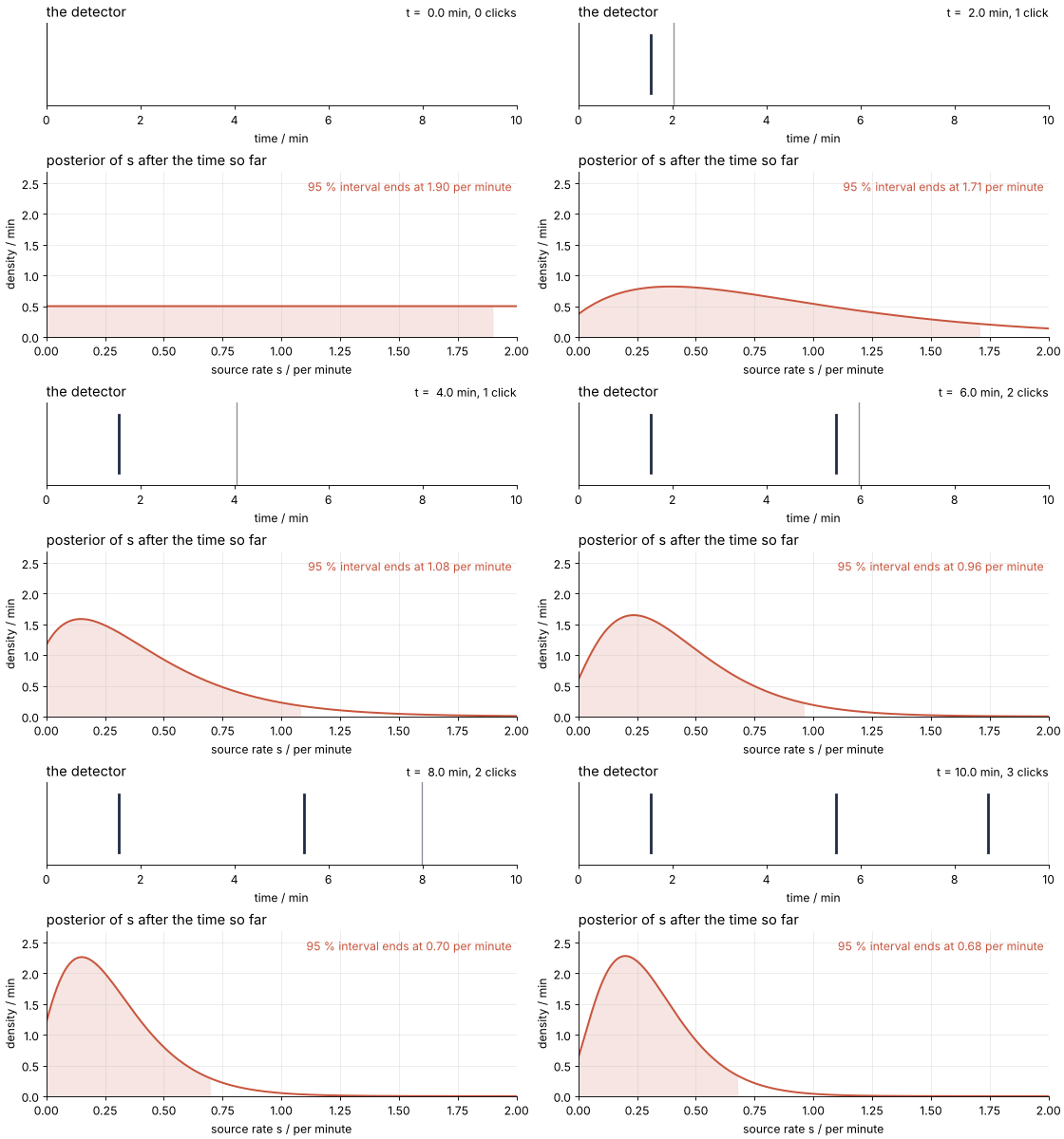
You can also build the posterior while the detector runs. At time \(t\) the likelihood is the Poisson probability of the \(n(t)\) clicks so far in the time \(t\) so far, so the posterior moves between clicks too. With the flat prior the posterior peaks where the likelihood does, so the cell needs only the likelihood. Here is its peak at the second click and just before the third:
Show code
for t_now, n_now in [(times[1], 2), (times[2], 2)]:
    p_now = poisson.pmf(n_now, (s + b) * t_now)
    print(f"t = {t_now:.1f} min, {n_now} clicks: peak at s = {s[p_now.argmax()]:.2f} per minute")
t = 5.5 min, 2 clicks: peak at s = 0.27 per minute
t = 8.7 min, 2 clicks: peak at s = 0.13 per minute
In 3.2 min without a click the peak slides from 0.27 to 0.13 per minute, halfway to zero. A minute of silence is data.
Show code
"""Count by count: the posterior of a source rate, updated while the detector runs.

Renders ../../assets/count-by-count.gif. Run it from any directory:

    python scene.py
"""
from pathlib import Path

import numpy as np
import matplotlib.pyplot as plt
from matplotlib.animation import FuncAnimation, PillowWriter
from PIL import Image

OUT = Path(__file__).resolve().parents[2] / "assets" / "count-by-count.gif"
INK, ACCENT, MUTED = "#1f2a44", "#c8553d", "#8a8f98"
plt.rcParams.update({"axes.spines.top": False, "axes.spines.right": False,
                     "axes.grid": True, "grid.alpha": 0.25, "font.size": 11})

# ---- data: the same three clicks as in the tutorial
N, T, b = 3, 10.0, 0.1                                    # counts, min, counts per minute
rng = np.random.default_rng(231)
times = np.sort(rng.uniform(0, T, N))
s = np.linspace(0, 2, 2001)                               # source rate / per minute
ds = s[1] - s[0]

def posterior(t):
    """Flat prior on [0, 2] times the Poisson likelihood of n(t) clicks in time t."""
    n = np.sum(times <= t)
    lam = (s + b) * t
    log_p = n * np.log(s + b) - lam                       # logs, so that t = 0 is flat, not 0/0
    p = np.exp(log_p - log_p.max())
    return p / (p.sum() * ds)

def hpd(p, q=0.95):
    order = np.argsort(-p, kind="stable")                 # ties, as in the flat start, fill from s = 0 up
    keep = order[:np.searchsorted(np.cumsum(p[order]) * ds, q) + 1]
    return s[keep].min(), s[keep].max()

frames = np.concatenate([np.linspace(0, T, 100), np.full(14, T)])   # hold the last state
p_max = max(posterior(t).max() for t in frames)

# ---- figure, drawn once
fig, (ax1, ax2) = plt.subplots(2, 1, figsize=(7, 5), dpi=80, height_ratios=[1, 2],
                               layout="constrained")
ax1.set(xlim=(0, T), ylim=(0, 1), yticks=[], xlabel="time / min")
ax1.grid(False)
clock = ax1.axvline(0, color=MUTED, lw=1.2)
ticks = [ax1.plot([ti, ti], [0.15, 0.85], color=INK, lw=2.5, visible=False)[0] for ti in times]
count_text = ax1.text(1, 1.04, "", transform=ax1.transAxes, ha="right", va="bottom")
ax1.set_title("the detector", loc="left")

(curve,) = ax2.plot([], [], color=ACCENT, lw=1.8)
band = ax2.fill_between(s, 0, 0, color=ACCENT, alpha=0.15, lw=0)
upper_text = ax2.text(0.99, 0.95, "", transform=ax2.transAxes, ha="right", va="top", color=ACCENT)
ax2.set(xlim=(0, 2), ylim=(0, 1.08 * p_max), xlabel="source rate s / per minute",
        ylabel="density / min")
ax2.set_title("posterior of s after the time so far", loc="left")

# ---- one frame: a function of the elapsed time alone
def update(t):
    p = posterior(t)
    lo, hi = hpd(p)
    inside = (s >= lo) & (s <= hi)
    clock.set_xdata([t, t])
    for tick, ti in zip(ticks, times):
        tick.set_visible(ti <= t)
    n = np.sum(times <= t)
    count_text.set_text(f"t = {t:4.1f} min, {n} click{'' if n == 1 else 's'}")
    curve.set_data(s, p)
    band.set_data(s, 0, np.where(inside, p, 0))
    upper_text.set_text(f"95 % interval ends at {hi:.2f} per minute")

# ---- render, and read back what was written
OUT.parent.mkdir(exist_ok=True)
FuncAnimation(fig, update, frames=frames).save(OUT, writer=PillowWriter(fps=12))
plt.close(fig)
with Image.open(OUT) as im:
    seconds = 0.0
    for i in range(im.n_frames):                          # Pillow merges the held frames into one long frame
        im.seek(i)
        seconds += im.info["duration"] / 1000
    print(f"{OUT.name}: {im.width} x {im.height} px, {im.n_frames} frames, "
          f"{seconds:.1f} s, {OUT.stat().st_size / 1024:,.0f} kB")
A 95 % credible interval is a range of \(s\) that holds 95 % of the posterior's area. It claims what you want to say about your own measurement: given these counts and this prior, the probability that \(s\) lies inside is 0.95. The naive range promises something else: a recipe that would cover the true rate in 95 % of repeated experiments if the counts were large. Three counts are not large, and the negative rates are the visible sign.
Many intervals hold 95 %; I use the shortest, the highest-density interval. Draw a horizontal line across the posterior and lower it until the parts of the curve above the line enclose 95 % of the area under the curve. The interval is where the curve lies above the line. That gives one interval when the posterior has a single peak, as every posterior here does. The other common convention cuts 2.5 % off each tail and gives [0.03, 0.78] per minute; it can never reach zero, because it always removes a lower tail.
def hpd(s, p, q=0.95):
    """Highest-density interval of a single-peaked density p on an evenly spaced grid s."""
    order = np.argsort(p)[::-1]
    keep = order[:np.searchsorted(np.cumsum(p[order]) * (s[1] - s[0]), q) + 1]
    return s[keep].min(), s[keep].max()

lo, hi = hpd(s, posterior)
cdf = np.cumsum(posterior) * ds
print(f"mode {s[posterior.argmax()]:.2f}, mean {(s * posterior).sum() * ds:.2f} per minute")
print(f"95 % highest density: [{lo:.2f}, {hi:.2f}] per minute")
print(f"95 % equal tails:     [{s[np.searchsorted(cdf, 0.025)]:.2f}, {s[np.searchsorted(cdf, 0.975)]:.2f}] per minute")
print(f"density at s = 0 over peak density: {posterior[0] / posterior.max():.2f}")
print(f"cut line over peak density:          {posterior[s <= hi][-1] / posterior.max():.2f}")
mode 0.20, mean 0.31 per minute
95 % highest density: [0.00, 0.68] per minute
95 % equal tails:     [0.03, 0.78] per minute
density at s = 0 over peak density: 0.27
cut line over peak density:          0.15
Show code
fig, ax = plt.subplots(figsize=(8, 3.6))
ax.axvspan(-0.3, 0, color=MUTED, alpha=0.12, lw=0)
ax.step([-0.3, 0, 1.2], [0, 0.5, 0.5], where="post", color=MUTED, lw=1.2)
inside = (s >= lo) & (s <= hi)
ax.fill_between(s[inside], 0, posterior[inside], color=ACCENT, alpha=0.15, lw=0)
ax.plot(s, posterior, color=ACCENT, lw=2.8)              # wide, so the likelihood shows inside it
ax.plot(s_l, L / (L.sum() * ds_l), color=INK, lw=1.0)
y_naive = -0.35
ax.errorbar(s_hat, y_naive, xerr=1.96 * err, fmt="o", ms=6, capsize=3, lw=1.2, color=SECOND)
ax.text(0.47, 1.5, "posterior", color=ACCENT)
ax.annotate("likelihood", xy=(-0.05, 0.1), xytext=(-0.28, 0.9), color=INK,
            arrowprops=dict(arrowstyle="-", color=INK, lw=0.8))
ax.text(1.0, 0.56, "prior", color=MUTED)
ax.text(hi + 0.02, 0.06, f"{hi:.2f}", color=ACCENT)
ax.text(lo + 0.02, 0.06, f"{lo:.0f}", color=ACCENT)
ax.text(s_hat + 1.96 * err + 0.03, y_naive, f"naive range [{s_hat - 1.96 * err:.2f}, {s_hat + 1.96 * err:.2f}]",
        va="center", color=SECOND)
ax.set(xlabel="source rate s / per minute", ylabel="density / min", xlim=(-0.3, 1.2), ylim=(-0.6, 2.5),
       yticks=np.arange(0, 2.6, 0.5))
plt.show()
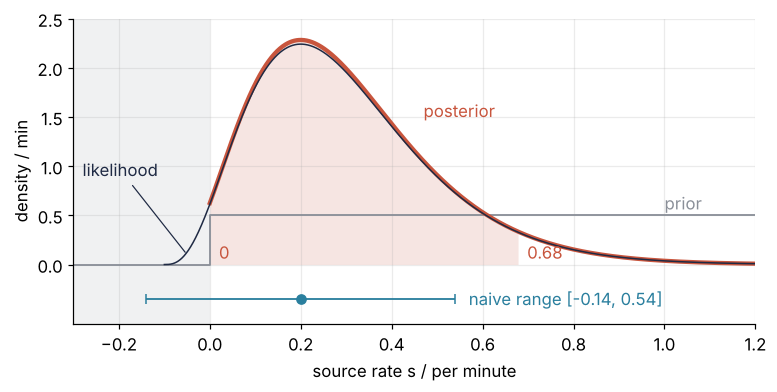
The posterior peaks at 0.20 per minute, the same place as the naive estimate, and its mean is 0.31. Its 95 % interval runs from exactly zero to 0.68 per minute, so as an upper limit the measurement says \(s < 0.68\) per minute at 95 %. It ends at zero because of where the horizontal line sits: lowered until it encloses 95 %, it lies at 15 % of the peak height, while the posterior at \(s = 0\) is still at 27 %, above the line. The interval runs into the boundary and stops there. At the upper end it reaches further than the naive range, 0.68 against 0.54, because a Poisson posterior with three counts has a long tail toward high rates, which a symmetric error bar cannot have. The posterior and the likelihood nearly coincide, and that is the point: with a flat prior the posterior is the likelihood cut at zero and rescaled, and the cut is all the prior contributes.
Formalization
Bayes' theorem for one parameter says that the posterior is the likelihood times the prior, divided by a number that makes the result a density:
\(p(s)\) is the prior, \(p(N \mid s)\) the likelihood, \(p(s \mid N)\) the posterior, and \(p(N)\) the evidence; the bar reads "given". The theorem holds because the joint probability of a rate and a count splits two ways: the probability of the rate times that of the count given the rate, or the probability of the count times that of the rate given the count. So \(p(s)\, p(N \mid s) = p(N)\, p(s \mid N)\), and dividing by \(p(N)\) gives the theorem.
For counts above a known background the likelihood is the Poisson probability
On a grid \(s_i\) with spacing \(\Delta s\), likelihood values \(L_i\), and prior values \(\pi_i\), the theorem becomes the grid cell above, \(p_i = L_i \pi_i / \sum_j L_j \pi_j \Delta s\). For your own measurement only the line that computes the likelihood changes.
Show code
def posterior_of(counts, minutes, prior):
    p = poisson.pmf(counts, (s + b) * minutes) * prior
    return p / (p.sum() * ds)

log_prior = 1 / (s + b)
log_prior /= log_prior.sum() * ds
evidence = (likelihood * prior).sum() * ds
print(f"evidence p(N) = 0.5 min × {evidence / 0.5:.4f} per minute = {evidence:.4f}")
print(f"posterior peak = {likelihood.max():.4f} × 0.5 min / {evidence:.4f} = {likelihood.max() * 0.5 / evidence:.2f} min")

# run by run: yesterday's posterior is today's prior
two_runs = posterior_of(N, T, posterior)
print(f"largest difference, run by run against 6 counts at once: {np.abs(two_runs - posterior_of(6, 2 * T, prior)).max():.1e}")
print()
print("counts  minutes  flat prior     log prior")
for counts, minutes in [(3, 10), (6, 20), (30, 100)]:
    flat, logp = posterior_of(counts, minutes, prior), posterior_of(counts, minutes, log_prior)
    (a, c), (d, e) = hpd(s, flat), hpd(s, logp)
    print(f"{counts:4d}  {minutes:7d}    [{a:.2f}, {c:.2f}]   [{d:.2f}, {e:.2f}]")
print(f"mode with the log prior, 3 counts: {s[posterior_of(N, T, log_prior).argmax()]:.2f} per minute")
err_20 = np.sqrt(6) / 20
print(f"naive, 20 min: {0.2:.2f} ± {err_20:.2f}, 95 % range [{0.2 - 1.96 * err_20:.2f}, {0.2 + 1.96 * err_20:.2f}] per minute")
evidence p(N) = 0.5 min × 0.0981 per minute = 0.0491
posterior peak = 0.2240 × 0.5 min / 0.0491 = 2.28 min
largest difference, run by run against 6 counts at once: 6.7e-15

counts  minutes  flat prior     log prior
   3       10    [0.00, 0.68]   [0.00, 0.54]
   6       20    [0.02, 0.51]   [0.00, 0.43]
  30      100    [0.10, 0.32]   [0.10, 0.31]
mode with the log prior, 3 counts: 0.10 per minute
naive, 20 min: 0.20 ± 0.12, 95 % range [-0.04, 0.44] per minute
The evidence only rescales. \(p(N)\) is the probability of seeing exactly 3 counts before you know \(s\): the likelihood averaged over the prior, \(p(N) = \int p(N \mid s)\, p(s)\, ds = 0.5\ \text{min} \times 0.0981\) per minute \(= 0.0491\). It is a pure probability, because the prior's minutes and the per minute of \(ds\) cancel. Dividing by it turns the likelihood's 0.2240 at the peak into a posterior density of \(0.2240 \times 0.5\ \text{min} / 0.0491 = 2.28\) min. That number has a unit because a density is probability per unit of \(s\), and \(s\) is in per minute. The evidence changes the height and nothing else: the peak stays at 0.20.
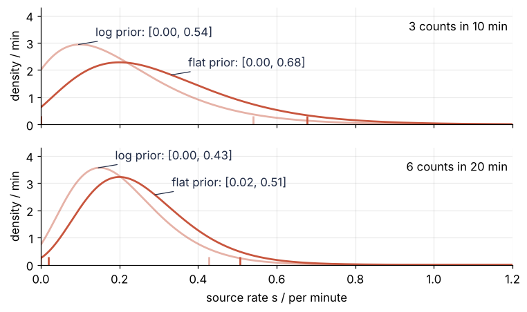
A flat prior is still a choice. It says a rate near 1.9 per minute is as plausible as one near 0.1. When you do not know even the order of magnitude of the total rate \(\lambda = s + b\), 0.01 or 1 per minute, the honest statement is equal plausibility per factor of ten, which is a prior flat in \(\ln \lambda\). A change of variables, \(p(\lambda)\, d\lambda = p(\ln \lambda)\, d(\ln \lambda) = \text{const} \cdot d\lambda / \lambda\), turns that into the density \(1/\lambda\). The prior \(p(s) \propto 1/(s + b)\) moves the mode to 0.10 and the interval to [0, 0.54] per minute. It acts like a flat prior with one count fewer, because \(1/\lambda\) cancels one power of \(\lambda^N\) in the likelihood. A prior \(1/s\) would not do, since the posterior's area would grow without bound toward \(s = 0\). The rule I follow: flat when you know the range a parameter lives in, flat in the logarithm when you know only that it is positive, and compute both. If the interval moves a lot, the data are too few to decide, and that is itself the answer.
More data makes the prior matter less. Yesterday's posterior is today's prior: updating run by run gives the same posterior as both runs at once, to within \(10^{-14}\). A second ten-minute run with another 3 counts gives [0.02, 0.51] per minute with the flat prior and [0, 0.43] with the log prior. The flat-prior interval has lifted off zero, so it no longer holds a rate of zero, while the naive 20-minute range [-0.04, 0.44] still offers negative rates. After ten runs and 30 counts the two priors give [0.10, 0.32] and [0.10, 0.31]: they have stopped disagreeing.
Show code
fig, axes = plt.subplots(2, 1, figsize=(8, 4.4), sharex=True)
for ax, (counts, minutes) in zip(axes, [(3, 10), (6, 20)]):
    for pr, alpha, name in [(prior, 1.0, "flat prior"), (log_prior, 0.45, "log prior")]:   # both posteriors
        p = posterior_of(counts, minutes, pr)
        a, c = hpd(s, p)
        ax.plot(s, p, color=ACCENT, alpha=alpha)
        ax.vlines([a, c], 0, 0.3, color=ACCENT, alpha=alpha, lw=1.8)
        # the label beside its curve, in INK so the light tint stays legible: the flat one on its right flank,
        # the log one by its peak, where it is the outer curve
        i = np.argmax((s > s[p.argmax()]) & (p < 0.8 * p.max())) if pr is prior else p.argmax() - 4
        ax.annotate(f"{name}: [{a:.2f}, {c:.2f}]", xy=(s[i], p[i]), xytext=(16, 12), textcoords="offset points",
                    va="center", color=INK, arrowprops=dict(arrowstyle="-", color=INK, lw=0.8, shrinkA=2, shrinkB=0))
    ax.text(0.99, 0.9, f"{counts} counts in {minutes} min", transform=ax.transAxes, ha="right", va="top")
    ax.set(ylabel="density / min", ylim=(0, 4.3))
axes[-1].set(xlabel="source rate s / per minute", xlim=(0, 1.2))
plt.show()
See it in code
As a function of the total rate \(\lambda\), the likelihood \(\lambda^N e^{-\lambda T}\) has the shape of a Gamma distribution, the family of densities proportional to \(\lambda^{a-1} e^{-\lambda/\theta}\), here with shape \(a = N + 1 = 4\) and \(\theta = 1/T\). With the flat prior the posterior is therefore this Gamma cut at \(\lambda = b\), where \(s = 0\), and divided by its area above \(b\): an exact answer to check the grid against. SciPy, like NumPy, takes \(\theta\) as scale, so the call is gamma(a=N + 1, scale=1/T). PyTorch, Stan, and PyMC take the rate \(T\) instead, so check which one a library means.
Show code
lam = gamma(a=N + 1, scale=1 / T)
mass = lam.sf(b)                             # area of the Gamma above lambda = b
exact = lam.pdf(s + b) / mass

print(f"Gamma area above b:              {mass:.3f}")
print(f"P(s < {hi:.3f}), grid / exact:      {posterior[s <= hi].sum() * ds:.3f} / {(lam.cdf(hi + b) - lam.cdf(b)) / mass:.3f}")
print(f"mean, grid / exact:              {(s * posterior).sum() * ds:.3f} / {lam.expect(lambda x: x, lb=b) / mass - b:.3f} per minute")
print(f"largest density difference:      {np.abs(exact - posterior).max():.4f} min")
Gamma area above b:              0.981
P(s < 0.678), grid / exact:      0.950 / 0.950
mean, grid / exact:              0.306 / 0.306 per minute
largest density difference:      0.0007 min
The grid and the exact answer agree to the three decimals printed: 0.950 of the posterior below the upper end of the interval, a mean of 0.306 per minute, and densities that differ by under 0.001 min against a peak of 2.28. For one parameter a grid of 2,001 points is exact for every purpose you will have, and it works for any prior and likelihood you can write down, closed form or not. It stops working at a handful of parameters: a hundred points per axis is \(10^{10}\) evaluations at five. That is where sampling takes over, as in MCMC with emcee.
Where it shows up
- Radiocarbon dating. A small sample, or an old one near the method's limit of about 50,000 years, gives few ¹⁴C counts above the blank, the background of material with no ¹⁴C left. Calibration programs such as OxCal turn the measurement into a posterior distribution of calendar age, and the age ranges archaeologists quote are its highest-density intervals.
- Rare events in particle physics. Rare-decay and dark matter searches often see a handful of events on a known background, which is this tutorial's problem with other numbers. The result is an upper limit, reported from a flat-prior posterior or from the frequentist Feldman-Cousins construction, which also never returns negative rates; Profile likelihood shows the frequentist side.
- Single-molecule fluorescence. A single dye molecule in a confocal spot gives a few photons per time bin, and the detector's dark counts are the background. Whether a bin holds a molecule is a question about a rate near zero with three or four counts in it.
- Epidemiology of rare diseases. Three cases in a known number of person-years, against a baseline rate from the population, is a Poisson count above background, and the same arithmetic decides whether three cases near one factory are a cluster or chance. An exposure can also lower the incidence, so a nonnegative excess is an assumption here, not a law as for a source rate, and the prior is where that assumption goes.
In each of them the likelihood comes from the counting statistics, the prior from what the parameter can be, and the interval from the posterior, never from a ± that ignores the boundary.
Further reading
scipy.stats.poissonandscipy.stats.gamma, for the parametrizations.- Sivia and Skilling, Data Analysis: A Bayesian Tutorial, for Bayes' theorem as a physicist uses it.
- Gelman et al., Bayesian Data Analysis, chapter 2, for single-parameter models and the choice of prior.
- Related tutorials on this site: MCMC with emcee, Posterior predictive band from emcee samples, Hamiltonian Monte Carlo, Profile likelihood, The standard error of the mean.
- Download the notebook. It was executed with the library versions in the header.