Labeled arrays: why broadcasting by name cannot pick the wrong axis
Afterwards you can say what names and coordinates add to arrays, why NumPy broadcasting fails silently on equal-length axes, and what alignment by label does.
- Field
- Geology, Physics
- Prerequisites
- none beyond Python basics
- Libraries
matplotlib 3.11.2numpy 2.5.3xarray 2026.9.0
py-labeled-arrays.ipynb, executed with the versions above. The download needs a free account
Run it yourself. In a terminal, this installs exactly the versions above:
pip install numpy==2.5.3 xarray==2026.9.0 matplotlib==3.11.2 jupyterlabThe question
Here are two years of daily near-surface temperature, 730 days from January 1, 2023, on a grid of 25 latitudes from 30° N to 78° N and 25 longitudes from 24° W to 24° E, every 2°. The region is ocean with a continent in its east. In NumPy it is an array T of shape (730, 25, 25), with the axes time, latitude, longitude.
Show code
import numpy as np
import xarray as xr
import matplotlib.pyplot as plt

plt.rcParams.update({
    "figure.figsize": (8, 3.6), "figure.dpi": 110,
    "axes.spines.top": False, "axes.spines.right": False,
    "axes.grid": True, "grid.alpha": 0.25,
    "font.size": 11, "lines.linewidth": 1.8,
})
INK, ACCENT, SECOND, MUTED = "#1f2a44", "#c8553d", "#2a7f9e", "#8a8f98"

# The field is synthetic, built from four known terms, so that the answer can be
# checked at the end. Pretend you have not seen this cell.
rng = np.random.default_rng(241)
lat = np.arange(30, 79, 2.0)                                  # °N, 25 values
lon = np.arange(-24, 25, 2.0)                                 # °E, 25 values
time = np.datetime64("2023-01-01") + np.arange(730)
day = np.arange(730)

def climate(lat, lon):
    """Two-year mean (°C), seasonal amplitude (K), and land fraction on a latitude-longitude grid."""
    LAT, LON = np.meshgrid(lat, lon, indexing="ij")
    land = 1 / (1 + np.exp((np.hypot(LAT - 50, LON - 12) - 12) / 1.44))   # a disk of 12° around 12° E, 50° N
    mean = 15 - 0.6 * (LAT - 30) - 3 * land
    amplitude = (4 + 0.1 * (LAT - 30)) * (1 + 1.5 * land)
    return mean, amplitude, land

mean, amplitude, land = climate(lat, lon)
season = np.cos(2 * np.pi * (day - 200) / 365.25)             # warmest around day 200
clean = mean + amplitude * season[:, None, None]
T = clean + 2.0 * rng.standard_normal(clean.shape)            # daily weather, σ = 2 K

clean_mean = clean.mean(axis=0)
true_pattern = clean_mean - clean_mean.mean(axis=1, keepdims=True)   # what a correct method must find

def draw_map(ax, field, cmap, vmin, vmax, ylabel=True):
    """A latitude-longitude panel with the coast as the 0.5 contour of the land fraction."""
    mesh = ax.pcolormesh(lon, lat, field, cmap=cmap, vmin=vmin, vmax=vmax, shading="nearest")
    ax.contour(lon, lat, land, [0.5], colors=INK, linewidths=1)
    ax.set(xlabel="longitude / °E", xticks=[-20, 0, 20], yticks=[30, 50, 70], aspect="equal")
    ax.set_ylabel("latitude / °N" if ylabel else "")
    ax.tick_params(labelleft=ylabel)                          # the latitudes once per row of maps
    ax.grid(False)
    return mesh
The task is the departure from the zonal mean. The zonal mean is the average along a circle of latitude, here over all longitudes and all 730 days; subtract it, average over time, and what is left is the land-sea pattern. Climate scientists call such a departure an anomaly. Subtracting the 25 latitude means from the whole array is one line, thanks to broadcasting: NumPy lines the two shapes up from the right, by position, so that the last axis of one meets the last axis of the other, and stretches the smaller array along the axes it lacks. The 25 latitude means therefore meet the last axis, longitude, which is also 25 long.
zm = T.mean(axis=(0, 2))                  # one mean per latitude
anom = T - zm
print("zm:", zm.shape, "  T - zm:", anom.shape)
print(f"largest |departure|, time mean: {np.abs(anom.mean(axis=0)).max():5.2f} K")
print(f"largest |true pattern|:         {np.abs(true_pattern).max():5.2f} K")
zm: (25,)   T - zm: (730, 25, 25)
largest |departure|, time mean: 28.93 K
largest |true pattern|:          1.80 K
Show code
fig, (ax1, ax2) = plt.subplots(1, 2, layout="constrained")
fig.colorbar(draw_map(ax1, T.mean(axis=0), "cividis", None, None), ax=ax1, label="T / °C")
limit = np.abs(anom.mean(axis=0)).max()
fig.colorbar(draw_map(ax2, anom.mean(axis=0), "RdBu_r", -limit, limit, ylabel=False), ax=ax2, label="departure / K")
plt.show()
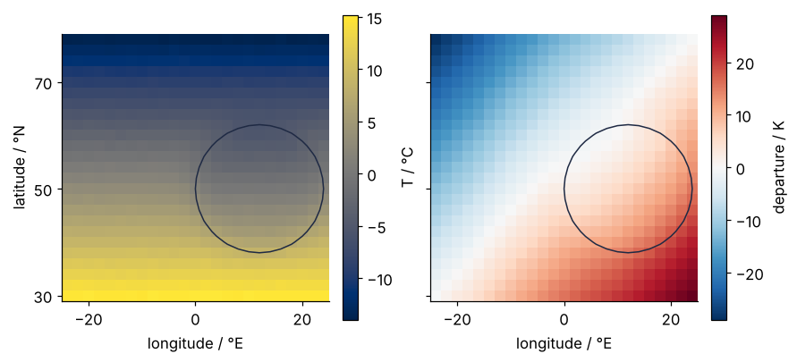
No error, no warning. The temperature map on the left, in the cividis colormap, shows the obvious: it is colder to the north, so much so that the continent inside its coast hardly shows. Taking out the zonal mean is how you make it show. The departure on the right, in the diverging RdBu_r, looks like a departure map should: centered on zero, smooth, warm in the southeast and cold in the northwest.
The data are synthetic, so the land-sea pattern built into them is known: it stays within ±1.80 K. The map spans ±28.93 K. It is wrong by a factor of sixteen, and nothing complained. On a grid 53 longitudes wide the same line raises an error, as the Formalization shows.
Hence the question. NumPy ran the line along the wrong axis without a word. How can an array know which axis an operation means, and refuse a mistake like this one?
The idea: give every axis a name
The vector zm holds one mean per latitude, but it carries no record of that: all NumPy sees is 25 numbers. Here is what was subtracted, against what was meant:
Show code
fig, axes = plt.subplots(1, 3, figsize=(8, 3), layout="constrained")
stretched = np.broadcast_to(zm, (25, 25))
meant = np.broadcast_to(zm[:, None], (25, 25))
draw_map(axes[0], stretched, "cividis", zm.min(), zm.max())
mesh = draw_map(axes[1], meant, "cividis", zm.min(), zm.max(), ylabel=False)
fig.colorbar(mesh, ax=axes[:2], label="T / °C", shrink=0.8)
limit = np.abs(meant - stretched).max()
mesh = draw_map(axes[2], meant - stretched, "RdBu_r", -limit, limit, ylabel=False)
fig.colorbar(mesh, ax=axes[2], label="error / K", shrink=0.8)
for ax, label in zip(axes, ["subtracted", "meant", "error"]):
    ax.text(0, 1.03, label, transform=ax.transAxes, va="bottom")
plt.show()
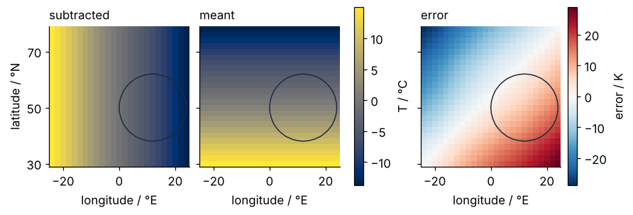
The stripes run the wrong way. NumPy subtracted the warm southern means from the eastern columns and the cold northern means from the western ones, and the difference between the two stretches is the error map, almost all of the 29 K the departure showed.
The NumPy fix is to give the vector the shape that puts its values where they belong:
print(zm[:, None].shape)
print(T.mean(axis=(0, 2), keepdims=True).shape)
(25, 1)
(1, 25, 1)
None in an index inserts a new axis of length 1 at that place, so the 25 values stand in a column and broadcasting stretches them along longitude. keepdims=True keeps the averaged axes as axes of length 1 instead of removing them, so the mean comes out with the right shape. Both are correct. Both are correct only because you remembered that latitude is the middle of three axes.
A labeled array remembers it for you. xarray's DataArray is a NumPy array with a name for each axis, called a dimension, and coordinates: which latitude each row is, which longitude each column, which day each slice.
t = xr.DataArray(T, dims=("time", "lat", "lon"), coords={"time": time, "lat": lat, "lon": lon})
zm_t = t.mean(("time", "lon"))
print(zm_t.dims)
print((t - zm_t).dims)
('lat',)
('time', 'lat', 'lon')
The mean over time and longitude leaves a vector that knows it runs along lat. The subtraction pairs dimensions by name, so the latitude means meet latitude whatever the shapes. The common slip in the NumPy line, axis=(0, 1) typed where (0, 2) was meant, returns 25 longitude means, which fit as well as the latitude means did. In xarray it would read t.mean(("time", "lat")), and nobody types "lat" when they mean longitude.
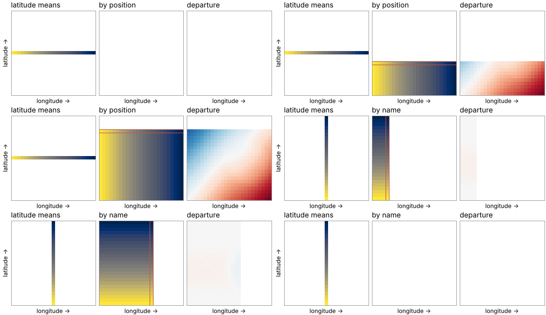
Here are both stretches of the same 25 numbers, laid down copy by copy, first by position and then by name. Watch the departure on the right: by position it fills with the ±29 K dipole, by name it stays within ±2 K, the land-sea pattern and the noise.
Show code
"""Broadcasting by position and by name: 25 latitude means stamped onto a 25 x 25 grid.

Renders ../../assets/broadcast-by-name.gif from the field of the py-labeled-arrays
tutorial (same formula, same seed). Run it from any directory:

    python scene.py
"""
from pathlib import Path

import numpy as np
import matplotlib.pyplot as plt
from matplotlib.animation import FuncAnimation, PillowWriter
from matplotlib.patches import Rectangle
from PIL import Image

OUT = Path(__file__).resolve().parents[2] / "assets" / "broadcast-by-name.gif"
INK, ACCENT, SECOND, MUTED = "#1f2a44", "#c8553d", "#2a7f9e", "#8a8f98"
plt.rcParams.update({"font.size": 11})

# ---- data: the tutorial's field, and its time mean
rng = np.random.default_rng(241)
lat = np.arange(30, 79, 2.0)
lon = np.arange(-24, 25, 2.0)
day = np.arange(730)
LAT, LON = np.meshgrid(lat, lon, indexing="ij")
land = 1 / (1 + np.exp((np.hypot(LAT - 50, LON - 12) - 12) / 1.44))
mean = 15 - 0.6 * (LAT - 30) - 3 * land
amplitude = (4 + 0.1 * (LAT - 30)) * (1 + 1.5 * land)
clean = mean + amplitude * np.cos(2 * np.pi * (day - 200) / 365.25)[:, None, None]
T = clean + 2.0 * rng.standard_normal(clean.shape)
T_mean = T.mean(axis=0)
zm = T.mean(axis=(0, 2))                                   # the 25 latitude means

stretch = {"position": np.broadcast_to(zm, (25, 25)),      # laid along longitude
           "name": np.broadcast_to(zm[:, None], (25, 25))}  # laid along latitude
spread = {k: np.abs(T_mean - s).max() for k, s in stretch.items()}

# ---- the timeline: (mode, number of rows or columns stamped), with pauses at both ends
steps = list(range(26))
timeline = ([("position", 0)] * 4 + [("position", k) for k in steps] + [("position", 25)] * 14
            + [("name", 0)] * 4 + [("name", k) for k in steps] + [("name", 25)] * 14 + [("name", 0)] * 3)

# ---- figure, drawn once
fig, (ax_v, ax_g, ax_d) = plt.subplots(1, 3, figsize=(7, 2.7), dpi=80,
                                       layout="constrained")
for ax in (ax_v, ax_g, ax_d):
    ax.set(xlim=(-0.5, 24.5), ylim=(-0.5, 24.5), aspect="equal", xticks=[], yticks=[])
    for side in ax.spines.values():                        # a thin frame shows the empty grid
        side.set_color(MUTED)
    ax.set_xlabel("longitude →")
ax_v.set_ylabel("latitude →")
ax_v.set_title("latitude means", loc="left")
grid_title = ax_g.set_title("", loc="left")
dep_title = ax_d.set_title("", loc="left")                 # the spread is printed here, off the data

empty = np.full((25, 25), np.nan)
vector_img = ax_v.imshow(empty, cmap="cividis", vmin=zm.min(), vmax=zm.max(), origin="lower")
grid_img = ax_g.imshow(empty, cmap="cividis", vmin=zm.min(), vmax=zm.max(), origin="lower")
dep_img = ax_d.imshow(empty, cmap="RdBu_r", vmin=-30, vmax=30, origin="lower")
marker = Rectangle((0, 0), 0, 0, fill=False, edgecolor=ACCENT, lw=1)
ax_g.add_patch(marker)

# ---- one frame: a function of the timeline entry alone
def update(entry):
    mode, k = entry
    shown = np.zeros((25, 25), bool)
    vector = np.full((25, 25), np.nan)
    if mode == "position":
        shown[:k] = True                                   # rows from the south
        vector[12] = zm                                    # the means as a row: west to east
        marker.set_bounds(-0.5, k - 1.5, 25, 1)
    else:
        shown[:, :k] = True                                # columns from the west
        vector[:, 12] = zm                                 # the means as a column: south to north
        marker.set_bounds(k - 1.5, -0.5, 1, 25)
    marker.set_visible(0 < k < 25)                         # the newest copy, while stamping
    vector_img.set_data(vector)
    grid_img.set_data(np.where(shown, stretch[mode], np.nan))
    dep_img.set_data(np.where(shown, T_mean - stretch[mode], np.nan))
    grid_title.set_text(f"by {mode}")
    dep_title.set_text(f"departure  ±{spread[mode]:.0f} K" if k == 25 else "departure")

# ---- render, and read back what was written
update(timeline[0])
fig.canvas.draw()
fig.set_layout_engine("none")                              # freeze the layout, so no frame shifts the panels
OUT.parent.mkdir(exist_ok=True)
FuncAnimation(fig, update, frames=timeline).save(OUT, writer=PillowWriter(fps=12))
plt.close(fig)
with Image.open(OUT) as im:
    seconds = 0.0
    for i in range(im.n_frames):                           # Pillow merges repeated frames into longer ones
        im.seek(i)
        seconds += im.info["duration"] / 1000
    print(f"{OUT.name}: {im.width} x {im.height} px, {len(timeline)} frames in {seconds:.1f} s, "
          f"{OUT.stat().st_size / 1024:,.0f} kB")
Coordinates, and two grids that cover different ranges
Names say which axis. Coordinates say which value along it, and that matters as soon as two arrays come from different places. Take another model's two-year mean, the same shape, 25 latitudes by 25 longitudes, but on latitudes 20° N to 68° N, 10° farther south, and with a known bias of +0.5 K. The cell below builds it with climate, the function in the setup cell that made our field. It returns the two-year mean on any grid, and that mean falls by 0.6 K per degree of latitude toward the pole, with the continent 3 K colder on top. The difference below is our field minus the other model, so a correct comparison returns minus the bias, about −0.5 K.
lat2 = np.arange(20, 69, 2.0)
ref = climate(lat2, lon)[0] + 0.5              # the same climate without weather, plus the bias
other = xr.DataArray(ref, dims=("lat", "lon"), coords={"lat": lat2, "lon": lon})

diff = t.mean("time") - other
print(f"NumPy, row against row:       {(T.mean(axis=0) - ref).mean():+.2f} K")
print(f"xarray, latitude by latitude: {diff.mean().item():+.2f} K")
print(f"result: {dict(diff.sizes)}, {diff.lat.values[0]:.0f}° N to {diff.lat.values[-1]:.0f}° N")
NumPy, row against row:       -6.50 K
xarray, latitude by latitude: -0.49 K
result: {'lat': 20, 'lon': 25}, 30° N to 68° N
NumPy compared row with row, 30° N with 20° N all the way up, and found −6.50 K: the 10° offset times the 0.6 K per degree by which the temperature falls poleward, −6.00 K, and minus the bias on top. xarray compared like with like and found −0.49 K, minus the bias and nothing else. It kept only the 20 latitudes both grids share, 30° N to 68° N. Each grid lost five rows, not five in total: this one its northernmost five, 70° N to 78° N, the other its southernmost five, 20° N to 28° N. They were dropped, not filled. Keeping only the labels both operands have is called an inner join.
When two grids are supposed to be identical, demand it, and get an error instead of a quiet trim:
try:
    xr.align(t.mean("time"), other, join="exact")
except ValueError as err:
    print(str(err).splitlines()[0])
cannot align objects with join='exact' where index/labels/sizes are not equal along these coordinates (dimensions): 'lat' ('lat',)
The error names the dimension whose labels differ, lat. On matching grids align returns the two arrays unchanged, as a tuple, and the computation goes on.
Formalization
Write the field as \(T_{t,i,j}\) with \(t\) the day, \(i\) the latitude, and \(j\) the longitude. The mean over time and longitude at latitude \(i\) is \(m_i = \frac{1}{N_t N_j}\sum_{t,j} T_{t,i,j}\), with \(N_t = 730\) days and \(N_j = 25\) longitudes. The intended operation is
What NumPy computed was \(T_{t,i,j} - m_j\). Nothing in the array says that the index of \(m\) is a latitude index, and the subscript is the whole difference. A labeled array carries the name of that index with the values, so \(m\) can only meet the latitude axis.
NumPy's rule. Shapes are compared from the right, and each pair of lengths must be equal or one of them 1; an array with fewer axes gets leading axes of length 1. Against (25,), the shape (730, 25, 25) compares the longitude's 25 with 25 and passes. A grid with 53 longitudes compares 53 with 25 and fails:
try:
    np.zeros((730, 25, 53)) - zm
except ValueError as err:
    print(err)
operands could not be broadcast together with shapes (730,25,53) (25,)
The rule looks at lengths only. Any two axes of the same length, on a square grid or not, can stand in for each other, and the result has the right shape either way.
Broadcasting by name, so axis order stops mattering. In xarray the result of an operation has the union of the operands' dimensions, in the order of the first operand with new ones appended. The order of the axes is then a matter of display. transpose lists the dimensions in a new order:
reordered = t.transpose("lon", "time", "lat") - zm_t
print(reordered.dims)
print(abs(reordered.transpose("time", "lat", "lon") - (t - zm_t)).max().item())
('lon', 'time', 'lat')
0.0
The same numbers to the last bit, in another order. In NumPy, T.transpose(2, 0, 1) - zm puts latitude last and is right by accident: the same subtraction means a different axis after every reordering, and no error marks the change.
Alignment compares labels as values. Arithmetic between two labeled arrays keeps the labels both have, the inner join, unless xr.set_options(arithmetic_join=...) says otherwise: "outer" keeps the labels either has and fills the gaps with NaN, "left" and "right" keep one operand's labels, and "exact" raises the error shown above. Labels match only when they are equal, and floating-point equality is strict. A copy of the latitude means on a grid shifted by 1e-9 degrees shares no latitude with t:
shifted = xr.DataArray(zm_t.values, dims="lat", coords={"lat": lat + 1e-9})
print(dict((t - shifted).sizes))
{'time': 730, 'lat': 0, 'lon': 25}
No latitudes left, and no message. That is a silent failure of its own. Compare grids from two sources with join="exact" first, so that a mismatch of 1e-9 raises an error instead of emptying the result. Grids that differ, on purpose or by rounding, are brought onto one another with reindex, interp, or sel(..., method="nearest"), the subject of a tutorial of their own.
See it in code
The whole computation the labeled way is two lines, and the cell below compares it with the truth built into the data and with the positional NumPy result.
Show code
departure = (t - t.mean(("time", "lon"))).mean("time")
by_position = (T - T.mean(axis=(0, 2))).mean(axis=0)

results = {"by name": departure.values, "by position": by_position}
for name, result in results.items():
    error = result - true_pattern
    print(f"{name:12s} RMS error {np.sqrt(np.mean(error**2)):6.2f} K   largest {np.abs(error).max():6.2f} K")
print(f"noise floor  σ/√730 = {2.0 / np.sqrt(730):.3f} K")

fig, axes = plt.subplots(1, 3, figsize=(8, 3.2), layout="constrained")
draw_map(axes[0], true_pattern, "RdBu_r", -2, 2)
mesh = draw_map(axes[1], results["by name"], "RdBu_r", -2, 2, ylabel=False)
fig.colorbar(mesh, ax=axes[:2], label="departure / K", shrink=0.8)
mesh = draw_map(axes[2], results["by position"], "RdBu_r", -30, 30, ylabel=False)
fig.colorbar(mesh, ax=axes[2], label="departure / K", shrink=0.8)
for ax, label in zip(axes, ["true", "by name", "by position"]):
    rms = "" if label == "true" else f"\nRMS {np.sqrt(np.mean((results[label] - true_pattern)**2)):.2f} K"
    ax.annotate(label + rms, (0, 1), xycoords="axes fraction", xytext=(0, 30), textcoords="offset points",
                va="top")                                     # first lines level across the panels
plt.show()
by name      RMS error   0.08 K   largest   0.27 K
by position  RMS error  12.04 K   largest  28.93 K
noise floor  σ/√730 = 0.074 K
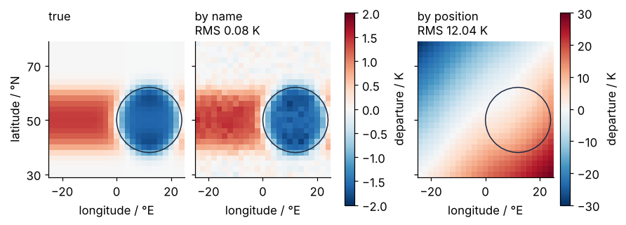
On a shared scale of ±2 K the departure by name is the true pattern with a speckle of noise: the cold continent and, at its latitudes, the ocean warmer than the zonal mean. It agrees with the true pattern to 0.08 K RMS. That is, to a good approximation, the daily noise of 2 K divided by the square root of 730, 0.074 K, the standard error of a mean over 730 independent days: the method adds nothing to what the weather leaves. The departure by position is off by 12.04 K RMS and 28.93 K at the corners, sixteen times the size of the pattern it was meant to show, which is why its panel needs a scale of ±30 K. The two lines that produced them differ only in whether the axes were named.
Where it shows up
The field here is one example of a pattern that runs through every science that measures on a grid, and the two axes of equal length need not form a map: a year of daily profiles at 25 depths and 25 stations, 365 × 25 × 25, is as exposed as this one.
- Climate and ocean model output. CMIP and ERA5 data come as NetCDF files with dimensions (time, level, lat, lon), and zonal means and anomalies are the daily diagnostics. xarray grew up on these files, and the Pangeo community builds its tools on it.
- Remote sensing. A satellite stack is (time, band, y, x), and Sentinel-2 delivers 13 spectral bands. With 13 acquisitions of one tile, a per-band mean taken over the wrong axes returns one value per date, 13 of them, and the subtraction runs.
- Seismic surveys. A survey's traces form a (source, receiver, time) array. On a line with 240 shots recorded by 240 receivers, a per-receiver static correction reshaped with one
Nonetoo many shifts the traces of each source instead. - Microscopy. Live-cell stacks are (time, channel, z, y, x). With four channels and four focal planes, a per-channel background reshaped with one
Nonetoo few lands on the z axis, and the images still look like images. - Plasma diagnostics and multi-detector experiments. Thomson scattering and detector panels give (shot, channel, time) arrays. In a run with as many shots as channels, a per-channel gain with one
Nonetoo many scales whole shots.
The fix carries over to all of them unchanged: name the dimensions where the data are read, while it is still known which axis is which, and every later operation has to say which dimension it means.
Further reading
- xarray's user guide on computation, with broadcasting by dimension name and automatic alignment, and the reference for
xarray.alignand itsjoinchoices. - NumPy's user guide on broadcasting, for the positional rule with pictures.
- Hoyer and Hamman, "xarray: N-D labeled Arrays and Datasets in Python", Journal of Open Research Software 5 (2017), doi:10.5334/jors.148, the paper that states the design.
- Wes McKinney, Python for Data Analysis, 3rd edition (O'Reilly, 2022), Appendix A, whose broadcasting section writes a function that demeans an array along any axis by inserting
np.newaxis, the positional fix above in general form. - Related tutorials on this site: Vectorizing loops with NumPy: nearest neighbors of two thousand points, broadcasting by position used for speed; Maps with Cartopy: a sea-surface temperature anomaly and its stations, drawing such a field on a real map; Map projections: why Greenland looks as large as Africa, and what each keeps, why a global mean of a latitude-longitude grid is weighted by cos φ; pandas from the ground up: a week of temperature logs, the same alignment by index, for tables; Matplotlib animation with FuncAnimation: a probe sweep as a small GIF, how animations like the one above are built; planned: an xarray tutorial from the ground up, and the same tutorial in Julia.
- Download the notebook. It was executed with the library versions in the header.