Continuous wavelet transform with PyWavelets: when El Niño went quiet
Afterwards you can run pywt.cwt on a time series, read its periods, mark the cone of influence, test peaks against red noise, and average over time and a band.
- Topic
- Signal processing, Time series
- Field
- Geology, Physics
- Libraries
matplotlib 3.11.2numpy 2.4.3pooch 1.9.0pywt 1.10.0
py-pywavelets-cwt.ipynb, executed with the versions above. The download needs a free account
Run it yourself. In a terminal, this installs exactly the versions above:
pip install pywt==1.10.0 numpy==2.4.3 pooch==1.9.0 matplotlib==3.11.2 jupyterlabThe problem: when El Niño beats, and when it does not
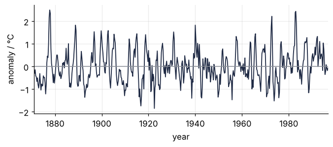
The sea surface of the Niño 3 region, the eastern tropical Pacific from 5°S to 5°N and 150°W to 90°W, warms or cools by a degree or more every two to seven years: El Niño when it is warm, La Niña when it is cool. The record used here runs quarterly from 1871 to 1996. Its two warmest quarters, +2.50 °C in the last quarter of 1877 and +2.44 °C in the first of 1983, are 105 years apart. The values are anomalies, the deviation from the long-term mean for that season, so the seasonal cycle is already gone.
The Fourier spectrum of the Fourier transform tutorial gives this record a broad hump between 2 and 7 years. It cannot tell you whether the 1930s beat like the 1980s, because each of its sines runs through all 126 years. The continuous wavelet transform answers period and time together, and Torrence and Compo's practical guide of 1998 made this record its standard example.
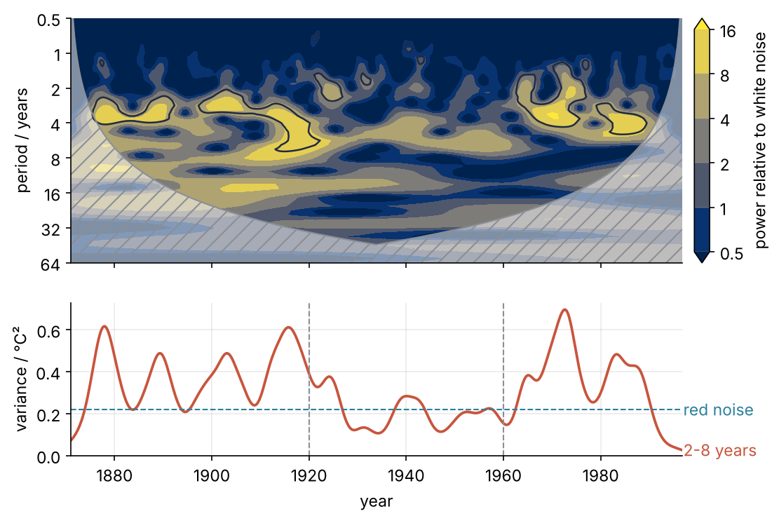
The top panel is the scalogram, power drawn as an image over time and period. The bottom panel follows the variance of the 2-to-8-year band through time, and between 1920 and 1960 it sits on what red noise alone would give. Step 6 draws this figure.
Setup
The file is sst_nino3.dat, 3024 bytes, the quarterly anomalies that accompany Torrence and Compo's paper, from the University of Colorado wavelet page; an identical copy is in Christopher Torrence's GitHub repository. pooch.retrieve downloads it once, checks its SHA-256 hash, and reads it from its cache afterwards. The time axis is 1871 plus a quarter year per sample, as in the paper's own code.
import warnings
warnings.filterwarnings("ignore", message="IProgress not found")   # from tqdm, which pooch imports

import numpy as np
import pywt
import pooch
import matplotlib.pyplot as plt

plt.rcParams.update({
    "figure.figsize": (7, 3.6), "figure.dpi": 110,
    "axes.spines.top": False, "axes.spines.right": False,
    "axes.grid": True, "grid.alpha": 0.25,
    "font.size": 11, "lines.linewidth": 1.8,
})
INK, ACCENT, SECOND, MUTED = "#1f2a44", "#c8553d", "#2a7f9e", "#8a8f98"

pooch.get_logger().setLevel("WARNING")                              # no download message on the first run
path = pooch.retrieve(
    "https://paos.colorado.edu/research/wavelets/wave_idl/sst_nino3.dat",
    known_hash="sha256:632e0562cb54d92c9fa457d59bb7c206e7a395deb68a93adf1e6d5a07fd3746e",
)
sst = np.loadtxt(path)                     # °C, one value per quarter
DT = 0.25                                  # years
N = sst.size
t = 1871 + DT * np.arange(N)
x = sst - sst.mean()
var = x.var()

warm = np.argsort(x)[::-1][:2]
print(f"{N} quarters from {t[0]:.2f} to {t[-1]:.2f}, std {x.std():.2f} °C, "
      f"warmest {x[warm[0]]:+.2f} °C at {t[warm[0]]:.2f} and {x[warm[1]]:+.2f} °C at {t[warm[1]]:.2f}")
504 quarters from 1871.00 to 1996.75, std 0.73 °C, warmest +2.50 °C at 1877.75 and +2.44 °C at 1983.00
Step 1: Look at the series and its Fourier spectrum
Plot the record, then its periodogram, the squared magnitude of the FFT, against period on a log axis:
fig, ax = plt.subplots(figsize=(7, 2.6))
ax.plot(t, x, color=INK, lw=1.2)
ax.axhline(0, color=MUTED, lw=1)
ax.set(xlabel="year", ylabel="anomaly / °C", xlim=(t[0], t[-1]))
plt.show()

X = np.fft.rfft(x)
f = np.fft.rfftfreq(N, DT)[1:]             # cycles per year, without the zero frequency
P_fourier = np.abs(X[1:]) ** 2 / N         # °C²; averages to the variance
T_fourier = 1 / f

fig, ax = plt.subplots(figsize=(7, 2.6))
ax.axvspan(2, 7, color=MUTED, alpha=0.15, lw=0)
ax.plot(T_fourier, P_fourier, color=INK, lw=1.2)
ax.set(xscale="log", xlim=(1, 64), xlabel="period / years", ylabel="power / °C²")
ax.set_xticks([1, 2, 4, 8, 16, 32, 64], labels=["1", "2", "4", "8", "16", "32", "64"])
plt.show()

top = np.argsort(P_fourier)[::-1][:4]
print("highest peaks at", ", ".join(f"{T:.1f}" for T in T_fourier[top]), "years")
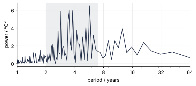
highest peaks at 5.7, 3.5, 3.8, 2.9 years
Four peaks of nearly equal height between 2.9 and 5.7 years, on a hump over the shaded 2 to 7 years. Each peak is a sine of constant amplitude from 1871 to 1996, so a beat that came and went has to be built from several of them.
Step 2: Turn periods into scales and run pywt.cwt
A wavelet is a short wave packet, here the complex Morlet cmor2-1: a complex sine under a Gaussian envelope, bandwidth 2, center frequency 1. The transform slides the packet along the record and at each position measures how well the record matches it, as a Fourier coefficient does for a sine that spans the whole record. The scale s is how far the packet is stretched, and for cmor2-1 it equals the period of the wave. The wavelet is complex so that its modulus does not wiggle with the phase of the record; the real Morlet morl paints stripes into the power.
The shortest period is 2 DT, the Nyquist limit, here 0.5 years. The longest comes from Step 4, which trusts a period s only where the record extends √2 s on both sides. The center of this record lies 63 years from either end, so 63/√2 = 44.5 years is the longest reliable period, rounded up to the next power of two, 64. In between, eight periods per octave, an octave being a doubling of the period. A cmor2-1 peak is about 0.4 octave wide at half power, so every peak gets three rows.
pywt.cwt wants the scales in samples, s / DT, and returns frequencies in cycles per year when you pass sampling_period:
wavelet = pywt.ContinuousWavelet("cmor2-1")
periods = 0.5 * 2 ** (np.arange(57) / 8)              # years, 0.5 to 64, eight per octave
s = periods * wavelet.center_frequency                # scale in years; equal to the period here
W, freqs = pywt.cwt(x, s / DT, wavelet, sampling_period=DT, method="fft",
                    precision=16)     # the default, 12, samples long wavelets too coarsely

print("periods recovered:", np.allclose(1 / freqs, periods))
print("W:", W.shape, W.dtype)
periods recovered: True
W: (57, 504) complex128
One complex number per period and quarter, but the shortest periods come out too weak: PyWavelets averages the wavelet over each quarter instead of sampling it, a running mean one sample wide that damps a period of k samples by \((\sin(\pi/k)/(\pi/k))^2\). White noise, equal power at every period, shows it:
Show code
rng = np.random.default_rng(256)
k_dt = np.array([2, 4, 8, 16])                        # periods in units of DT
def mean_row_power(e):
    return (np.abs(pywt.cwt(e, k_dt, wavelet, method="fft", precision=16)[0]) ** 2).mean(axis=1)

mean_power = np.mean([mean_row_power(e) for e in rng.standard_normal((20, 8192))], axis=0)
damping = np.sinc(1 / k_dt) ** 2                      # np.sinc(u) is sin(pi u) / (pi u)
for k, p, d in zip(k_dt, mean_power / mean_power[-1], damping / damping[-1]):
    print(f"white noise at {k:2d} DT: {p:.2f} of its level at 16 DT, predicted {d:.2f}")
white noise at  2 DT: 0.41 of its level at 16 DT, predicted 0.41
white noise at  4 DT: 0.82 of its level at 16 DT, predicted 0.82
white noise at  8 DT: 0.97 of its level at 16 DT, predicted 0.96
white noise at 16 DT: 1.00 of its level at 16 DT, predicted 1.00
The noise loses 59 % at 2 DT and 18 % at 4 DT, as predicted, and 3 % at 8 DT. Quote no power below 8 DT, two years here.
Step 3: Normalize the power and draw the scalogram
The power abs(W)**2 is in °C² times a factor that belongs to the wavelet, so a value alone says nothing. Each coefficient is a weighted sum of the record. For white noise the expected square of a weighted sum is the variance times the sum of the squared weights, and PyWavelets divides every stretched wavelet by √s, which keeps that sum the same at every scale. The sum is the integral of |ψ|² over the unstretched wavelet, here called norm2, computed from ψ sampled on 2¹⁰ points by wavefun(level=10). White noise therefore has expected power var * norm2 at every period, and dividing by it sets that level to 1:
psi, t_psi = wavelet.wavefun(level=10)
norm2 = np.trapezoid(np.abs(psi) ** 2, t_psi)
power = np.abs(W) ** 2 / (var * norm2)
print(f"norm2 = {norm2:.3f}")

def draw_scalogram(ax, power):
    cs = ax.contourf(t, periods, np.log2(power), levels=np.arange(-1, 5), extend="both", cmap="cividis")
    ax.set(yscale="log", ylim=(64, 0.5), xlabel="year", ylabel="period / years")
    ax.set_yticks([0.5, 1, 2, 4, 8, 16, 32, 64], labels=["0.5", "1", "2", "4", "8", "16", "32", "64"])
    ax.tick_params(axis="y", which="minor", length=0)
    ax.grid(False)
    cax = ax.inset_axes([1.02, 0, 0.025, 1])          # outside the axes, so stacked panels keep one width
    cb = ax.figure.colorbar(cs, cax=cax, ticks=np.arange(-1, 5))
    cb.ax.set_yticklabels(["0.5", "1", "2", "4", "8", "16"])
    cb.set_label("power relative to white noise")

fig, ax = plt.subplots(figsize=(7, 3.4))
draw_scalogram(ax, power)
plt.show()
norm2 = 0.282
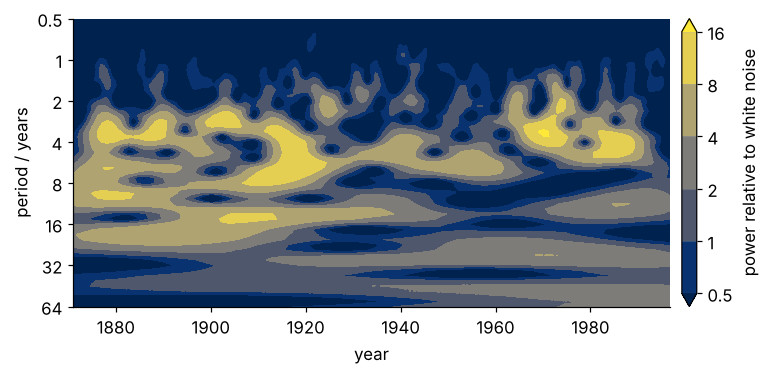
On the colorbar, 1 is as much power as white noise with the record's variance would put there, and 4 is four times that. The colormap is cividis, perceptually uniform (see the colormaps tutorial). The bright patches sit at 2 to 7 years from 1880 to 1920 and from 1960 on, with little between.
Step 4: Mark the cone of influence
pywt.cwt treats the record as zero beyond its ends, so near the ends a stretched wavelet overlaps data that do not exist. A single spike at distance τ leaves Morlet power that falls off as \(e^{-\tau^2/s^2}\), so at τ = √2 s it is down by a factor \(e^{-2}\); Torrence and Compo call √2 s the e-folding time (their Table 1), because the amplitude has fallen to 1/e there. The edge effect counts as gone at that distance, so the period s is trustworthy where the distance to the nearer end exceeds √2 s:
k = np.arange(N)
coi = DT * np.minimum(k + 1, N - k) / np.sqrt(2)      # largest reliable s, in years
inside = s[:, None] <= coi[None, :]
print(f"reliable up to {coi.max():.1f} years at the center, {coi[t == 1880][0]:.1f} years at 1880; "
      f"{inside.mean():.0%} of the plane inside, {inside[periods > 32].mean():.1%} above 32 years")

def draw_cone(ax):
    ax.fill_between(t, coi, 64, color="white", alpha=0.5, lw=0)
    ax.fill_between(t, coi, 64, facecolor="none", edgecolor=MUTED, hatch="//", lw=0)
    ax.plot(t, coi, color=MUTED, lw=1)

fig, ax = plt.subplots(figsize=(7, 3.4))
draw_scalogram(ax, power)
draw_cone(ax)
plt.show()
reliable up to 44.5 years at the center, 6.5 years at 1880; 72% of the plane inside, 5.5% above 32 years
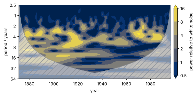
At 1880 only periods up to 6.5 years are reliable, so the long periods of the 1870s lie partly in the hatched zone, and above 32 years only 5.5 % of the plane is inside.
Step 5: Test the power against red noise
Most geophysical records remember their last value, \(x_n = \alpha\, x_{n-1} + \text{noise}\), and such red noise has more power at long periods than white noise. The lag-1 autocorrelation is the correlation coefficient between the record and itself shifted by one sample, the lag-2 one the same for a shift of two. For red noise the lag-1 value is α, and Torrence and Compo estimate it as \((\alpha_1 + \sqrt{\alpha_2})/2\): for pure red noise \(\alpha_2 = \alpha^2\), so \(\sqrt{\alpha_2}\) is a second estimate, and the mean of the two is steadier.
def autocorr(x, lag):
    return np.sum(x[:-lag] * x[lag:]) / np.sum(x * x)

alpha_1, alpha_2 = autocorr(x, 1), autocorr(x, 2)
alpha = (alpha_1 + np.sqrt(alpha_2)) / 2
print(f"lag 1: {alpha_1:.3f}, square root of lag 2: {np.sqrt(alpha_2):.3f}, alpha = {alpha:.3f}")
lag 1: 0.767, square root of lag 2: 0.673, alpha = 0.720
The two estimates differ by 0.09, so the record is red noise only roughly; their mean, 0.72, sets the background.
The red-noise background in the units of Step 3, where white noise is 1, is
with \(T_k\) the period and \(\Delta t\) the sampling step DT. The power at one point is a sum of two squared Gaussians, the real and imaginary parts, so it is \(P_k/2\) times a chi-squared variable with two degrees of freedom. That variable has mean 2, and its 95 % point, the value pure noise exceeds by chance 5 % of the time, is \(-2\ln 0.05 = 5.99\). The 95 % level is therefore \(P_k \times 5.99/2\).
First run the test on 20 red-noise series with the same α. A working test flags about 5 % of their points:
P_red = (1 - alpha**2) / (1 + alpha**2 - 2 * alpha * np.cos(2 * np.pi * DT / periods))
level = P_red * (-2 * np.log(0.05)) / 2
band = (periods >= 2) & (periods <= 8)

flagged = []
for _ in range(20):
    noise = rng.standard_normal(N + 200)
    r = np.zeros(N + 200)
    for n in range(1, N + 200):
        r[n] = alpha * r[n - 1] + noise[n]
    r = r[200:] - r[200:].mean()                      # drop the start, which has not forgotten r[0] = 0
    W_r = pywt.cwt(r, s / DT, wavelet, method="fft", precision=16)[0]
    p_r = np.abs(W_r) ** 2 / (r.var() * norm2)
    flagged.append((p_r >= level[:, None])[band][inside[band]].mean())
print(f"red-noise surrogates: {np.mean(flagged):.1%} of their 2-to-8-year points flagged")
red-noise surrogates: 5.2% of their 2-to-8-year points flagged
significant = power >= level[:, None]
eras = {"1871-1920": t < 1920, "1920-1960": (t >= 1920) & (t < 1960), "1960-1996": t >= 1960}
for name, era in eras.items():
    share = significant[band][:, era][inside[band][:, era]].mean()
    print(f"{name}: {share:5.1%} of the 2-to-8-year band significant")

fig, ax = plt.subplots(figsize=(7, 3.4))
draw_scalogram(ax, power)
ax.contour(t, periods, power / level[:, None], levels=[1], colors=INK, linewidths=1.2)
draw_cone(ax)
plt.show()
1871-1920: 21.7% of the 2-to-8-year band significant
1920-1960:  2.4% of the 2-to-8-year band significant
1960-1996: 22.1% of the 2-to-8-year band significant
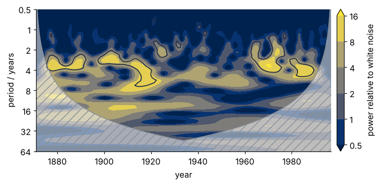
The significant islands sit at 2 to 7 years in the two loud eras. Between 1920 and 1960 only 2.4 % passes, half the 5.2 % that pure red noise reaches by chance.
Step 6: Average over time and over the 2-to-8-year band
Averaging the power over the quarters inside the cone gives the global wavelet spectrum, a smoothed version of the periodogram:
global_spectrum = np.array([row[ok].mean() if ok.any() else 0 for row, ok in zip(power, inside)])
j = global_spectrum.argmax()                          # the 64-year row has no point inside the cone
print(f"global spectrum peaks at {periods[j]:.1f} years: {global_spectrum[j]:.1f} times white noise, "
      f"red noise there {P_red[j]:.1f}")
global spectrum peaks at 3.7 years: 5.1 times white noise, red noise there 2.3
The jagged peaks of Step 1 merge into one at 3.7 years, more than twice the red-noise background, but the average over time has lost the when, as the periodogram did.
To follow the band through time, sum its 17 rows with Torrence and Compo's Eq. 24, here divided by norm2 as in Step 3, since the paper's wavelet has unit energy:
Dividing by \(s_j\) matters because a sine of fixed amplitude gives power that grows with s: a longer packet adds up more cycles of the sine in step, which noise does not do. The factor \(\delta j = 1/8\) is the width of one row in octaves, which turns the sum over rows into an integral over log-period. Neighboring rows overlap, and no wavelet is a sharp band filter, so the sum still misstates the variance by a factor of the wavelet alone, \(C_\delta\). Their Eq. 11 reconstructs the record from the real part of its transform, here in samples:
with ψ(0) the wavelet at its center, where |ψ| is largest. An impulse contains every frequency equally, so transform a unit impulse, set \(x_n = 1\) at its position, and solve for \(C_\delta\), their Eq. 13:
dj = 1 / 8
impulse = np.zeros(2049)
impulse[1024] = 1
a = 0.5 * 2 ** (np.arange(78) / 8)                   # 0.5 to 395 samples
W_imp = pywt.cwt(impulse, a, wavelet, method="fft", precision=16)[0][:, 1024]
C_delta = dj * np.sum(W_imp.real / np.sqrt(a)) / np.abs(psi).max()
print(f"C_delta = {C_delta:.3f}   (Torrence and Compo: 0.776 for their Morlet)")

band_var = dj * DT / C_delta * np.sum(np.abs(W[band]) ** 2 / norm2 / s[band, None], axis=0)
red_var = dj * DT / C_delta * np.sum(var * P_red[band] / s[band])
for name, era in eras.items():
    print(f"{name}: {band_var[era].mean():.2f} °C²")
print(f"red-noise expectation: {red_var:.2f} °C²")
decade = np.convolve(band_var, np.ones(40) / 40, mode="valid")
print(f"quietest decade starts {t[decade.argmin()]:.0f}: {decade.min():.2f} °C²")
C_delta = 0.774   (Torrence and Compo: 0.776 for their Morlet)
1871-1920: 0.38 °C²
1920-1960: 0.21 °C²
1960-1996: 0.34 °C²
red-noise expectation: 0.22 °C²
quietest decade starts 1927: 0.13 °C²
The middle era carries 0.21 °C², about what red noise gives, and the decade from 1927 only 0.13 °C². Stack the scalogram on the band variance:
fig, (top, bottom) = plt.subplots(2, 1, figsize=(7.5, 5.4), sharex=True,
                                  gridspec_kw={"height_ratios": [3.2, 2]})
draw_scalogram(top, power)
top.contour(t, periods, power / level[:, None], levels=[1], colors=INK, linewidths=1.2)
draw_cone(top)
top.set_xlabel("")
bottom.plot(t, band_var, color=ACCENT)
bottom.axhline(red_var, color=SECOND, lw=1, ls="--")
bottom.text(1997, red_var, "red noise", color=SECOND, va="center")
bottom.text(1997, band_var[-1], "2-8 years", color=ACCENT, va="center")
for year in (1920, 1960):
    bottom.axvline(year, color=MUTED, lw=1, ls="--")
bottom.set(xlabel="year", ylabel="variance / °C²", xlim=(t[0], t[-1]), ylim=(0, None))
plt.show()
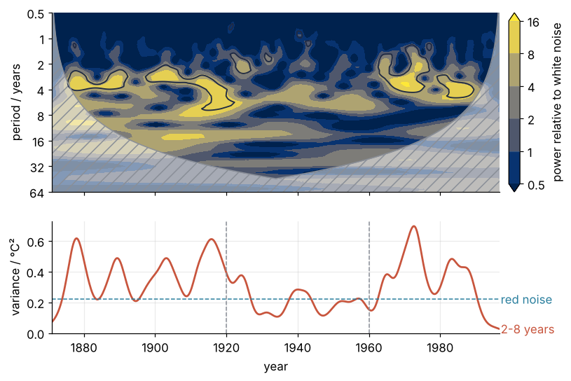
From 1920 to 1960 the band follows the red-noise line, and the two outer eras run well above it. El Niño did not stop in those decades, but its beat could not be told from noise.
Pitfalls
Scales are not periods. Pass periods where pywt.cwt wants scales, or drop sampling_period, and every period comes out off by the center frequency or in cycles per sample. Converting by hand has a trap of its own: pywt.central_frequency estimates the center frequency on a grid of 1/16, so for cmor2-0.955, Torrence and Compo's ω0 = 6, it misses:
w6 = pywt.ContinuousWavelet("cmor2-0.955")
print(f"estimated {pywt.central_frequency(w6):.4f}, true {w6.center_frequency:.4f}")
estimated 0.9375, true 0.9550
That is a 2 % error in every period. Convert from periods with the wavelet's own center_frequency, pass sampling_period, check 1 / freqs, and prefer a center frequency the estimate gets exactly, such as 1.
Reading the power near the ends. The zeros beyond the record pull the power down near 1871 and 1996, the more the longer the period, so a feature there looks weaker than it was, and its contour shrinks or vanishes. A steady 16-year cycle shows how much:
p16 = np.abs(pywt.cwt(np.sin(2 * np.pi * t / 16), [16 / DT], wavelet, method="fft", precision=16)[0][0]) ** 2
print(f"16-year power at 1871: {p16[0] / p16[N // 2]:.2f}, at 1996: {p16[-1] / p16[N // 2]:.2f} of its value at the center")
16-year power at 1871: 0.23, at 1996: 0.28 of its value at the center
About a quarter of its power is left at the ends, and nothing in the scalogram marks the damage. Hatch the cone in every figure and quote only what lies inside it.
Comparing power without normalizing. The same record in °F has 1.8² = 3.24 times the raw power, and a record from another site has another variance:
W_f = pywt.cwt(x * 1.8, s / DT, wavelet, method="fft", precision=16)[0]
print(f"raw maximum x{(np.abs(W_f) ** 2).max() / (np.abs(W) ** 2).max():.2f}, "
      f"normalized maximum {(np.abs(W_f) ** 2 / ((1.8 * x).var() * norm2)).max():.1f} against {power.max():.1f}")
raw maximum x3.24, normalized maximum 17.0 against 17.0
Divide by the variance and by norm2, as in Step 3, before comparing records or wavelets.
Variations
- A sediment or ice core. Set
DTin kyr on an evenly spaced age grid and look for the 23, 41, and 100 kyr orbital cycles. Uneven ages need interpolation first, or the approach of the Lomb-Scargle tutorial. - Seismic or volcanic tremor.
DTand the periods in seconds. For sharp onsets, a wavelet with a shorter envelope,cmor1-1or the Mexican hatmexh, trades period resolution for time resolution. - Two records together. Transform both on the same scales; the cross-wavelet power \(W_1 W_2^*\) shows where Niño 3 and a monsoon rainfall index share a period, and its phase says which leads.
- Filter the band back into a time series. Torrence and Compo's Eq. 29 sums \(\mathrm{Re}\,W/\sqrt{s}\) over the band, with the same \(\delta j\) and \(C_\delta\), and gives the 2-to-8-year signal alone.
Cheat sheet
wavelet = pywt.ContinuousWavelet("cmor2-1")                 # complex Morlet; period = scale
periods = 2 * DT * 2 ** (np.arange(8 * n_octaves + 1) / 8)  # x sampled every DT; quote from 8 * DT up
s = periods * wavelet.center_frequency                      # scale in the time unit of DT, not in samples
W, freqs = pywt.cwt(x, s / DT, wavelet, sampling_period=DT, method="fft", precision=16)
psi, t_psi = wavelet.wavefun(level=10)                      # psi on 2**10 points
power = abs(W)**2 / (x.var() * np.trapezoid(abs(psi)**2, t_psi))       # white noise = 1
coi = DT * np.minimum(k + 1, x.size - k) / np.sqrt(2)       # k = np.arange(x.size); trust s <= coi
P_red = (1 - alpha**2) / (1 + alpha**2 - 2 * alpha * np.cos(2 * np.pi * DT / periods))  # alpha: lags 1, 2
significant = power >= P_red[:, None] * 5.99 / 2            # 95 % against red noise
band_var = DT / 8 / 0.774 * x.var() * (power[band] / s[band, None]).sum(0)  # band: mask over periods
Further reading
- PyWavelets: continuous wavelet transform, the reference for
pywt.cwtand the continuous wavelet families. - C. Torrence and G. P. Compo, A practical guide to wavelet analysis, Bull. Amer. Meteor. Soc. 79, 61 (1998), the method of this tutorial, Eqs. 11, 13, 24, and 29.
- G. R. Lee, R. Gommers, F. Wasilewski, K. Wohlfahrt, and A. O'Leary, PyWavelets: A Python package for wavelet analysis, J. Open Source Softw. 4, 1237 (2019).
- A. Grinsted, J. C. Moore, and S. Jevrejeva, Nonlin. Processes Geophys. 11, 561 (2004), cross-wavelet transform and coherence for geophysical records.
- D. B. Percival and A. T. Walden, Wavelet Methods for Time Series Analysis (Cambridge, 2000).
- Related tutorials on this site: The Fourier transform: asking a signal how much of each frequency it contains, Lomb-Scargle periodograms with astropy, Autocorrelation: how many independent hours a year of wind power holds, Colormaps: why a rainbow scale draws features that are not in the data, Filtering with scipy.signal: mains hum and noise out of an ECG, and Denoise a low-light micrograph with scikit-image, whose wavelet filter uses discrete wavelets from PyWavelets underneath.
- Download the notebook. It was executed with the library versions in the header.