xarray from the ground up: two years of air temperature over North America
Afterwards you can open a netCDF file with xarray and select, reduce, group, and plot it by dimension names and coordinates, not axis numbers.
- Field
- Geology, Physics
- Libraries
cartopy 0.26.0matplotlib 3.11.2numpy 2.4.3pooch 1.9.0scipy 1.18.1xarray 2026.9.0
py-xarray.ipynb, executed with the versions above. The download needs a free account
Run it yourself. In a terminal, this installs exactly the versions above:
pip install numpy==2.4.3 pooch==1.9.0 scipy==1.18.1 xarray==2026.9.0 cartopy==0.26.0 matplotlib==3.11.2 jupyterlabThe problem: how much warmer is July than January, everywhere at once?
Here are two years of air temperature near the ground over North America in one netCDF file, four readings a day at 00, 06, 12, and 18 UTC from January 2013 to December 2014, on 25 latitudes by 53 longitudes, 3.87 million numbers in all. They come from a reanalysis: a weather model run again over past decades and pulled toward each day's observations, so that it fills a complete grid where stations are sparse. In NumPy this is an array of shape (2920, 25, 53), and you have to remember that axis 1 runs from 75° N southward and that Fargo sits at position 25 on axis 2. Get either wrong and the code still runs.
xarray keeps the dimension names and the coordinates with the numbers, and the questions then read the way you would say them: the mean over July at 18 UTC, the seasonal cycle at Fargo, each month's departure from the two-year mean. The last one leads to the seasonal amplitude, the warmest minus the coldest monthly mean at every grid point, which is how far a place swings between winter and summer.
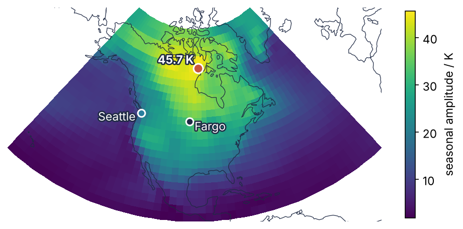
This is where we end up. The amplitude is small over the oceans and large inland, and it peaks northwest of Hudson Bay. Fargo and Seattle lie on the same grid row and differ by a factor of two. Step 6 finds the largest value and draws the map.
Setup
The file is air_temperature.nc, 7.8 MB, from the xarray project's own example data: a subset of the NCEP/NCAR Reanalysis 1 (Kalnay et al., 1996). pooch.retrieve downloads it from a pinned commit, checks its SHA-256 hash, and reads it from its cache on every later run. The coastlines for the map in Step 6 ship in assets/, and the two Cartopy lines make sure nothing else is downloaded.
import warnings
from pathlib import Path
warnings.filterwarnings("ignore", message="IProgress not found")   # from tqdm, which pooch imports

import numpy as np
import xarray as xr
import pooch
import matplotlib.pyplot as plt
import matplotlib.dates as mdates
import matplotlib.patheffects as pe
import cartopy
import cartopy.crs as ccrs

cartopy.config["pre_existing_data_dir"] = Path("assets")       # holds shapefiles/natural_earth/physical/
warnings.simplefilter("error", cartopy.io.DownloadWarning)      # a download attempt stops the run

plt.rcParams.update({
    "figure.figsize": (7, 3.6), "figure.dpi": 110,
    "axes.spines.top": False, "axes.spines.right": False,
    "axes.grid": True, "grid.alpha": 0.25,
    "font.size": 11, "lines.linewidth": 1.8,
})
INK, ACCENT, SECOND, MUTED = "#1f2a44", "#c8553d", "#2a7f9e", "#8a8f98"

pooch.get_logger().setLevel("WARNING")                          # no download message on the first run
URL = ("https://raw.githubusercontent.com/pydata/xarray-data/"
       "a35297e9da2cc99c811014f0c8a4297345a5c28d/air_temperature.nc")
path = pooch.retrieve(URL, known_hash="sha256:c606b89c35970a2983b914b76df4adbb409003ef34aa7cfd7f582e41f307482b")
print(f"air_temperature.nc: {Path(path).stat().st_size / 1e6:.1f} MB")
air_temperature.nc: 7.8 MB
Step 1: Open the file with open_dataset and read what it says
A netCDF file stores named variables together with their dimensions, the coordinate values along each dimension, and attributes such as units, so the file describes itself. xarray reads that description and turns it into labels you select by.
ds = xr.open_dataset(path, engine="scipy")
ds
<xarray.Dataset> Size: 31MB
Dimensions:  (time: 2920, lat: 25, lon: 53)
Coordinates:
  * time     (time) datetime64[ns] 23kB 2013-01-01 ... 2014-12-31T18:00:00
  * lat      (lat) float32 100B 75.0 72.5 70.0 67.5 65.0 ... 22.5 20.0 17.5 15.0
  * lon      (lon) float32 212B 200.0 202.5 205.0 207.5 ... 325.0 327.5 330.0
Data variables:
    air      (time, lat, lon) float64 31MB ...
Attributes:
    Conventions:  COARDS
    title:        4x daily NMC reanalysis (1948)
    description:  Data is from NMC initialized reanalysis\n(4x/day).  These a...
    platform:     Model
references: http://www.esrl.noaa.gov/psd/data/gridded/data.ncep.reanaly...A Dataset is a collection of variables that share coordinates. This one holds a single variable, air, with three named dimensions, and the coordinates already show the first trap: latitude runs from 75 down to 15, longitude from 200 to 330. Take the variable out, a DataArray, and check what its numbers mean:
air = ds["air"]
print("dims: ", air.dims)
print("units:", air.attrs["units"])
print("lat:  ", air.lat.values[[0, -1]], "  lon:", air.lon.values[[0, -1]])
print(f"in memory: {air.nbytes / 1e6:.0f} MB")
dims:  ('time', 'lat', 'lon')
units: degK
lat:   [75. 15.]   lon: [200. 330.]
in memory: 31 MB
The units are degK, kelvin. In memory the array takes 31 MB, four times the 7.8 MB on disk, because the file stores two-byte integers that xarray multiplies by 0.01 as it reads them.
netCDF comes in two formats: the older netCDF3, which this file is, and netCDF4, built on HDF5, the format of most current model output and data portals. xarray reads neither itself. It hands the file to a reader package, which it calls the engine, and SciPy's reads netCDF3. For a netCDF4 file, run pip install netCDF4 (or h5netcdf), and xr.open_dataset(path) without engine= finds it. With neither installed, open_dataset raises a ValueError that names ['netcdf4', 'h5netcdf'] as matches whose dependencies may not be installed. It means "install one of these", not "the file is broken".
Step 2: Select by label with sel, by position with isel
isel selects by position, the integer index NumPy uses, but along a named dimension. sel selects by label, the coordinate value. Position 0 on every dimension:
first = air.isel(time=0, lat=0, lon=0)
print(f"{first.time.dt.strftime('%Y-%m-%d %H:%M').item()}   lat {first.lat.item()}   lon {first.lon.item()}   {first.item():.2f} K")
2013-01-01 00:00 lat 75.0 lon 200.0 241.20 K
The first row is the north. sel reads a date given as a partial string, so "2014-07" means every time step in July 2014:
print(dict(air.sel(time="2014-07").sizes))
{'time': 124, 'lat': 25, 'lon': 53}
That is 124 time steps, 31 days of four. For a city, method="nearest" picks the closest grid point. The file counts longitude east from 0 to 360, and -96.8 % 360 is 263.2, because Python's % takes the sign of the divisor, so any western longitude lands between 0 and 360:
fargo = air.sel(lat=46.9, lon=-96.8 % 360, method="nearest")
print(f"Fargo:      lat {fargo.lat.item()}   lon {fargo.lon.item()}")

wrong = air.sel(lat=46.9, lon=-96.8, method="nearest")
print(f"no % 360:   lat {wrong.lat.item()}   lon {wrong.lon.item()}")
try:
    air.sel(lat=46.9, lon=-96.8, method="nearest", tolerance=2.5)
except KeyError as err:
    print("tolerance:  KeyError", err)
Fargo:      lat 47.5   lon 262.5
no % 360:   lat 47.5   lon 200.0
tolerance:  KeyError "not all values found in index 'lon'"
Without % 360, "nearest" still finds something: the western edge of the grid, in the open Pacific, and no error says so. tolerance=2.5 turns that silent wrong answer into a KeyError.
Step 3: Reduce along a named dimension
air.time.dt gives the parts of each time stamp (month, hour, day of year) as DataArrays along time, the way .dt does for a datetime column in pandas. A comparison on them gives a True/False DataArray along time, and sel keeps the time steps where it is True, as a boolean mask does in NumPy:
is_july_18 = (air.time.dt.month == 7) & (air.time.dt.hour == 18)
july = air.sel(time=is_july_18)
print(dict(july.sizes))
{'time': 62, 'lat': 25, 'lon': 53}
That is 62 maps, the 18 UTC readings of 31 July days in each of two years, and 18 UTC is 1 p.m. Central Daylight Time in Fargo. Average them by naming the dimension that disappears:
july_mean = july.mean("time") - 273.15
july_mean.attrs["units"] = "°C"

fig, ax = plt.subplots()
july_mean.plot(ax=ax, cmap="cividis", center=False, cbar_kwargs={"label": "T / °C"})
ax.set_title("")                                     # .plot() writes the selected coordinates there
plt.show()

print(f"Fargo:   {july_mean.sel(lat=46.9, lon=-96.8 % 360, method='nearest').item():5.1f} °C")
print(f"maximum: {july_mean.max().item():5.1f} °C")
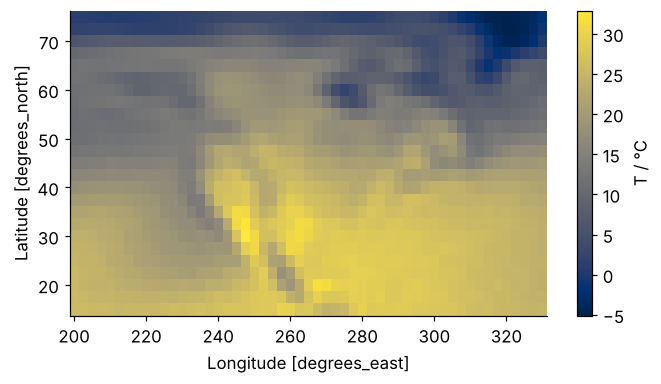
Fargo:    22.4 °C
maximum:  32.9 °C
mean("time") says which dimension goes, where NumPy would need axis=0 and your memory of the order. .plot() saw two dimensions left, drew a color map in cividis, and labeled the axes from the coordinates' own attributes; center=False stops it from centering the colors on zero, which it does for data of both signs. Coastlines come in Step 6. The Kelvin conversion and the units line are deliberate, and the first pitfall shows why.
Step 4: Resample to daily means and group by month
The verbs of pandas from the ground up carry over. resample changes the time step, here from six hours to one day, and groupby gathers the time steps that share a label, wherever they are:
daily = air.resample(time="1D").mean()
clim = air.groupby("time.month").mean()
print("daily:", dict(daily.sizes))
print("clim: ", dict(clim.sizes))
daily: {'time': 730, 'lat': 25, 'lon': 53}
clim:  {'month': 12, 'lat': 25, 'lon': 53}
"time.month" is shorthand for air.time.dt.month from Step 3, so each group holds every time step with one month number, both Januaries together, and the result has a month dimension of 12 in place of time.
To follow both cities through time, pick both grid points in one call. Plain lists select every combination:
print(dict(daily.sel(lat=[46.9, 47.6], lon=[263.2, 237.7], method="nearest").sizes))
{'time': 730, 'lat': 2, 'lon': 2}
That is a 2 × 2 block of four grid points, not two cities. Indexers that are DataArrays sharing one dimension are paired element by element instead, and the shared name becomes the new dimension of the result. xr.DataArray takes the values, the name of their dimension, and the labels along it:
city = ["Fargo", "Seattle"]
lat_c = xr.DataArray([46.9, 47.6], dims="city", coords={"city": city})
lon_c = xr.DataArray([-96.8 % 360, -122.3 % 360], dims="city", coords={"city": city})
pts = daily.sel(lat=lat_c, lon=lon_c, method="nearest")
print(dict(pts.sizes), " lat", pts.lat.values, " lon", pts.lon.values)
{'time': 730, 'city': 2} lat [47.5 47.5] lon [262.5 237.5]
fig, ax = plt.subplots()
for name, color, (x_label, y_label) in [("Fargo", INK, ("2013-04-10", -20)), ("Seattle", SECOND, ("2013-02-01", 13))]:
    T = pts.sel(city=name) - 273.15
    ax.plot(T.time, T, color=color, lw=1.2)
    ax.text(np.datetime64(x_label), y_label, name, color=color)
ax.axhline(0, color=MUTED, lw=1)
ax.xaxis.set_major_locator(mdates.MonthLocator(bymonth=[1, 7]))     # one date label per half year
ax.xaxis.set_major_formatter(mdates.DateFormatter("%b %Y"))
ax.set(xlabel="date", ylabel="T / °C")
plt.show()

for name in city:
    T = pts.sel(city=name) - 273.15
    t_min, t_max = (t.dt.strftime("%Y-%m-%d").item() for t in (T.idxmin("time"), T.idxmax("time")))
    print(f"{name:8s} min {T.min().item():+6.1f} °C on {t_min}   max {T.max().item():+6.1f} °C on {t_max}")
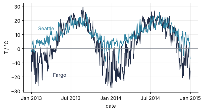
Fargo    min  -28.0 °C on 2014-01-01   max  +29.3 °C on 2013-08-26
Seattle  min  -10.5 °C on 2014-02-06   max  +25.8 °C on 2014-08-12
Both points lie on 47.5° N, 25° of longitude apart. Fargo's coldest day was 17.5 K colder than Seattle's, and its warmest 3.5 K warmer.
Step 5: Subtract the two-year mean, and let the names line up
seasonal = clim - air.mean("time")
print(seasonal.dims)
('month', 'lat', 'lon')
A (12, 25, 53) array minus a (25, 53) array: xarray matched lat with lat and lon with lon by name, not by trailing position, and kept month in front. Labeled arrays shows why matching by name cannot pick the wrong axis. The cities come out with the indexers of Step 4:
at_cities = seasonal.sel(lat=lat_c, lon=lon_c, method="nearest")

fig, ax = plt.subplots(figsize=(7, 3.4))
ax.axhline(0, color=MUTED, lw=1)
for name, color in [("Fargo", INK), ("Seattle", SECOND)]:
    a = at_cities.sel(city=name)
    ax.plot(a.month, a, "o-", color=color, ms=6)
    ax.text(12.3, a.sel(month=12).item(), f"{name}\n{(a.max() - a.min()).item():.1f} K", color=color, va="center")
ax.set(xlabel="month", ylabel="anomaly / K", xticks=range(1, 13), xticklabels="JFMAMJJASOND", xlim=(0.5, 13.8))
plt.show()

for name in city:
    a = at_cities.sel(city=name)
    print(f"{name:8s} {a.min().item():+5.1f} K in month {int(a.idxmin('month')):2d}   "
          f"{a.max().item():+5.1f} K in month {int(a.idxmax('month')):2d}")
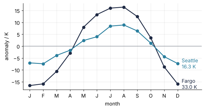
Fargo    -16.6 K in month  1   +16.4 K in month  8
Seattle   -7.4 K in month  2    +8.9 K in month  8
Fargo runs from −16.6 K in January to +16.4 K in August, Seattle from −7.4 K in February to +8.9 K in August. Same latitude, half the swing.
Step 6: Map the seasonal amplitude and find its largest value
The amplitude is the range of seasonal over the months, and again you name the dimension that goes. Then find where it is largest:
amp = seasonal.max("month") - seasonal.min("month")
where = amp.argmax(...)
print({dim: int(i) for dim, i in where.items()})
{'lat': 4, 'lon': 27}
The ..., Python's Ellipsis, means "over all dimensions at once", so argmax(...) returns a dictionary with one position per dimension instead of a single flat index. Its values are 0-d DataArrays, whose repr runs over a dozen lines each, hence the int. isel takes exactly such a dictionary of positions, so the two calls fit together:
peak = amp.isel(where)
low = amp.isel(amp.argmin(...))
for label, p in [("largest", peak), ("smallest", low)]:
    print(f"{label:8s} {p.item():4.1f} K at {p.lat.item():.1f}° N, {360 - p.lon.item():.1f}° W")
largest  45.7 K at 65.0° N, 92.5° W
smallest  1.9 K at 17.5° N, 102.5° W
The largest swing, 45.7 K, is at 65.0° N, 92.5° W, in the Kivalliq region of Nunavut northwest of Hudson Bay; the smallest, 1.9 K, is at 17.5° N, 102.5° W, on the Pacific coast of Mexico. The map needs two Cartopy keywords (Maps with Cartopy explains both): a projection for the axes, here Lambert conformal centered on 95° W, and transform=ccrs.PlateCarree() on the data, which says its numbers are plain longitudes and latitudes.
fig = plt.figure(figsize=(8, 4.2))
ax = plt.axes(projection=ccrs.LambertConformal(central_longitude=-95, standard_parallels=(25, 55)))
amp.plot.pcolormesh(ax=ax, transform=ccrs.PlateCarree(), cmap="viridis",
                    cbar_kwargs={"label": "seasonal amplitude / K", "shrink": 0.85})
ax.coastlines("110m", color=INK, lw=0.6)
ax.spines["geo"].set_visible(False)
ax.set_title("")

halo = [pe.withStroke(linewidth=2.5, foreground=INK)]                # white text readable on any color
ax.plot(peak.lon, peak.lat, "o", ms=9, color=ACCENT, mec="white", mew=1.5, transform=ccrs.PlateCarree())
ax.text(peak.lon.item() - 3, peak.lat.item() + 1.5, f"{peak.item():.1f} K", color="white", ha="right",
        fontweight="bold", path_effects=halo, transform=ccrs.PlateCarree())
for name, color, ha, dx in [("Fargo", INK, "left", 2.5), ("Seattle", SECOND, "right", -1.5)]:
    p = amp.sel(lat=lat_c, lon=lon_c, method="nearest").sel(city=name)
    ax.plot(p.lon, p.lat, "o", ms=7, color=color, mec="white", mew=1.5, transform=ccrs.PlateCarree())
    ax.text(p.lon.item() + dx, p.lat.item() - 3, name, color="white", ha=ha,
            path_effects=halo, transform=ccrs.PlateCarree())
plt.show()
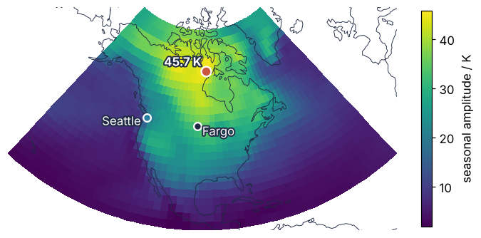
The amplitude runs from under 5 K over the subtropical oceans to over 40 K in northern Canada. The coasts stay low because the ocean stores the summer's heat and gives it back in winter, and Seattle's air mostly comes in off the Pacific. Fargo's has crossed a continent.
Pitfalls
Kelvin that stays Kelvin, or Celsius labeled as Kelvin. Two-year means of 281 read as degrees look like a very hot continent; the other half of the mistake is quieter. In xarray 2026.9 the attributes travel through arithmetic, and .plot() builds the colorbar label from long_name and units, so a field converted to Celsius still says kelvin:
print((air.isel(time=0) - 273.15).attrs["units"])
degK
Read attrs["units"] before you compute anything, and set it again after every conversion, as Step 3 does.
A latitude slice that comes back empty. sel with a slice follows the order of the coordinate, and this one runs from 75 down to 15. Ask for 30° N to 50° N the natural way and you get nothing, with no error:
print(air.sel(lat=slice(30, 50)).sizes["lat"], air.sel(lat=slice(50, 30)).sizes["lat"])
0 9
Write the slice in the coordinate's order, slice(50, 30), which gives the 9 rows, or call air = air.sortby("lat") once after opening and forget about it. Many gridded products store latitude from north to south, so look at the ends of the coordinate, as Step 1 did, before you slice.
A mean over latitude without weights. A 2.5° cell at 75° N covers a little over a quarter of the area of one at 15° N, because the meridians converge toward the pole (Map projections draws it). A plain mean over the grid counts every cell the same. weighted takes one weight per latitude, here cos φ, and broadcasts it by name over time and longitude:
weights = np.cos(np.deg2rad(air.lat))
print(f"plain mean:    {air.mean().item() - 273.15:5.2f} °C")
print(f"area-weighted: {air.weighted(weights).mean().item() - 273.15:5.2f} °C")
plain mean:     8.11 °C
area-weighted: 12.36 °C
The plain mean is 4.3 K too cold, because it lets the small northern cells outvote the large southern ones. Every mean that spans latitudes needs the weights, and so does every sum of a quantity per area.
Variations
- A larger file, opened lazily. With Dask installed,
xr.open_dataset(path, chunks={"time": 365}), orxr.open_mfdataset("air_*.nc")for one file per year, reads the values only when they are needed. Everything above runs unchanged, and.compute()at the end does the work. - Write the result.
amp.to_netcdf("amplitude.nc")writes the map with its coordinates and attributes, so the next script opens it as Step 1 did.amp.to_zarr(...)does the same with the zarr package, for cloud storage. - An ensemble.
xr.concat(runs, dim="member")stacks several model runs along a new dimension. Then.mean("member")and.std("member")give the ensemble mean and spread, and every line above keeps working with the extra dimension. - The daily cycle.
air.sel(time=air.time.dt.month == 7).groupby("time.hour").mean()gives four maps, one per reading time at 00, 06, 12, and 18 UTC.
Cheat sheet
ds = xr.open_dataset(path, engine="scipy")                       # netCDF3; netCDF4: pip install netCDF4, omit engine
da = ds["air"]; da.attrs["units"]                                # read the units first
da.sel(time="2014-07", lat=slice(50, 30))                        # labels; slice in the coordinate's order
da.sel(lat=46.9, lon=-96.8 % 360, method="nearest", tolerance=2.5)   # nearest, but not too far
da.isel(time=0)                                                  # positions
da.sel(time=da.time.dt.month == 7).mean("time")                  # mask by date part, reduce by name
da.resample(time="1D").mean(); da.groupby("time.month").mean()   # new time step; all Julys together
da.sel(lat=lat_pts, lon=lon_pts, method="nearest")               # DataArray indexers on one dim: points, not a block
da.weighted(np.cos(np.deg2rad(da.lat))).mean(("lat", "lon"))     # area-weighted mean
m.isel(m.argmax(...)); m.plot(ax=ax, transform=ccrs.PlateCarree())   # 2-D map m: where its maximum is; draw it
Further reading
- xarray user guide: Indexing and selecting data, Time series data, GroupBy, weighted reductions, Plotting, and Reading and writing files, which lists the engines.
- Hoyer, Hamman, "xarray: N-D labeled arrays and datasets in Python", Journal of Open Research Software 5 (2017), doi:10.5334/jors.148, for the design.
- Kalnay et al., "The NCEP/NCAR 40-Year Reanalysis Project", Bulletin of the American Meteorological Society 77, 437–471 (1996), for where the numbers come from.
- The
pooch.retrievereference, for pinned downloads with a hash. - Hartmann, Global Physical Climatology (2nd ed., 2016), for continentality and the seasonal cycle of surface temperature.
- Related tutorials on this site: Labeled arrays: why broadcasting by name cannot pick the wrong axis; pandas from the ground up: a week of temperature logs; Maps with Cartopy: a sea-surface temperature anomaly and its stations; Map projections: why Greenland looks as large as Africa, and what each keeps; Colormaps: why a rainbow scale draws features that are not in the data, for
cividisandviridis; HDF5 with h5py: detector frames, their metadata, and reading one at a time, for the format under netCDF4. Planned: the same tutorial in Julia with DimensionalData.jl. - Download the notebook. It was executed with the library versions in the header.